

183
Hi PMC, and welcome to a new blog.
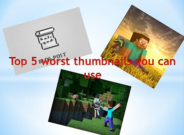
The top five worst thumbnails you can use.
Number five.
This picture takes number five on our list. People often use this picture for blogs about diamonding. I find this one annoying simply because it’s very unattractive and simple. The blogs that it is used on are also quite unoriginal as well. You shouldn’t just type in “diamond on google images and select one of the first to come up that looks nice!
There are a number of diamond thumbnails like this, but in my opinion, this is probably the worst.
Number four.
This thumbnail is used in PVP blogs, and it takes number four on our list. Type in “Minecraft PVP” on Google Images, and this is the first thing to come up, which I guess is why it’s so overused. I like to read PVP tactic blogs, but it just puts me off if I see that as the thumbnail! To really entice people in on your PVP tactic blogs, take a screenshot of you doing that tactic. Don’t use random things you find on Google Images.
This picture was almost beaten by this little bombshell:
But I decided on the other one for the simple fact that that it looks much, much, much worse than the latter.
Number three.
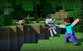
A-ha, now we are into the top three. It’s time to get juicy. This picture of what looks like steve pushing a skeleton off of a cliff takes number three on our countdown. This thumbnail, unlike the last two, isn’t used with specific blogs, it is just used when the creator is too lazy to find or make a relevant picture. Imagine, a blog about… Oh, let’s say…. The new minecraft update. What does a skeleton being pushed off of a cliff have to do with that exactly? It really grinds my gears when I see that familiar skeleton on the pop-reel.
This spot was another close one. I was also thinking of:
But the other one is much, much more overused that the latter.
Number two
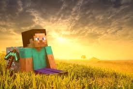
I think everyone who has ever even taken a curious glance at the blog section has seen this picture. The picture of Steve laying down on some realistic grass takes number two on our list. The fact about his one is that it is SO overused, probably more than number five and number four combined. Type in Minecraft on Google Images and it is not very far down. But why is it overused? I think it’s because people think, because it’s bright, that it will attract more people to it.
Sorry to burst your bubble, but no one will want to read a blog with that as the thumbnail. It’s about the worst you can get.
Did I say about the worst?
You heard me right.
Get ready for number one. Are you ready?
Are you absolutely sure you’re ready?
Are you positively, completely sure you’re ready?
Okay then.
Number one.

Yup, you saw it coming. The default thumbnail takes the top spot on our list. If your eyes are already bleeding, look away and go look at some memes or something. Then come back. You back? Okay. This is number one because it is the lazy person’s way out of making a thumbnail. Very attractive! A grey thumbnail with a piece of paper on it. That will really attract people to your blog! It will probably make you the most famous person in the world if you use that for your thumbnail!
As if. If you use that as your thumbnail, it will just show that you are too lazy to either find a decent picture or make one yourself! That reputation will stick with you, until you are ignored everytime you post!
Okay, that’s a little dramatic, but still, don’t let PMC do the work for you. Like I just said, it will make you look lazy. And honestly, the thumbnail normally tells you a bit about how good the blog is going to be.
Moral of the story? Make your own thumbnails.
The top five worst thumbnails you can use.
Number five.
This picture takes number five on our list. People often use this picture for blogs about diamonding. I find this one annoying simply because it’s very unattractive and simple. The blogs that it is used on are also quite unoriginal as well. You shouldn’t just type in “diamond on google images and select one of the first to come up that looks nice!
There are a number of diamond thumbnails like this, but in my opinion, this is probably the worst.
Number four.
This thumbnail is used in PVP blogs, and it takes number four on our list. Type in “Minecraft PVP” on Google Images, and this is the first thing to come up, which I guess is why it’s so overused. I like to read PVP tactic blogs, but it just puts me off if I see that as the thumbnail! To really entice people in on your PVP tactic blogs, take a screenshot of you doing that tactic. Don’t use random things you find on Google Images.
This picture was almost beaten by this little bombshell:
But I decided on the other one for the simple fact that that it looks much, much, much worse than the latter.
Number three.
A-ha, now we are into the top three. It’s time to get juicy. This picture of what looks like steve pushing a skeleton off of a cliff takes number three on our countdown. This thumbnail, unlike the last two, isn’t used with specific blogs, it is just used when the creator is too lazy to find or make a relevant picture. Imagine, a blog about… Oh, let’s say…. The new minecraft update. What does a skeleton being pushed off of a cliff have to do with that exactly? It really grinds my gears when I see that familiar skeleton on the pop-reel.
This spot was another close one. I was also thinking of:
But the other one is much, much more overused that the latter.
Number two
I think everyone who has ever even taken a curious glance at the blog section has seen this picture. The picture of Steve laying down on some realistic grass takes number two on our list. The fact about his one is that it is SO overused, probably more than number five and number four combined. Type in Minecraft on Google Images and it is not very far down. But why is it overused? I think it’s because people think, because it’s bright, that it will attract more people to it.
Sorry to burst your bubble, but no one will want to read a blog with that as the thumbnail. It’s about the worst you can get.
Did I say about the worst?
You heard me right.
Get ready for number one. Are you ready?
Are you absolutely sure you’re ready?
Are you positively, completely sure you’re ready?
Okay then.
Number one.
Yup, you saw it coming. The default thumbnail takes the top spot on our list. If your eyes are already bleeding, look away and go look at some memes or something. Then come back. You back? Okay. This is number one because it is the lazy person’s way out of making a thumbnail. Very attractive! A grey thumbnail with a piece of paper on it. That will really attract people to your blog! It will probably make you the most famous person in the world if you use that for your thumbnail!
As if. If you use that as your thumbnail, it will just show that you are too lazy to either find a decent picture or make one yourself! That reputation will stick with you, until you are ignored everytime you post!
Okay, that’s a little dramatic, but still, don’t let PMC do the work for you. Like I just said, it will make you look lazy. And honestly, the thumbnail normally tells you a bit about how good the blog is going to be.
Moral of the story? Make your own thumbnails.

| Tags |
tools/tracking
2688489
6
the-top-five-worst-thumbnails-you-can-use
![The Entity - Herobrine Mythos [7th Place] Minecraft Blog](https://static.planetminecraft.com/files/resource_media/screenshot/1619/the_entity10137502_thumb.jpg)


 Apro87
 MarioLuigi
 Ryderlb09
 PufferFishGuy_22
 Hippopotamoss
![Confirmed kiruna campus locatoins [BENT] Minecraft Blog](https://static.planetminecraft.com/images/layout/missing_image.png)
 GoldenScientist
 Ender Sparkle
 Escapazition
 ShellyD
Create an account or sign in to comment.
The reason why is, we make thumbnails, yes, but sometimes either we are too tired, etc, to make one.
For example;
I recently made a blog, but I couldn't create a thumbnail because...
My wifi blew out.
It is kinda a big problem for certain people.
But still, great blog.
As for the first two, it's more than just on PMC. I've seen people use them on YouTube videos. It's not really that hard to make your own thumbs. Just take a cool screenshot and edit in some words and what not. There are a lot of free sites and programs that can help you edit them.
diamond
Great blog, diamond :)
"The fact about his one is that..."
Which earns you...
1. A Shiny Gem (Diamond)
2. A click of the Subscribe button
3. A favourite.
Well done!