

1
3D Renders
 BrosUltimateGaming
 Ludicrous
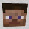
Hello, I am just making this thread to get some feedback on my renders and give feedback to people who post their renders below. Here is one of my renders. Not sure if I should add arms.

Create an account or sign in to comment.
7
1
1
thanks for the opinions guys! I shall work on that
1

it could be better, do you use Cinema4D?
if you do ill give you a link to a lighting pack you could use.
if you do ill give you a link to a lighting pack you could use.
1
Yea i use C4D, and yeah I dont have a lighting pack so if u could give me the url that would be awesome...thx
1

hm, you might want to change your lighting angle, it is difficult to see the depth from this one. also perhaps try to reposition the camera with it, so you get a more perspective view. try to add some subtle texture to the top sphere, and slightly decrease the specularity cause its hardly made out of glass.
1
No offence, but they suck.
1
please do not judge until you can at least say what exactly sucks about it and what could have been done better.
Btw your pictures arent too fantastic either, let me give you some free feedback.
The font on the parchment is inconsitent with the rest of the render, the lighting of the parchment itself is omnidirectional (doesnt come from a particular direction, or comes from several illogical directions at once) and the emboss of the ' apply now' is way too strong, it doesnt fit into the picture. I suggest you alter the text font to be more medieval ,and adjust the color of the server Ip so it fits in more.
Adjust the lighting on the parchment roll so that it clearly(!) comes from 1 logical direction, and adjust the gradient of the ' apply now' accordingly.
apart from that, turn the emboss of the ' apply now' into a slight bevel, and make the
Furthermore the double parchment texture makes little sense, I suggest you change the background to wood or stone or something, and either expand the roll of parchment effect to encompass the entire thing or make it look like the text outside it was engraved in the wood/stone.