

1
 Quatec
I have been wanting to do YouTube for a very long time. Speaking of which, since I am leaving school in less than a month with a two month holiday, I've taken my dream and have packed up a lot of things (metaphorically) and learned how to do graphics design, amateur video editing and much more in my spare time.
Speaking of which, as you read the title, I am wondering what you guys think of my webcamera and text underneath it.
Anyway, here it is. I do not mind intentionally that my face is showing but it fits nicely together and I just wanted to know what you thought. I used the Minecraft background as a game source to show what any game would look like.
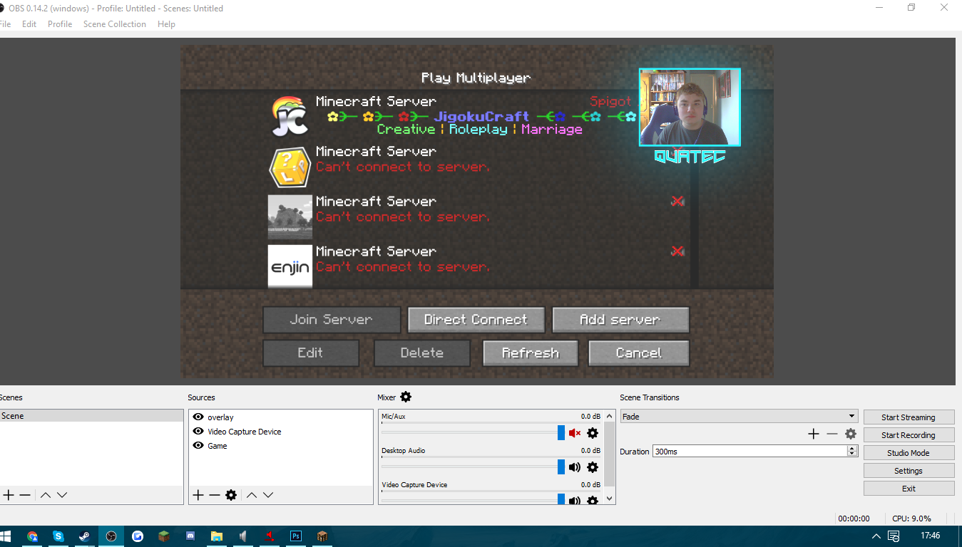
Create an account or sign in to comment.
12
1
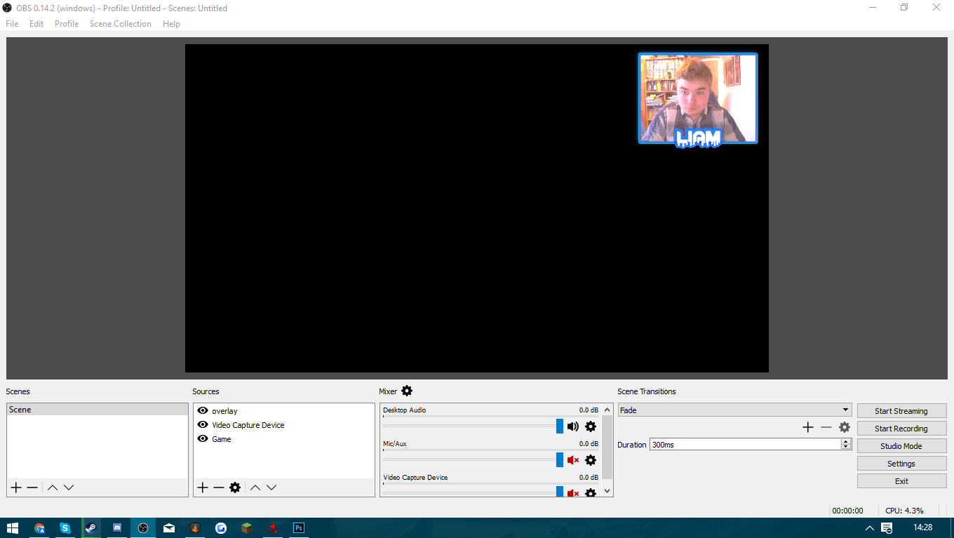
Update! Added more of a simplistic colour that matched mine and turned down outer glow around the webcamera. What do you guys think?
1

personally the light blue is a distraction, but that's more my taste i colouring's,i would personally go for something darker
1

I really like how it looks! However your name is really hard to read with only those light colours, so may I suggest adding a little contrast there?
1

I really like it now it doesn't have radial light. Not sure whether the profile picture you use here is the one from your (youtube?) channel as well. In case yes, I'd try to get them the same color. Nevertheless, I like it.
1
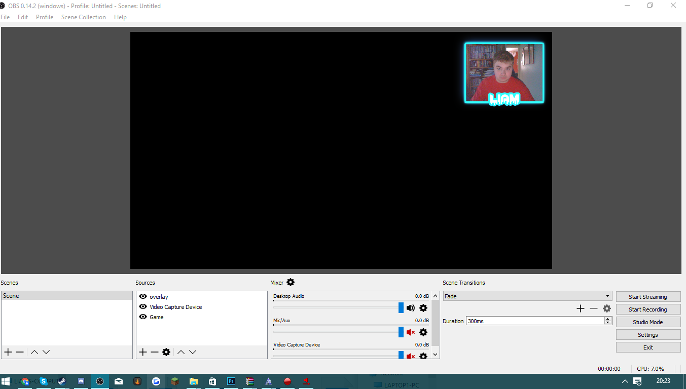
It only has a hint of radial light. Don't worry, obviously I didn't go overboard. The use of colour of what you suggested is what I wanted to do, but I wanted to use this as a draft so far.
1
I just updated! Anyone willing to give me criticism or opinions?
1

[deleted]
1
bump!
I agree and tried adjusting it. Didn't work unfortunately but it wasn't hard to make as well. If it's too much on my audience I'll rework on it again, but it's just I am busy now with exams.
aJason__Looking great but the radial light around the frame is a bit distracting IMO.
I agree and tried adjusting it. Didn't work unfortunately but it wasn't hard to make as well. If it's too much on my audience I'll rework on it again, but it's just I am busy now with exams.
1

Looking great but the radial light around the frame is a bit distracting IMO.
1
Thanks guys! I also happen to have my door behind me and normally when it is normal, it brings a large ray of sunlight in. I know it sounds silly, but when I have my door open I find it nicely themed to also have an outer glow in the background. Regardless if it doesn't fit, it looks sick.
1
I agree with Jaquarrr (above). Its looking great
1

It looks good simple and doesn't take away from the follicle point being the video game.