
1
Prison Server Logo - Opinions
 LockDownMCPrison
Updated Post - Please comment which one you prefer: 1, 2 or 3? Please vote also and add any further suggestions in the comment!
Thanks

Original Post:

Hi guys!
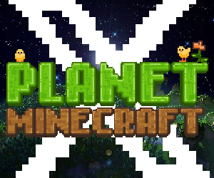
So basically I am working on a new prison server that I plan to release in a few days and was wondering if any of you could give an opinion on my logo? I just finished it the other day and wasn't too sure what was best to add to the typography layer.
I dont plan to adjust anything regarding the swords/colour/texture but was mainly looking for opinions on the logo as a whole right now and what you might want to see changed?
Is it appealing?
Literally any feedback would be great on this as I do wish to take graphic design at Uni in September so it would be good to get some constructive criticism
Thanks in advance! Go Wild with opinions and suggestions!
Kylesteruk
Update #1:
Update #2:
Can you guys please comment now on whether or not you prefer colour 1, 2 or 3? Thank you
Thanks
Original Post:
Click to reveal
Hi guys!
So basically I am working on a new prison server that I plan to release in a few days and was wondering if any of you could give an opinion on my logo? I just finished it the other day and wasn't too sure what was best to add to the typography layer.
I dont plan to adjust anything regarding the swords/colour/texture but was mainly looking for opinions on the logo as a whole right now and what you might want to see changed?
Is it appealing?
Literally any feedback would be great on this as I do wish to take graphic design at Uni in September so it would be good to get some constructive criticism
Thanks in advance! Go Wild with opinions and suggestions!
Kylesteruk
Update #1:
Click to reveal
Introducing some of the suggested comments - experimenting with gradient.

Update #2:
Can you guys please comment now on whether or not you prefer colour 1, 2 or 3? Thank you
Create an account or sign in to comment.
63
1

Looks pretty basic, but still nice!
1

I don't know what your idea of "basic" is but that certainly isn't basic. Most logos nowadays are either purposely oversimplified or extremely basic (a circle with a letter or two in the middle)
Look at the windows logo for example, it's just 4 coloured squares now, not even any design.
Look at the windows logo for example, it's just 4 coloured squares now, not even any design.
1
Everyone is entitled to their opinions I guess haha
1
|| Update ||
Live logo in place! Review them at the two links below
Forums with logo: http://lockdownmc.enjin.com/
Buycraft with logo: http://prison-lockdownmc.buycraft.net/
How well does it work with the background? any suggestions on a custom background?
Looking for ideas to maximize ethos of design
Live logo in place! Review them at the two links below
Forums with logo: http://lockdownmc.enjin.com/
Buycraft with logo: http://prison-lockdownmc.buycraft.net/
How well does it work with the background? any suggestions on a custom background?
Looking for ideas to maximize ethos of design
1
2 and 3 are my favorite colors, its looks really nice and i like it the only thing i would suggest it make it a little more prisony you already have a ball and chain maybe hang a handcuff from letter L or D ect something just to make it prisony
1
I like this idea dude of the linking of L and D http://lockdownmc.enjin.com and here: prison-lockdownmc.buycraft.net/
We launched it as a server as well now! Check my account for the IP if u wanna check it out!
We launched it as a server as well now! Check my account for the IP if u wanna check it out!
1
|| Update ||
1
If you guys would like to see the server logo in place I have recently added it to the buycraft store and have to say, thanks to all of your suggestions it looks great!
Thank you all so much for the support with voting, I am glad you all liked it!
taking further suggestions now for a potential banner?
Buycraft Link: http://prison-lockdownmc.buycraft.net/
Thank you all so much for the support with voting, I am glad you all liked it!
taking further suggestions now for a potential banner?
Buycraft Link: http://prison-lockdownmc.buycraft.net/
1

what Ives said but have a dark prison bar texture maybe? and i reckon have a deeper inside shadow on the letters
1

What's the difference ( sarcasm )
1
For square things you should add a background, white looks bad with the logo, so try to do something like light/dark gray and maybe have some swirly texture pattern in there.
1
Thank you for the suggestions, without you I would still be at faze 1 (Original Posted logo... terrible now that I look back on it!!! )
Feel free to continue posting suggestions because if anything new pops up I am always willing to test it out and continue the voting process!
Feel free to continue posting suggestions because if anything new pops up I am always willing to test it out and continue the voting process!
1

Here I am again,
Logo 2, without doubt.
The first one has a gradient that is too pink'ish, and therefore not within my likings. The thirds one has a blue gradient, which I dislike because the logo itself (swords) are blue for the biggest part already. However, the second logo is perfect. The dark-purple gradient just makes the logo look on point. Also, the handles of the swords have the purple color, which makes them match with the text perfectly.
Overall the second logo is just balanced-out best. Good job on the improvements man.
1
Thanks dude much appriciated! It appears that majority are interested in the second option so I will be using this for my prison server logo in the next few days!
1

superlegos113Hey I was wondering if I could be a staff member!!??!
this is absolutely pathetic.
1
Ivessuperlegos113
Unique Skillsets : ( What can are you good at ? )
Pretty sure he's not hiring, but if he was, you might wanna rethink that whole application..
Looks like a cheap attempt to advertise his server if you ask me (Check how he mentions the name of the server also in his 'application' )
1
superlegos113
Unique Skillsets : ( What can are you good at ? )
Pretty sure he's not hiring, but if he was, you might wanna rethink that whole application..
1

Hey I was wondering if I could be a staff member!!??! also i think number 1 looks best!
IGN : Superlegos113
AGE: 11
Skype: ( << its glitched but its Superlegos113_yt) Discord: Superlegos113
How active are you : pretty active!
Unique Skillsets : ( What can are you good at ? )
Experience : im a mod in iron minecart (its going live in a few day in a few days too!)
IGN : Superlegos113
AGE: 11
Skype: ( << its glitched but its Superlegos113_yt) Discord: Superlegos113
How active are you : pretty active!
Unique Skillsets : ( What can are you good at ? )
Experience : im a mod in iron minecart (its going live in a few day in a few days too!)
1
I will be recruiting staff members but there will be age restrictions due to maturity levels, ensuring that it is run professionally allowing all players to be safe from any potential threats to which they are not responsible for.
Thanks you for suggesting no.1 though! I have started a tally between 1 and 2 haha
Thanks you for suggesting no.1 though! I have started a tally between 1 and 2 haha
1

[deleted]
1
2
1
Adjusted the forum thread slightly.
Could you now all just comment on which one your prefer out of 1, 2 or 3? Any other suggestions are also appreciated at this point before it is a final design!
Could you now all just comment on which one your prefer out of 1, 2 or 3? Any other suggestions are also appreciated at this point before it is a final design!
1

Definitely 2 It has a bit of purple but still a dark shading
1
Yeah I agree, I think 2 is the most appropriate design out of the 3
Do you think the level of embossing is enough?
How about the texturing on the lettering now? any further suggestions?
Do you think the level of embossing is enough?
How about the texturing on the lettering now? any further suggestions?
1
I like 1 or 2, they stand out more, number 3 fits in too much. It may look good, but you need something that'll stick into people's minds and bright or popping colours do that easily
1
It is difficult :/ I do think number 2 is best but then again number 1 does stand out a lot more but it actually works and compliments the darker hues in the background on the swords :/ I'll sleep on it and get back to you all in the morning with another potential colour/texture arrangement!
Feel free to continue commenting on the three different options though! It's you guys I am obviously trying to show off the server to so whatever you thinks best goes
Feel free to continue commenting on the three different options though! It's you guys I am obviously trying to show off the server to so whatever you thinks best goes
1

I like number 3 the best, Great job.
1
Cheers dude, was debating between 2 and 3 myself
1
Could everyone please just comment 1 2 or 3 depending upon which colour gradient you like best!
Any other suggestions are still welcome! Be quick though as I do plan to release this as an actual server soon
Any other suggestions are still welcome! Be quick though as I do plan to release this as an actual server soon
1
Obsidian or ice, the stone/metal would look too similar to the background swords
1
Blue/Purple gradient with emboss looks good, but it still feels a little plain. Maybe add some very subtle texturing (NOTHING THAT DEFAULTS WITH PHOTOSHOP - make your own) or draw the letters to be metal
Or having the letters completely redone as ice blocks would look cool with the theme and would be pretty awesome xD
Or having the letters completely redone as ice blocks would look cool with the theme and would be pretty awesome xD
1
I like the idea of ice blocks as I feel it will suit the sword texturing/colours well.
However, the name 'LockDown' seems quite harsh so I feel a more concrete block texture might be more suitable?
Thoughts on potentially stone, iron, obsidian, ice (I could give it a go)?
However, the name 'LockDown' seems quite harsh so I feel a more concrete block texture might be more suitable?
Thoughts on potentially stone, iron, obsidian, ice (I could give it a go)?
1

This looks great
you should Just leave it as it now
you should Just leave it as it now
1
Which one? Original? Blue/Purple gradient? OR Blue/Purple gradient with emboss?
1
Bump.
Any further opinions on the logo and its current development stages would be much appreciated! Please also vote on the poll so I can get a generalized overview on opinions
Any further opinions on the logo and its current development stages would be much appreciated! Please also vote on the poll so I can get a generalized overview on opinions
1
[deleted]
1
[deleted]
1
100% Photoshop CS6
1
[deleted]
1
Played around with the bevel and emboss as well as adding a subtle stroke so it matches the line drawings

1
[deleted]
1
Cheers for the help dude haha well suggested
1
Well suggested dude it actually looks really good with blue purple gradient!
1
[deleted]
1
I like the upwards gradient better, that anime I used to watch with the ball and chain is MÄR
1
I agree, it suits it well because of the low opacity flames that also act as a gradient
I do plan on adjusting colours though as the bright purple is a bit too distracting!
I do plan on adjusting colours though as the bright purple is a bit too distracting!
1
Update
I have taken up on some of the comments and altered the colour and gradient on typography.
Take note I am still taking further suggestions on colour and more textures - just looking for what you guys think on this style and if to use it in the final design ( the gradient aspect that is, colour alterations are also welcome )
Downwards Gradient:

Upwards Gradient:

1

Looks very professional! The detail and colours are appealing and kind on the eye.
1
I agree with woundedwolf, needs a pick/shovel not swords and maybe have cell bars in the text or somewhere else, it honestly doesn't remind me of a prison, I wouldn't know this is a prison server and I probably would have no idea what LD stands for... maybe have the iron bars over the LD? I mean the ball and chain works but with the swords it just looks like another weapon, like from an old anime I used to watch.
Hope that didn't come off as harsh, it's just my opinion
Hope that didn't come off as harsh, it's just my opinion
1
Yeah dude thats a valid point to be honest. The pickaxe and shovel would have probably been more symbolic of prison but the issue I had was when I did this the logo didn't really capture that symmetry and looked quite odd
Regarding the 'LD' the name of the server is LockDownMC (Hopefully you see where I was going with this now - LDMC )
What anime?
Regarding the 'LD' the name of the server is LockDownMC (Hopefully you see where I was going with this now - LDMC )
What anime?
view more replies ( 8 )