Rating: 6/10
What You hate / Dislike:
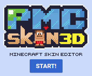
Color palette & font-size variations
What would look cool on it:
A nicer color scheme, more uniformity.
Comments:
You've put forth a good effort, and I applaud that, it's great to see someone take the initiative to learn the creative process, and I can't wait to see what else you can come up with, but you've made some of the usual newbie mistakes (it's okay, everyone does it when starting out! ) Here's the problems, and possible solutions:
The color scheme isn't good, those colors aren't complementary, and clash horridly. Take a look at a color wheel (Google is your friend) and choose some colors that compliment each other. (Best to Google some articles about this too. Color theory is difficult, but it's a MUST if you want your art to be taken seriously.)
Next up, the font. You have 5 words total on the artwork. Out of 5 words, 2 have different font styles, and all 5 are comprised of different font sizes, which make the piece look very busy, and amateurish. The main text needs to be more uniform, and less varied in size, and a nice layer style on the words couldn't hurt, they're rather flat. (Try a nice linear gradient, with some sort of texture, or use Google for some inspiration!)
The background gradient is too harsh, and the weird jagged line in the middle is very out of place, and confusing. (A gradient shouldn't go from solid black to full color in such a short distance, try making the gradient larger, and possibly using a radial gradient instead of a linear one.)
Now, I'm not claiming to be any sort of design expert, but I am self-taught with 9 years of experience, so I know a thing or two. With that said, take my words with a grain of salt, and know I write these critiques not to de-motivate, or hurt you, but to inspire you, I just want to see you get better. You have potential, and I want to see your skills and your art improve.
All the best, and keep on learning,
-Xer0


