- check_circle GUI
- 4,594 views, 7 today
- 388 downloads, 1 today
45
Preview images of what had changed
Samples provided, as additional images because it's really, really hard to convey even with a complete understanding of font terminology what improvements are actually made and it's too much to fit here ideally without cluttering this page. GitHub page soon to receive a revamp. Not everything is included.Name change
So some important information about the future of this project: I had submitted my initial fixes of the small letter glyphs to Compliance team, which means hopefully these changes trickle down to Vanilla Tweaks in future. I'll be in touch with VT to see if they'll update their Smoother Font package.This doesn't mean I'm done. I want to make sure there isn't an x64 font from Compliance first*, if there is, implement my changes there and further improvements are to come for this project over time. Compliance are the guys that made this font pack after all, not Vanilla Tweaks — VT is solely a distributor. This is a good project to procrastinate on as I contemplate what to do with my other stuff anyway, so expect better from me and my future works.
There is, but x64 only has ASCII and SGA.
While Compliance did make this work, the various changes I've been making to it is further deviating from the original content, so maybe I should call this the Non-Compliance Font. Jokes aside, there will be more where this came from.
Intent
Resolves some issues with the Smoother Font texture pack from Vanilla Tweaks. Specifically:- Reintroduces into nonlatin-european glyphs for small cap letters — Test: ᴀʙᴄᴅᴇꜰɢʜɪᴊᴋʟᴍɴᴏᴘꞯʀꜱᴛᴜᴠᴡxʏᴢ
Side note: Wikipedia has a compendium for most of these Latin letters available here.
Side note 2: Small capital Q doesn't render in almost any font, but Minecraft can use it.
Side note 3: Soon-to-be-resolved in Compliance. - Edits small cap glyphs so ʏ has a slightly taller split, ᴀ has a couple more pixels rounding the inside
- Q and ꞯ have a bigger tail going inside of the glyph, which improves readability
- ᴍ and ᴡ have slightly taller middle stems
- All changes to small cap letters in nonlatin-european also apply to circle letters in accented
- Made ⓪ more closely resemble Ⓞ so the circle-enclosed zero looks exactly like a target
Side note: If glyphs do not render due to lacking browser font support, see the "Archery enthusiasts" image. - It 100% doesn't suck
Changelog
Update e2401- Fixed all of the A's. Every single one of them Resolved in e2440
- Updated pack.png to also include improved ᴀ
- Copyright, registered trademark and whatever that circle-e symbol is have consistent face width Revised: e2440
- Small 6 and small 9 have an extra pixel at the tail wherever I saw it to match the one instance I saw of this
- Alternative nonlatin-european glyphs for "Black" dice and number dice are available in GitHub (visit altAssets)
- Added fix for Ꝺ
- More dice selections in GitHub — Rounded normal and number selections (-round suffix)
Side note: most numbers are clipped to better fit within the "Round" shape. - Option for replacing ascii with a variant which includes a slanted # symbol (-slantHash suffix)
- Actually modified all of the A's this time — Æ and the like only has the left side of the glyph modified Revised AGAIN: e2450
- Further modified copyright and registered trademark, slight addition to information symbol.
- Found some Q-alike character that was one pixel shorter in nonlatin-european, didn't extend the tail to the inside because I wasn't quite sure what it was.
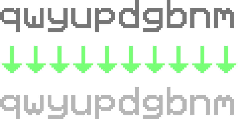
- q and p, b and d, u and n (normal latin, not CJK-made serif latin) have improved serifs, m and w lose their tails in favour of being more curvy and reflections of each other. g and y have a little more detail. Not all foreign characters edited due to uncertainty of intended appearance. I need your help please provide assistance with this!
- Fancy pound symbol! Britian rejoice!
- For the love of God there are way too many things with A the world uses.
- Where have I been? Don't ask I modified the non-existent symbol so the question mark is one pixel shorter
- What have I been doing? Don't bother I modified all question marks to have straight tails, as originally intended by Compliance.
- Why do I bother? Don't care I made interrobangs (‽, ⸘) appear more distinct, while sticking with Compliance's theme.
- How hadn't you bothered to update anything until now? Why do you care, I added another pixel to double question (⁇) Revised: e310
- When are you going to update again? Who knows I just released this to be 1:1 with other changes by Compliance.
- Oh, also added other slight changes to filled-in flag and added alternate accented bitmaps in altAssets for different style ballot boxes.
- Modified the number 4. See images. Revised: e312
- Modified ④ and ⑭ to match.
- Modified ⅘ to match, 1-numerator fractions are consistent with ⅒ Revised: e341
- Modified ⁇ to similar effect. See images.
- Okay you got me I stretched the truth a little bit.
- In my haste I had forgotten to fix ߈.
- Act first, forgive later: I've decided without user intervention to make 4 and 7 appear curved
- ASCII 6 and 9 are modified to be consistent with small numbers.
- Small number 2 in all sheets have a right-angle tail at the end, just like ASCII.
- Small numbers are consistent across multiple sheets now.
- Variations use consistent appearance for 4 and 2.
- I noticed the V symbol was less distinguish with my changes, reverting that…
- … as well a whole heap of changes in ascii.png which I neglected to undo before committal.
- Shaved off a couple of pixels for % and ; Revised: e400
- Forgot some pixels for the fractions in some NLE sheets, resolved.
- Adjusted spacing and realigned the colons (;, ;), Centred tilde (~).
- Modified all fractions to appear exactly like the percent family
- Made %, ‰ (per-mille) and ‱ (per-myriad) use the same zero throughout
- Modified & (Ampersand / And per-se) to use the more primitive "et" variant.
- Slightly modified $ (Dollar) to be different from s.
- Modified ©, ® and whatever that circle-enclosed small e (can't reproduce) to be filled, using glyphs similar to circle-enclosed variants.
- Modified all numerals (except for 1, 2 and 5).and things in other bitmaps related to them.
- Modified R and K so they appear similar to X. See images.
- Modified small R's to use a straight tail rather than a curved one.
- Resolved an oopsie on Github where I made the number dice NLE alt use default dice.
- Fixed the upside-down V's so that's basically Vendetta part 2.
- V part 3 — more V's fixed
- Missed a glyph in the R family, fixed that.
- Modified symbols in the S family — Please comment if these changes are incorrect!
- Fixed some logical reasoning errors where I erased bits of NLE by accident
- Modified B — this also required I shortened the stroke in Ƀ (Latin capital stroked B)
- There were several characters with the letter R (or variants thereof) I had edited in NLE and accented
- I also did some other characters too? Look, I forgot okay?
Check my GitHub and compare against for me, I also don't have time as I am writing this!
- 1-bit indexed all images, also like I should had done ages ago
Why does this matter?
If not wanting to visit my GitHub, at least read this. (Scroll to section Extended.)How to install
If you already have Smoother Fonts from Vanilla Tweaks, drop in your pack and disable GUI > Smoother Font. Redownload and replace your current instance. Else, just place this pack above Vanilla Tweaks if not removing Smoother Font.Afterward, just place in your game directory's resource packs, enable it and enjoy slightly better text.
Make it better!
Visit the alternate download link and see what else you think needs fixing. If I like your changes, improvements will be made! Since we're dealing with just images, it might help to inverse select around your work and invert the colour of surrounding glyphs you had not modified so what you changed is abundantly evident.| Credit | Compliance team, Vanilla Tweaks |
| Progress | 100% complete |
| Game Version | Minecraft 1.18 |
| Resolution | 32x |
| Tags |
11 Update Logs
Update #11 : by Hebgbs 02/12/2022 2:59:57 pmFeb 12th, 2022
Information added in submission body text.
Added new preview image.
Added new preview image.
LOAD MORE LOGS
4929615
4


![Hebgbs' 3D emissive ores remix [e801] Minecraft Texture Pack](https://static.planetminecraft.com/files/image/minecraft/texture-pack/2022/602/15452520-pack_s.jpg)
![Immersive Subtitles (1.18.1 En, 1.16.5 Es, De, Fr) [e510] Minecraft Texture Pack](https://static.planetminecraft.com/files/image/minecraft/texture-pack/2020/171/13685744-imsubs_s.jpg)


Create an account or sign in to comment.
Many numerals are different, though 4 was already modified so that was left alone. Polished off the fractional symbols and finished with that — once and for all I am never touching those again. Per-mille and per-myriad use conjoined zeroes at the denominator, which ironically made per-mille one pixel shorter in width, and as an added side-effect distinguished it from the Arabic percent sign which just uses dots.
These changes came from many days of mulling about it and researching through other iterations. No massive changes had been made to the letters overall because while an extra pixel worth of adjustment would had made ASCII look better, it would had put me in a pickle with int'l characters.
Last update for today, promise. Also, please remark if you like the changes to 4 and 7. I'm not kidding, I need to know this. Preview images for each glyph change is available for evaluation and comment.
Going forward, the changes I've committed to the number 4 are going to persist unless you don't want it to.
The reason why this modification had been made is because 1) I always hated how the 4 looked. But also 2) the four-fifths fraction looked extra weird.
However, if the mob hates this most recent changes (update e310) then I will revert should enough people express their chagrin.
I was also thinking about making the number 7 have a curved tail instead of an acute-angle one (as some fonts would show), and making the number four match in-kind with the left tine. Should I do this?
Since a font sheet double the size also means double the pixels to play with, a little bit of pixel-pushing would benefit Minecraft's font immensely but I do not want to over-homogenize and disrespect people who write with non-Latin characters by appropriating into them Latin letter characteristics.
Also, if you want alternate dice glyphs there are a couple in the GitHub repo, under directory altAssets you can check out.