


- 3,595 views, 2 today

1,274
Foreword
I've been wanting to write something for a while. For nearly a year, in fact. This article has existed in some form since September of last year. Since then, 'Colour depth' as a topic became a 500-word section of a larger article I was writing on skinning palettes. I saw fit to further develop the concept independently - in its current form, the body of this article now comes close to 2500 words!
Is this a tutorial? Not strictly! This is moreso an exploration of one particular idea in skinning - colour depth and its importance. I wrote most of this with intermediate-veteran insights for the benefit of growing skinners. If you're an absolute beginner or otherwise interested in tutorials, CTRL + F for 4.1 See also.
Where some (not all!) skinning tutorials are content with giving you what (to do), I'd like for my skinning articles to justify why (you do the things you do). The main takeaway is that by better understanding your practice, you're better equipped to make skinning decisions on your own, independent of tutorials.
As a side note: members of DD's mentoring Discord may have seen an earlier version of this write-up. Hope they enjoy both versions : D
Disclaimer: I am neither a physics student nor an art student, nor a cosmetology student - I'm a humble IT student : )
A Brief Introduction
In the HSV colour model, there exists 3 properties that determine colour:
- Hue
- Saturation
- Value (aka brightness)

Too often do I see skinners restricting themselves to only adjusting value in their colour ramps. They neither hue shift nor adjust saturation in any worthwhile manner. In doing so, the colours they produce are often not only bland, but also fail to effectively represent depth. For both reasons, we can consider these colurs 'flat'.
Would you rather make those colours pop? Do you yearn to hook some unprecedented levels of dynamicism into your skinning veins? Look no further, friends, than colour depth.
1 Colour Depth - Advancing and Receding Colours
We'll loosely define 'colour depth' as how colours advance or recede relative to other colours. Bear with me, I'll gradually explain how colours 'move'. For now, think of colour depth as an empty box in you head which we'll slowly fill with ideas.
By exploiting colour depth in your skinning (or artistic creations in general), you can create the 'illusion of depth'. For our purposes, the illusion of depth refers to the mental impression of space in places where there are none.
This article will cover four ways in which colour depth is achieved, and we'll later discuss their implications for artistry and skinning.
For a bit of clarity, while 'hue' and 'colour' are used interchangeably in other contexts, we'll think of hue as one of three properties dictating colour (i.e. H + S + V = colour).
1.1 'Colour Temperature' (aka Hue Temperature)

Hope you're familiar with colour wheels! If not, imagine a rainbow connected end-to-end. While saturation and value can be measured linearly (minimum - maximum), we can express hue according to its position in the wheel.
In simple terms, 'colour temperature' (henceforth 'hue temperature') refers to which half of the colour wheel a colour can be found on.
- Colours that are redder in hue are thought of as 'warm' (think of fire)
- Colours that are bluer in hue are thought of as 'cool' (think of ice).
Now think of cool/warm in terms of depth:
Cool colours recede. Distant mountains and the sky seem bluer in colour due to ‘Rayleigh scattering’, wherein atmospheric molecules intercept light from the sun. As colours are made visible from light, by scattering light we get less colour. Basically, distant objects are bluer in hue - hence cool colours recede.
Warm colours advance. Seeing as distant objects are bluer in hue, nearby objects must be less blue as they are less subject to Rayleigh scattering. In sum, closer objects are less blue - warm colours advance.
There's some other mental associations to be made, but I think we've gotten the point already. As the adage goes, warmth advances, cool recedes; thus we may use colour temperature to create the impression of depth.
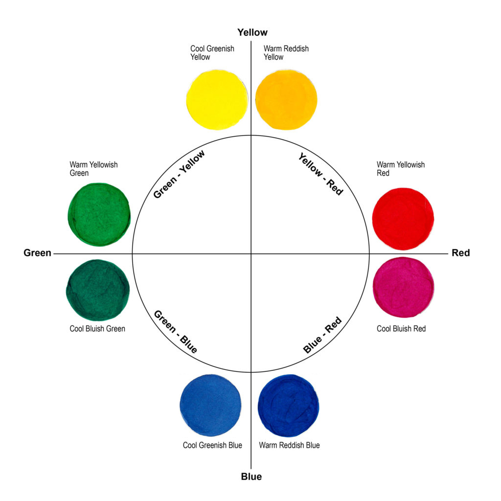
1.2 Hue Bias
There's a little more nuance to hue! Relative to other colours in the same temperature group, a colour may appear warmer or cooler (i.e. biased) in hue depending on its position on the colour wheel. Take the following example.
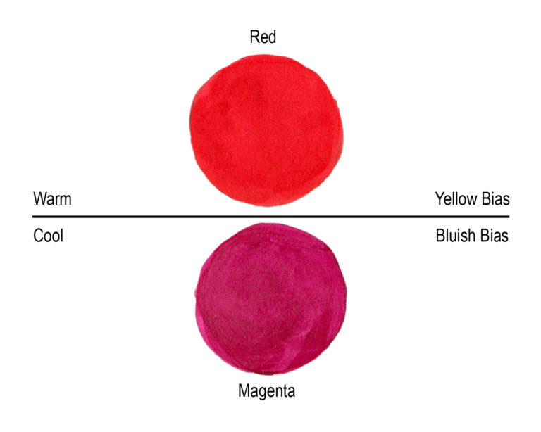
In this case of hue bias, we have both a cool and a warm version of an originally warm colour: red. If we think of this in terms of depth, relative to the above red-red, the magenta recedes.
So to completely distance ourselves from the temperature idea:
- Blue or green-biased colours of any hue recede
- Red or yellow-biased colours of any hue advance
1.3 Saturation
A third means by which colours can advance or recede - saturation

Saturation relates to fullness of colour, thus a fuller colour may be considered to be more vibrant; we know that vibrant things are advancing. By contraposition, duller colours must be receding.
Some sources try to attribute warmth and coolness to saturation - I'd rather distance ourselves from warm/cool terms. It tends to take a few extra steps to reconcile the 'greyness of a colour' with the idea of hot and cold. On the other hand, it’s easier to say that lower saturated colours appear to ‘fade into the distance’, especially when compared to higher saturation colours which we can think of as being 'in your face'.
Let's say:
- Lowly saturated colours of any hue recede
- Highly saturated colours of any hue advance
1.4 Value/Brightness
Fourthly, colours can appear to advance or recede according to value (aka the brightness of a colour).

To illustrate depth through value, consider Helmholtz' irradiation illusion. Focus on the size of the inner squares. The inner squares are technically the same size, but the white square appears larger than its black counterpart on the left. The alleged neurological explanation is our visual systems will exaggerate the size of lighter objects to take in greater detail, thus making darker objects smaller by comparison. It's for that reason that darker colours, black particularly, are thought of as 'slimming' (ooh la la).
This aligns with the illusion of depth we're trying to achieve, as we often use lighter colours on objects that protrude and darker colours on objects that recede.
TL;DR:
- Lower value colours of any hue recede
- Higher value colours of any hue advance
1.5 Summary - The Depth Illusion
There are four ways in which a colour may either advance or recede:
- Hue Temperature
- Hue Bias
- Saturation
- Value
Colours can vary in any combination of these four properties. Colour depths can also be relative to one another.
Let's tie all these ideas together - colour depth is essential to the illusion of depth in skinning. Recall that when we make skins, we're effectively drawing on flat surfaces. We use brighter or darker colours to denote the shape and form of an object we're skinning. These colours are often arranged into a gradient - a ramp. A group of ramps forms our palettes.
Flat colours are the result of miniscule changes between neighbouring colours in a ramp. Typically, this comes as the a result of only altering value/brightness and neglecting variances in saturation or hue. Hence, restricting ourselves to only one depth property will also restrict our ability to represent depth. Compare the impression of depth afforded in the two ramps below.

A Tale of Two Ramps
This is why accomplished skinners and their tutorials advocate for hue-shifting and saturation variance - these two techniques exploit colour depth to help create the illusion of depth. The contrast between neighbouring colours contributes to the impression of depth.
Hue-shifting is the driving property in colour depth. Ever notice how hue-shifted shadows got closer to blue/purple and your hue-shifted highlights got closer to red/yellow?
Consider the following hastily-drawn example depicting our friend Blank Bob. Bob has a belt that casts a shadow upon his waist. Clearly the belt is close to us or the light source than his waist. It then makes sense for the shadows to be bluer in hue, as blue-ness is associated with distance. Hence, while the belt is normally coloured with the B colour, we use a bluer C colour to depict depth.

Blank Bob and his Belt
Saturation plays a smaller role in depth - we tend to have a lot more flexibility in altering saturation across a ramp. For instance, the conventional saturation pattern is 'lightest colours = least saturated', 'darkest colours = most saturated'. Despite high saturation normally suggesting closeness, we use it anyway for our darkest and thus farthest colours. This only works in conjunction with hue-shifting and changes in value, which more than compensate for our saturation shenanigans.
Thus when it comes to ramps, saturation provides just enough of a visual distinction to keep your colours interesting*. It's not necessarily core to the suggestion of depth, but your ramps might look strange without saturation variety.
In sum, changes in value alone will produce bland, flat colours. Hence when we use hue-shifting and saturation variance to exploit colour depth, we are better capable of achieving the illusion of depth.
* I see the term 'visually interesting' thrown around a lot - Ive come under the impression that it's buzz term that people throw around meaninglessly just to sound cool lol. For our purposes, I think of it as a suggestion that some element of an artwork isn't bland - i.e. if something isn't bland, by default it must be interesting in some way. Bland in this instance might be flat colours.
2 Colour Depth - Implications
So what can we do with colour depth?
- We can achieve contrast by using colours of different depths.
- We can achieve unity by using colours of similar depths.
2.1 Contrast
The depth of a single colour is often amplified by adjacent colours of a different depth e.g.in terms of hue, green stands out more against red than against blue. We can call this 'contrast'.
Often contrast is used for eye-catching effect - as above, the receding colour will push the advancing colour outward. The difference becomes more apparent, and thusly attention-grabbing.
 Mad Max: Fury Road (2015) www.hollywoodreporter.com/behind-screen/2016-oscars-mad-max-fury-871212 |  Dragon Ball Z (1989-96) dragonball.fandom.com/wiki/Goku |
The contrast of orange and blue can be used to delineate between foregrounds and backgrounds in filmmaking. In George Miller’s Mad Max: Fury Road (pictured on the left), action scenes take place amidst vast, orange, desert landscapes. When placed against a blue sky, the action scenes really ‘reach out’ and demand you WITNESS them.
Delineation isn't nearly as necessary in character design, but we still welcome contrast for its eye-catching appeal. Goku (pictured on the right) characteristically dons bold oranges and blues. The orange gets pushed outward while the blue remains distant - the contrast of which is attention-grabbing and iconic.
In sum, holding the audience’s attention is utterly crucial when it comes to storytelling or selling Dragon Ball merch.
2.2 Unity
In truth, you can’t go applying contrast willy-nilly. If you imagine a character, object or ‘thing’ as being atomic (i.e. indivisible, ‘one’), then the wrong type of contrast breaks the singular nature of your thing. You might call this unnaturality a ‘clash’. We don’t like clashes - they’re hard on the eyes. Instead we want harmony (absence of clashes).
Might sound odd coming from me, but here's some cosmetology videos to illustrate the importance of colour unity in hairdying and fashion: Brad Mondo Vid | Brittany Gray Vid. TL;DW: we should match our hair and clothing choices to the warm or cool undertones of our flesh.
To avoid clashes, you want unity i.e. matching advancing colours with other advancing colours, and vice versa for receding colours. This doesn't mean we avoid contrast, however.
That's because unity and contrast aren’t mutually exclusive - there is still a way to use opposing hues, as seen in Goku (above) or the following characters (namely the first and third rows), while minimising a clash.
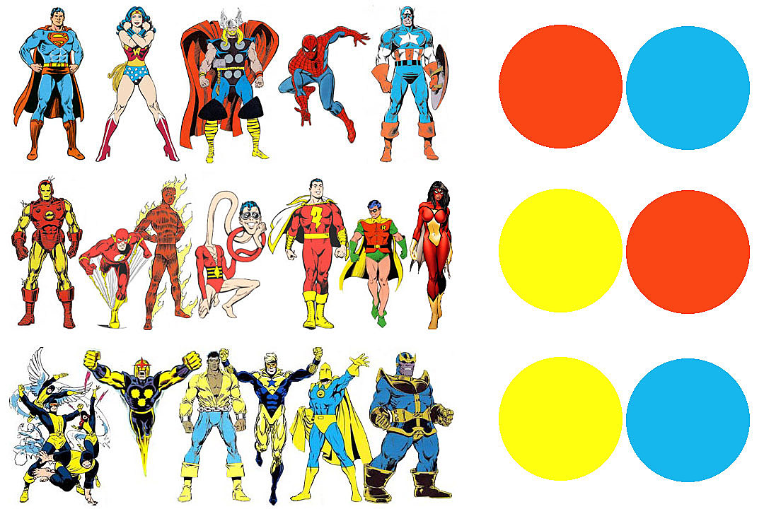
Even though these characters sport contrasting hues, they unify either through hue bias or saturation (Goku's orange and blue are both bold). In essence, we might mitigate a clash by using unity in the other three depth properties.
Unity and contrast are both possible and desirable - an object can both be fairly eye-catching whilst still easy on the eyes.
Of course, unity can be used for far more than just mitigating colour clashes. Often it''s used to portray a singular mood or idea.

Take this lovely frame from The Revenant. There's contrast in value of course, but hue unity is our main concern here. The overwhelming use of cooly-hued colours in this still aptly convey the sensation of cold that you might expect of its frigid setting. There's no contrast to suggest action nor variety - the tundra is exclusively and singularly cold and lifeless.
3 Colour Depth, Contrast and Unity - Implications for Skinning
As before, most accomplished skinners already exploit colour depth, whether consciously or unknowingly. They already hue-shift and vary saturation in their palettes, thus achieving depth.
Contrast and unity are inherent within effective colour ramps themselves. There will exist sufficient contrast to create depth, but also enough unity to mitigate any clashes in colour. I'm not 100% sure of it, but I suspect that experienced skinners tend to instinctively choose base colours within a certain saturation range. My skins, for instance, tend to feature lowly saturated base colours - this consistency in saturation gives me enough unity to avoid any harsh clashes.
There are of course more overt and interesting ways with which to exhibit unity and contrast.
 Auri's Mad Titan Value contrast (B&W skins are the exception to colour depth - there is only one useable depth property) |  Nighthearted's Nott Hue unity, value contrast |
 Auri's Worm-man-o Saturation and hue unity |  Elma's Rooster Hue and hue bias unity (i.e., warm greens) |
 DragonsDungeon's Zombie Dragon Hue contrast |  DragonsDungeon's Mega Charizard X Hue unity |
 nahh's dusty Low saturation unity, value contrast, hue unity | |
 Auri's Le Croak Monsieur Hue contrast (split complementary colour scheme) |


In conclusion, colour depth plays an absolutely vital role in effectively representing depth in our MC skins. Colour depth can be determined by at least four properties- hue temperature, hue bias, saturation and value. In skinning, colour depth can be achieved by hue-shifting and by varying saturation throughout a ramp. Furthermore, by mixing depths, we achieve contrast; by matching depths, we achieve unity. Contrast and unity can be used both within our colour ramps and in terms of the overall composition of a skin.
If you don't already hue-shift or vary saturation in your ramps, I encourage you to give it a try!
4 Further Reading
Welcome to the end! Here's a few blogs on colour in skinning, as well as some other sites on colour theory in general.
4.1 See Also
(Some tutorials & other informative articles on PMC which I referenced)
| DinowCookie | Dinow's tutorials part 3: Dictionary! |
| KnobleKnives | 1000+ Subscriber Special [Color Theory 101, Hue Shifting, Palettes, and STUFF!] |
| KnobleKnives | The Power of Colour Part 1 | Part 2 | Part 3 |
| the_soup | Tutorial: Palettes and Hue Shifting |
4.2 External Sources
(Great for further reading/watching)
| Brad Mondo | THE HAIR COLOR THAT WILL BEST SUIT YOU AND YOUR SKIN TONE! |
| Brittany Gray | THE BEST HAIR COLOR FOR YOU! |
| Curiosity | The Neurological Reason Why Black Clothes Are Slimming |
| Digital Synopsis | How Filmmakers Use Colors To Set The Mood Of A Film |
| Healthline | Skin Undertones Chart: Warm, Cool, Neutral, Pink, Yellow, and More |
| Just Paint | Defining Warm and Cool Colors: It’s All Relative |
| Pixel Joint - cure | The Pixel Art Tutorial |
| Pixel Joint - various users | COLOURING |
| Science of Colours | How Colors Advance and Recede in Art |
| Will Kemp Art School | The Hidden Secret of Colour Mixing |
| WriteDesignOnline | Color Rules of Thumb |
Last Modified: 2020/04/26 - reformatted links in 4.1, 4.2
| Credit | See section 4 |
| Tags |
1 Update Logs
Update #1 : by Auri 06/21/2019 8:10:09 amJun 21st, 2019
Minor grammatical/syntactical/semantic edits
tools/tracking
4328551
6
colour-depth


![1000+ Subscriber Special [Color Theory 101, Hue Shifting, Palettes, and STUFF!]](https://static.planetminecraft.com/files/resource_media/screenshot/1324/small/Untitled_5714630_thumb.jpg)


 Adrestio
 Dutcho
 CrownDeluxe
 ThunderBoomPika
 Khangbo84
 hotsuop

 The Gamers Club
 KongPlayz
 KaiOceansword
Create an account or sign in to comment.
I first came across that particular phenomena in japanese, where (as far as I remember) blue and green shared the same word
And I just now found a wikipedia page on [url=en.wikipedia.org/wiki/Blue–green_distinction_in_language]blue-green distinction[/url] - didn't know it so common in other languages :o
p.s. still compiling a list of other examples, I wanna edit them all in in one go
i'd recommend knoble's arc saturation method for realistic colours - ive used it a bunch myself