
 1sb2gamer
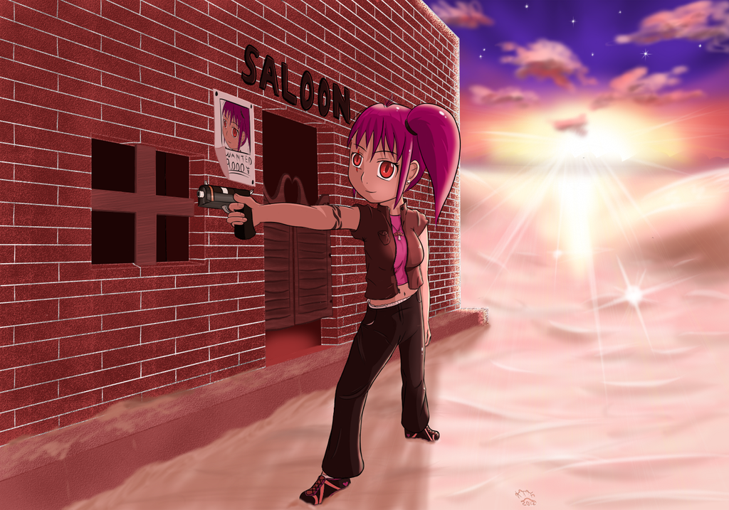
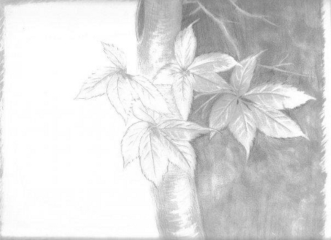
Drawing:
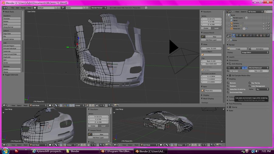
3D Modeling:

Graphic Design:


Rather then posting every picture I will link to my deviantART account and my portfolio which includes some graphic design for my youtube as well.
http://brook-brabbit3587.deviantart.com/
http://1sb2gamer.daportfolio.com/
3D Modeling:
Graphic Design:
Rather then posting every picture I will link to my deviantART account and my portfolio which includes some graphic design for my youtube as well.
http://brook-brabbit3587.deviantart.com/
http://1sb2gamer.daportfolio.com/
Create an account or sign in to comment.
5
1

This is nice art, although the first one looks odd. The character seems to be leaning to one side like a candle stuck diagonally into a cake, and the eyes don't look focused.
1

Your art is very very nice. Please pm me if you take requests (That cost $0)
1
Thanks, and sorry no I don't take requests as of right now. Well ... it actually depends I suppose more on what it is you want to request.
Haha .. yaaa ...I am pretty bad at anatomy. Also .. didn't notice the eyes till you mentioned it. Guess your right lol.
Jaxtrm_This is nice art, although the first one looks odd. The character seems to be leaning to one side like a candle stuck diagonally into a cake, and the eyes don't look focused.
Haha .. yaaa ...I am pretty bad at anatomy. Also .. didn't notice the eyes till you mentioned it. Guess your right lol.
1
Nom900The leaf one (second one) is nice, but it needs more variation in value. Make the darks darker, this creates a better contrast and really makes it stand out more.
Has more to do with the scan messing with darkness levels.
As a 3d moddler myself, I would prefer to see the finished render instead of the in-process screenshot before I say anything on it.
Fair enough
The fourth one is interesting, but I would like to see the text more. Try to make it more visible, maybe with a basic, light outer glow.
That has to do with image re-sizing ... Text is perfectly visible .. it's why I linked to my portfolio and deviantART page.
The Skyrim one is alright, but if "LP" is supposed to mean "Let's Play" or something like that, then you should just spell it out, as it isn't very noticeable as it is, and because of that, the image is heavily weighted at the bottom. Spelling "LP" out would help balance it. The bottom one is nice, but make the black text have a light outline or something, as it is hard to read on the background.
The LP thing a personal preference and I think the balance is fine. I wanted the Skyrim logo to be the focal point.
As for the last one, again re-sizeing is why. The full version text is perfectly visible.
Thanks for your advice though XD.
1

The leaf one (second one) is nice, but it needs more variation in value. Make the darks darker, this creates a better contrast and really makes it stand out more.
As a 3d moddler myself, I would prefer to see the finished render instead of the in-process screenshot before I say anything on it.
The fourth one is interesting, but I would like to see the text more. Try to make it more visible, maybe with a basic, light outer glow.
The Skyrim one is alright, but if "LP" is supposed to mean "Let's Play" or something like that, then you should just spell it out, as it isn't very noticeable as it is, and because of that, the image is heavily weighted at the bottom. Spelling "LP" out would help balance it. The bottom one is nice, but make the black text have a light outline or something, as it is hard to read on the background.