


44
Hello! Keep in mind that this blog may possibly be very long. So if you're into that, feel free to skip ahead or leave.
Now, I'm definitely not a skinner. I had never practiced enough with shading, as I plainly wasn't interested. But looking through a lot of skins, they seem to bug me quite a bit. I don't intend to be rude, it's just that they are so excellent at shading, and the skins are very beautiful, but the colors put me off. So here is a guide to Color Theory, and how to apply it onto your skins!

Ah, I love this chart. It's pretty self-explanatory, but if you didn't take an art class in school (for some reason,) or forgot, here are the basics.
There are three primary colors (resisting the urge to put 'colors' instead..): Red, blue, and yellow. These are the colors that you mix together to make secondary colors. Secondary colors can then be mixed to make tertiary colors, which are less talked about, for a good reason.
This chart, however, does not label complementary colors, which also should've been talked about in your art class.
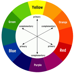
Complementary colors are frequently used in logos, designs, and other forms of media plainly because they go well together. If you mix complementary colors together, you will get an ugly brown. Also, notice how complementary colors are primary with secondary and tertiary with tertiary.
Let's talk about expressing mood with colors.
To do this, we're going to split the color wheel in half.

Another pretty self-explanatory chart.
Here we have WARM and COLD colors. If you take your hand and block one side of the wheel, you can see the difference in the color palette.
Temperature can greatly affect how your skins are portrayed. It can tell the setting of the skin, such as the time or place. When you look at the cold side of the wheel, you think nighttime or dusk. Maybe even winter. However, looking at the warm side of the wheel, you start to think of the morning where the sun shines bright, or in the middle of a hot summer. Maybe at the beach.
It can also affect the attitude of the skin. Let's imagine you are skinning a lovely lady who is bright, bubbly, and lots of fun to be around. You would use the warm side for the majority of the skin. It doesn't mean you only have to use one side of the wheel for a skin, but it should be mostly one side. But wait... Which color would define her personality? Red? No.. That doesn't seem like it at all. Which brings us to the next topic.
Color connotations.
When you look at color, you get a certain feeling or vibe from that color. It's usually from the things you see in your everyday life that give you this feeling. Imagine you're sitting in the sand, enjoying the wonderful view of an ocean... You notice it's a very dark and unsaturated looking blue. The ocean is very calm, (most of the time) and gives you a feeling of peacefulness and tranquility. An ocean is a pretty big thing for a lot of people, so when they look at a dark blue, possibly on dyed hair, they think the person who dyed their hair that color or wears the color in their clothing is very calm. (unless it's extremely bright, but we'll talk about that later.) Most people should understand this without having to think about it. However, they can easily forget to apply this to a piece of art or skin.

I also enjoy this chart. It talks about the positive connotations of each color. Colors also have an affect on your mood (refer to the chart above a little bit up) which is why in the interior of the house, walls are painted certain colors. If you're in a fancy house, sometimes the living room will have a deep red because red is energizing. Which is why it's absolutely absurd to paint your bedroom red, because you'll most likely be awake for hours due to your mind going "well obviously this guy doesn't need to sleep, the red is to keep him awake." Red is also a color of anger, so if you're surrounded by red, you're more likely to feel argumental, and easily irritable. You should also color your skins based on meanings, not just connotations and mood. Like for example, purple stands for royalty. (and gay.) Colors are truly fun, aren't they? But that's not all. We still have many more things to talk about.
Neighboring Colors
So what do I mean by this? Well, it's pretty simple. If you want to make a color palette for your skin, a good way to do it is to use neighboring colors. Basically just colors next to each other on the color wheel, regardless of whether it's in cold colors or warm colors. It can make for a nice color palette. It's personally not my favorite way to find colors for your skins, but it definitely works.
Hue, Saturation, and Value
Let's quickly address these terms.
Hue is quite literally color. That's it. Just a fancier name. So if you see some blogs about 'Hue Shifting,' don't be confused. Saturation, however, does not stand for color. It's quite different, and it's actually important to expressing mood in your skins as well!
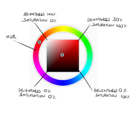
I feel quite lucky to have found this chart because it makes explaining things easier. This isn't a triangle color wheel, like in MCSkin3D, but the Paint Tool Sai color wheel, which is more easy to explain. It shouldn't be a problem that they are different wheels because you should always plan out your colors on another program before skinning. Otherwise it can become random. To quickly explain, value is brightness. So let's look at this chart. The outer ring of colors is so you can choose your hue. This is easy enough, you'll see this in MCSkin3D as well. The only true difference between the square and triangle color wheel is that you can pick out more specific colors around the edge where black is. On the top left corner, there is complete white. On the bottom edge of the square, there is complete black. The more the color you choose is to the right, the more saturated it will be. Saturation is slightly hard to explain, but it is how vibrant or dull your color is. The closer it is to monotone colors like gray, black, and white, the less saturated it is. On the color wheel here, brightness goes from the top edge right to the right edge down.
Hue, saturation, and brightness all determine the mood of your skin.
When people think of grayscale, they think boring, dull, and corrupted. It can also be creepy, depending on how you use it. The grayer it is, the more dull, down to earth, and boring it will be. Your skin could be of a character who was walking in the rain on a cloudy and gray evening. The colors will be unsaturated. Brightness, on the other hand, can connote age. Yep. When you get older, your tastes usually change. Many people wear colors based on how childish or mature they are. If you see someone with dark and not-so-bright colors, they appear to be more regal, fancy, and respectable. However, when you think of bright and light colors, you think of little kids. Like baby blue and baby pink, for example. It's suggested that when making a skin, all the colors should have the same level of brightness and saturation unless you want to make a certain color pop or be emphasized. Otherwise, it can appear to be clashing with each other. But how do I get it to be on the same level? The answer is simple my friend... Use:
Shades, Tone, and Tints
My favorite part. Remember when I said you should plan out your colors on another program before skinning? Well here's why. If you can't get your to be at the same level of brightness and saturation, it will look a little off. So let's talk about shades, tone, and tints. When doing this, put your choice of color/hue at 50% brightness, and 100% saturation. (See picture above for reference)
Shades are pretty self-explanatory when it comes to the title. This helps make your colors equally dark. When you do shades, you apply black at a low opacity, and the more you do it, the darker it becomes.
Tones, however, help make it less saturated. When you do tones, you apply gray at a low opacity, and the more you do it, the duller it becomes.
Tints will help make your colors brighter. Applying tints to your color will make it lighter.
Do you want your color to be unsaturated AND dark? No problemo. Just apply both shades and tones. Want it to be less saturated and bright? Also no problem, just apply tones and tints. However, shades and tints will cancel each other out unless you apply them at different opacities. Try doing this with all the hues you will be using at once, however, otherwise you may mix the shades, tone, and tints up and they will not be equal.
One thing to note is that it's perfectly fine to have different shades and tints (value) in different colors, but it should be too extreme, unless once again-- you are trying to emphasize a certain color.
And that's it!
It's finally over, phew. When I submit this, I'll be sure to check for mistakes with grammar, spelling, and sentence formations. If you see something I've missed, feel free to comment so. I don't mind. If there's something you'd like to point out, I don't mind either. This is a guide, and I want to make it as accurate and good as possible. Hope you enjoyed and possibly learned something? Maybe? I'm not sure. But thank you, friends, hope you had fun reading this regardless.
This is way too long.. Honestly.
Please note that the art on the blog cover is NOT mine, but is made by Triangle-cat on deviantART: triangle-cat.deviantart.com/art/Stand-in-Chapter-three-29-660696066
Now, I'm definitely not a skinner. I had never practiced enough with shading, as I plainly wasn't interested. But looking through a lot of skins, they seem to bug me quite a bit. I don't intend to be rude, it's just that they are so excellent at shading, and the skins are very beautiful, but the colors put me off. So here is a guide to Color Theory, and how to apply it onto your skins!
Ah, I love this chart. It's pretty self-explanatory, but if you didn't take an art class in school (for some reason,) or forgot, here are the basics.
There are three primary colors (resisting the urge to put 'colors' instead..): Red, blue, and yellow. These are the colors that you mix together to make secondary colors. Secondary colors can then be mixed to make tertiary colors, which are less talked about, for a good reason.
This chart, however, does not label complementary colors, which also should've been talked about in your art class.
Complementary colors are frequently used in logos, designs, and other forms of media plainly because they go well together. If you mix complementary colors together, you will get an ugly brown. Also, notice how complementary colors are primary with secondary and tertiary with tertiary.
Let's talk about expressing mood with colors.
To do this, we're going to split the color wheel in half.
Another pretty self-explanatory chart.
Here we have WARM and COLD colors. If you take your hand and block one side of the wheel, you can see the difference in the color palette.
Temperature can greatly affect how your skins are portrayed. It can tell the setting of the skin, such as the time or place. When you look at the cold side of the wheel, you think nighttime or dusk. Maybe even winter. However, looking at the warm side of the wheel, you start to think of the morning where the sun shines bright, or in the middle of a hot summer. Maybe at the beach.
It can also affect the attitude of the skin. Let's imagine you are skinning a lovely lady who is bright, bubbly, and lots of fun to be around. You would use the warm side for the majority of the skin. It doesn't mean you only have to use one side of the wheel for a skin, but it should be mostly one side. But wait... Which color would define her personality? Red? No.. That doesn't seem like it at all. Which brings us to the next topic.
Color connotations.
When you look at color, you get a certain feeling or vibe from that color. It's usually from the things you see in your everyday life that give you this feeling. Imagine you're sitting in the sand, enjoying the wonderful view of an ocean... You notice it's a very dark and unsaturated looking blue. The ocean is very calm, (most of the time) and gives you a feeling of peacefulness and tranquility. An ocean is a pretty big thing for a lot of people, so when they look at a dark blue, possibly on dyed hair, they think the person who dyed their hair that color or wears the color in their clothing is very calm. (unless it's extremely bright, but we'll talk about that later.) Most people should understand this without having to think about it. However, they can easily forget to apply this to a piece of art or skin.
I also enjoy this chart. It talks about the positive connotations of each color. Colors also have an affect on your mood (refer to the chart above a little bit up) which is why in the interior of the house, walls are painted certain colors. If you're in a fancy house, sometimes the living room will have a deep red because red is energizing. Which is why it's absolutely absurd to paint your bedroom red, because you'll most likely be awake for hours due to your mind going "well obviously this guy doesn't need to sleep, the red is to keep him awake." Red is also a color of anger, so if you're surrounded by red, you're more likely to feel argumental, and easily irritable. You should also color your skins based on meanings, not just connotations and mood. Like for example, purple stands for royalty. (and gay.) Colors are truly fun, aren't they? But that's not all. We still have many more things to talk about.
Neighboring Colors
So what do I mean by this? Well, it's pretty simple. If you want to make a color palette for your skin, a good way to do it is to use neighboring colors. Basically just colors next to each other on the color wheel, regardless of whether it's in cold colors or warm colors. It can make for a nice color palette. It's personally not my favorite way to find colors for your skins, but it definitely works.
Hue, Saturation, and Value
Let's quickly address these terms.
Hue is quite literally color. That's it. Just a fancier name. So if you see some blogs about 'Hue Shifting,' don't be confused. Saturation, however, does not stand for color. It's quite different, and it's actually important to expressing mood in your skins as well!
I feel quite lucky to have found this chart because it makes explaining things easier. This isn't a triangle color wheel, like in MCSkin3D, but the Paint Tool Sai color wheel, which is more easy to explain. It shouldn't be a problem that they are different wheels because you should always plan out your colors on another program before skinning. Otherwise it can become random. To quickly explain, value is brightness. So let's look at this chart. The outer ring of colors is so you can choose your hue. This is easy enough, you'll see this in MCSkin3D as well. The only true difference between the square and triangle color wheel is that you can pick out more specific colors around the edge where black is. On the top left corner, there is complete white. On the bottom edge of the square, there is complete black. The more the color you choose is to the right, the more saturated it will be. Saturation is slightly hard to explain, but it is how vibrant or dull your color is. The closer it is to monotone colors like gray, black, and white, the less saturated it is. On the color wheel here, brightness goes from the top edge right to the right edge down.
Hue, saturation, and brightness all determine the mood of your skin.
When people think of grayscale, they think boring, dull, and corrupted. It can also be creepy, depending on how you use it. The grayer it is, the more dull, down to earth, and boring it will be. Your skin could be of a character who was walking in the rain on a cloudy and gray evening. The colors will be unsaturated. Brightness, on the other hand, can connote age. Yep. When you get older, your tastes usually change. Many people wear colors based on how childish or mature they are. If you see someone with dark and not-so-bright colors, they appear to be more regal, fancy, and respectable. However, when you think of bright and light colors, you think of little kids. Like baby blue and baby pink, for example. It's suggested that when making a skin, all the colors should have the same level of brightness and saturation unless you want to make a certain color pop or be emphasized. Otherwise, it can appear to be clashing with each other. But how do I get it to be on the same level? The answer is simple my friend... Use:
Shades, Tone, and Tints
My favorite part. Remember when I said you should plan out your colors on another program before skinning? Well here's why. If you can't get your to be at the same level of brightness and saturation, it will look a little off. So let's talk about shades, tone, and tints. When doing this, put your choice of color/hue at 50% brightness, and 100% saturation. (See picture above for reference)
Shades are pretty self-explanatory when it comes to the title. This helps make your colors equally dark. When you do shades, you apply black at a low opacity, and the more you do it, the darker it becomes.
Tones, however, help make it less saturated. When you do tones, you apply gray at a low opacity, and the more you do it, the duller it becomes.
Tints will help make your colors brighter. Applying tints to your color will make it lighter.
Do you want your color to be unsaturated AND dark? No problemo. Just apply both shades and tones. Want it to be less saturated and bright? Also no problem, just apply tones and tints. However, shades and tints will cancel each other out unless you apply them at different opacities. Try doing this with all the hues you will be using at once, however, otherwise you may mix the shades, tone, and tints up and they will not be equal.
One thing to note is that it's perfectly fine to have different shades and tints (value) in different colors, but it should be too extreme, unless once again-- you are trying to emphasize a certain color.
And that's it!
It's finally over, phew. When I submit this, I'll be sure to check for mistakes with grammar, spelling, and sentence formations. If you see something I've missed, feel free to comment so. I don't mind. If there's something you'd like to point out, I don't mind either. This is a guide, and I want to make it as accurate and good as possible. Hope you enjoyed and possibly learned something? Maybe? I'm not sure. But thank you, friends, hope you had fun reading this regardless.
This is way too long.. Honestly.
Please note that the art on the blog cover is NOT mine, but is made by Triangle-cat on deviantART: triangle-cat.deviantart.com/art/Stand-in-Chapter-three-29-660696066
| Credit | Triangle-cat on deviantART |
| Tags |
1 Update Logs
Update #1 : by Lay 02/05/2017 10:04:48 amFeb 5th, 2017
fixed all visible grammar mistakes.
tools/tracking
3898268
6
color-theory-basics-and-skins


 Bubblez705
 Xx_Desu_xX
 TheMountaineer
 scratchcrafter1
 Echolynx
 BlissyMissy
 ScotsMiser

 Blueybird

 illystray

 pathisgamer
Create an account or sign in to comment.
Thanks for pointing it out.