
4
Model I made a while ago. Thoughts?
 AwesomeNinja886
 ImYourEnder
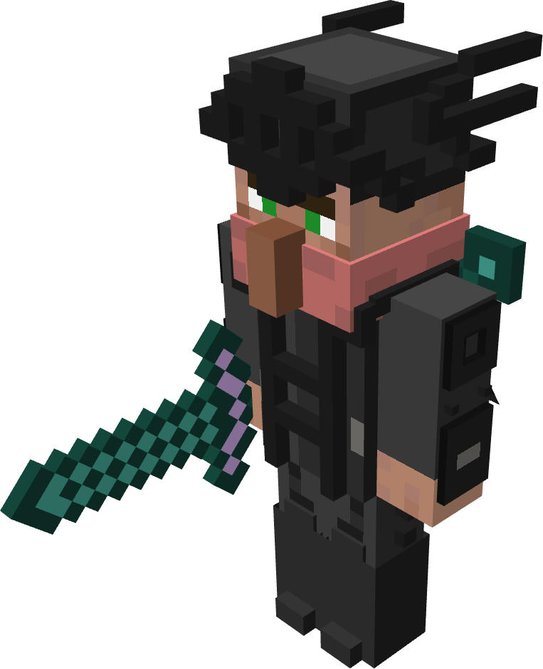
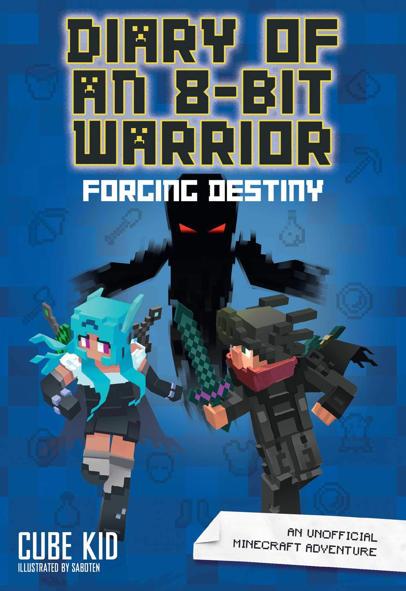
The model is made with BlockBench. I'm proud of it. It is based off of the main character from Diary of an 8-bit Warrior, Runt Ironfurnace, in his uniform from book 6 (haven't read past page 50 yet, don't spoil it!)
The model is based off of the cover.
UPDATE 1: I used the only feedback I got and edited the model! I also reset the poll for the new model's feedback.
UPDATE 2: I have just released v3! Reset poll again.
Current Model:

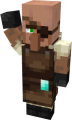
Book (for reference):
Any other feedback is welcome in the comments! (This includes suggestions, thoughts, possible improvements, etc.)
If you feel it could use improvement, then tell me what I could improve on!
The model is based off of the cover.
UPDATE 1: I used the only feedback I got and edited the model! I also reset the poll for the new model's feedback.
UPDATE 2: I have just released v3! Reset poll again.
Changes in v3
- Made the scarf a little more pink
- Altered the pitch black in some areas from #000000 to #1C1C1C
Changes in v2:
- Overall brighter in some areas
- More contrasting grays
- You can't really see it right now (the angle of the render), but I brightened up part of the cape.
Future plans
I have plans to brighten up the pitch-black part later, and I also have plans of releasing the texture and the model once it is more complete. The model will be in Bedrock Edition JSON format.
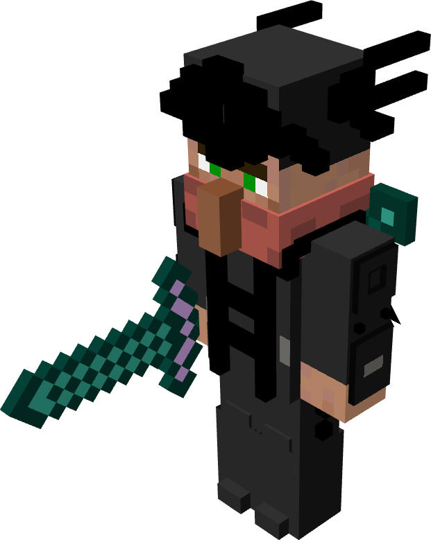
Current Model:
v2
v1
Book (for reference):
Any other feedback is welcome in the comments! (This includes suggestions, thoughts, possible improvements, etc.)
If you feel it could use improvement, then tell me what I could improve on!
Create an account or sign in to comment.
13
1
For the sake of using this, you should try and add a bit of shading, so we can tell details apart more, some parts just look like big blobs. But the actual model looks great.
1

I think you did great on the character, looks just like the one on the book!
1

i love diary of an 8 bit warrior
1

certain details are now a lot more visible than they were when it was originally black. Legs look much better and the model appears true to the cover design. and the outlines and shades of grey are definitlely the kind of improvements that the model needed!
i give it drop kicking 10/10!
i give it drop kicking 10/10!
1
Thanks!
1

I would say the scarf should be slightly more pinker but otherwise it is a great model!
2
Okay! Will do!
2
my only opinion is that some pieces seem a little flat compared to rest of the body, like the legs they kind of seem a little too blended in. and maybe try not use pure black , you should probably lighten up the tone of those black bits up slightly. overall i think its a very excellent model
1
v2 has been released! I made sure to take your suggestion. I didn't brighten up the pitch black though, I have plans to do that later.
1
Trying to get more feedback before I release v3.
1
V3 has been released!
1
Okay, thanks! Will do! The reason I used mostly a solid color is because that's what I had to work with (because I am basing it upon the cover).
1
Seriously, tell me what to improve on if you think I need to improve on something!