

- 1,154 views, 1 today

38
Creating a good palette can be difficult. With a colour palette, you are restricted to a particular set of colours to maintain a certain theme (bold for emphasis). Simply creating a palette can provoke your thoughts to create skins. Creating a colour scheme is just as hard. Be warned, this is NOT a guide for shading (although colour schemes can create your shades). It is a guide for creating a palette/scheme.
In my opinion, the palette and the scheme are two different things.
(Warning, my opinion ahead)
Palette: A plan of every colour you're using on your skin. It contains a variety of colours that make up the clothing/hair/skin/etc.
Scheme: Generally a plan of a specific colour in your palette. THIS CAN BE USED FOR SHADING, DEPENDING ON HOW YOU MAKE IT
Colour Harmony and Colour Theory
Colour harmony can be loosely defined as a good combination of colours. Colour harmony is also the reason why the colour theory exists. Colour theory is a body of practical guidance to colour mixing and the visual effects of a specific colour combination. There several different theories you can use to make your palette/scheme (using an image isn't officially part of colour theory, but w/e):
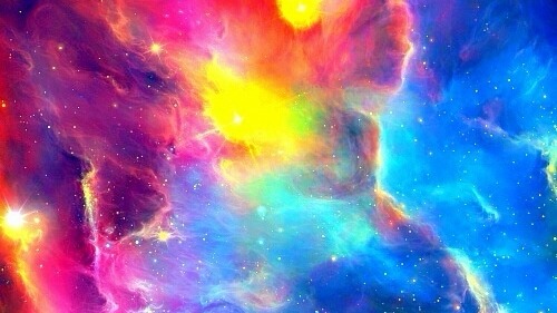
Using Images (my favourite)
You can create your palette using images on the internet. In order to do this, you can find any image online of a certain theme and you can utilise this image by using a colour picker and picking out colours that you'd like for your palette.
Analogous (Scheme AND Palette)
Analogous colour schemes are groups of three colours that are next to each other on the colour wheel.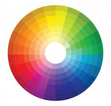
See this colour wheel? Your colour palette is analogous if it uses colours that are next to each other on the colour wheel. For example, yellow would go with light green, but not with magenta (As Faz_ said in the comments, yellow and purple do go together fabulously, but it doesn't follow the analogous theory).

The example above is a variety of analogous colour schemes from the 12-spoke colour wheel. They usually contain a primary colour, a secondary colour, and an accent colour (these three will be covered below), and makes for appealing skins that focus on elemental themes (water, fire, earth, air, etc.).
Monochromatic (Scheme AND Palette)
Monochromatic colour schemes are made up or tones, shades and tints within a specific hue. I like to separate these palettes into three parts.
Primary - Main colour most used in a skin.
Secondary - Other main colours in a skin.
Accents - Includes colours that may be neutral or luxury to a skin's theme.
You can use this method to shade, depending on how you make it.

The colour scheme above is an example of a basic monochromatic colour scheme. If you reorder these colours from darkest to lightest, you could very possibly use this for your shading.
Colour 1 would likely be the primary colour. Colour 2 and 4 may be the secondary colours. And the last two colours (3 and 5) would likely be used as accents.
Perhaps colour 3 would be for the hair, and the rest of the colours could be used for the clothing?
Pretty much just get a single colour, then change the values to create more shades of the same colour. This doesn't have to be limited to just one colour. You can use two, like the example below.
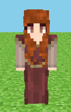
Check this skin out. Can you identify the primary, secondary and accent colours?
The maroon would be the primary, the pale reddish sleeves would be secondary, and the gold would be the accent colour.
Complementary (Palette)
Complementary palettes are created by combining colours from the opposite sides of the colour wheel. Once you have your two colours, you can expand them using tones, tints, and shades. Split-complementary is also another version where you choose three colours instead of two.
Triadic (Palette)
Triadic palettes are made up of hues evenly spaced around the 12-spoke colour wheel in a triangle formation. It can make for a very diverse colour palette. Tetradic (Also known as double-complementary) is also another version of triadic where you choose four colours instead of three.
Some little tricks:
Using muted tones (greytone/pale colours) against a single vibrant colour gives that colour a pop. It creates better emphasis and often makes cooler looking skins.


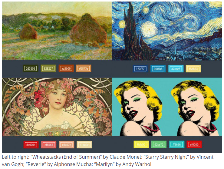
You can get inspiration by just looking at paintings.
Colour symbolism can also help you make your theme. This website can enlighten you on this topic:
http://www.three-musketeers.net/mike/colors.html
Conclusion:
I'm really bad at conclusions. Thank you for reading this guide. Remember, this guide can also be extended to use in building and art. You have 1.6777216x10ˆ6 colours to choose from! There are trillions of different colour combinations you can use on your colour scheme/palette.
In my opinion, the palette and the scheme are two different things.
(Warning, my opinion ahead)
Palette: A plan of every colour you're using on your skin. It contains a variety of colours that make up the clothing/hair/skin/etc.
Scheme: Generally a plan of a specific colour in your palette. THIS CAN BE USED FOR SHADING, DEPENDING ON HOW YOU MAKE IT
Colour Harmony and Colour Theory
Colour harmony can be loosely defined as a good combination of colours. Colour harmony is also the reason why the colour theory exists. Colour theory is a body of practical guidance to colour mixing and the visual effects of a specific colour combination. There several different theories you can use to make your palette/scheme (using an image isn't officially part of colour theory, but w/e):
Using Images (my favourite)
You can create your palette using images on the internet. In order to do this, you can find any image online of a certain theme and you can utilise this image by using a colour picker and picking out colours that you'd like for your palette.
Spoiler - click to reveal


Analogous (Scheme AND Palette)
Analogous colour schemes are groups of three colours that are next to each other on the colour wheel.
See this colour wheel? Your colour palette is analogous if it uses colours that are next to each other on the colour wheel. For example, yellow would go with light green, but not with magenta (As Faz_ said in the comments, yellow and purple do go together fabulously, but it doesn't follow the analogous theory).
Spoiler - click to reveal
The example above is a variety of analogous colour schemes from the 12-spoke colour wheel. They usually contain a primary colour, a secondary colour, and an accent colour (these three will be covered below), and makes for appealing skins that focus on elemental themes (water, fire, earth, air, etc.).
Monochromatic (Scheme AND Palette)
Monochromatic colour schemes are made up or tones, shades and tints within a specific hue. I like to separate these palettes into three parts.
Primary - Main colour most used in a skin.
Secondary - Other main colours in a skin.
Accents - Includes colours that may be neutral or luxury to a skin's theme.
You can use this method to shade, depending on how you make it.
Spoiler - click to reveal
The colour scheme above is an example of a basic monochromatic colour scheme. If you reorder these colours from darkest to lightest, you could very possibly use this for your shading.
Colour 1 would likely be the primary colour. Colour 2 and 4 may be the secondary colours. And the last two colours (3 and 5) would likely be used as accents.
Perhaps colour 3 would be for the hair, and the rest of the colours could be used for the clothing?
Pretty much just get a single colour, then change the values to create more shades of the same colour. This doesn't have to be limited to just one colour. You can use two, like the example below.
Check this skin out. Can you identify the primary, secondary and accent colours?
The maroon would be the primary, the pale reddish sleeves would be secondary, and the gold would be the accent colour.
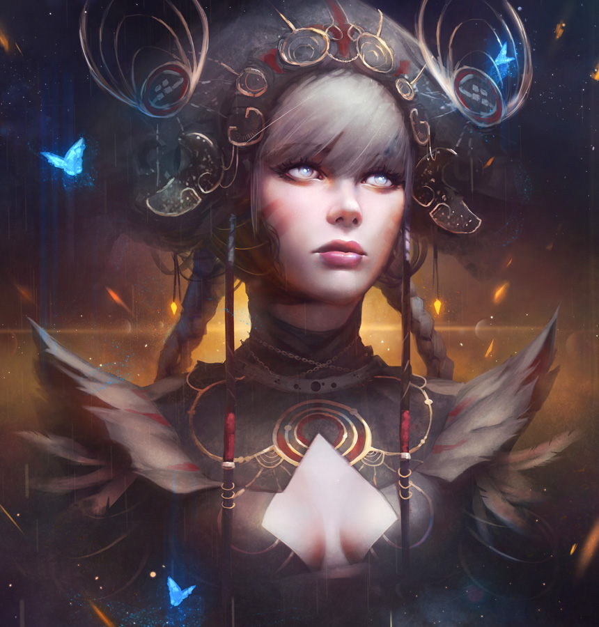
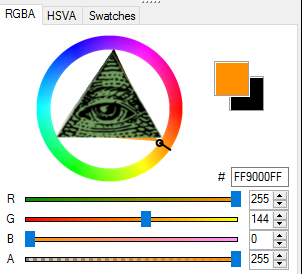
Complementary (Palette)
Complementary palettes are created by combining colours from the opposite sides of the colour wheel. Once you have your two colours, you can expand them using tones, tints, and shades. Split-complementary is also another version where you choose three colours instead of two.
Spoiler - click to reveal
1. Pick a random colour in the colour wheel. In my case, I chose cyan.
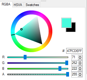
2. Go directly to the opposite side of the colour wheel.
3. You now have two colours to start with. In my case, I have cyan and pink (bubblegum and cotton candy!)

4. A wide variety of tints, shades, and tones, make this quite the versatile colour palette. Making a colour more vibrant, less vibrant, darker, lighter, or anything is pretty much the way to go. I recommend using the RGBA colour wheel to create the most pleasant colours.

(I call this palette "FBACC" aka "From bubblegum and cotton candy to goldfish". Lame name, I know, but w/e.)
From left to right, colours 2 and 4 would likely be the primary colours, colours 3 and 5 would be the secondary colour, and colour 1 would be the accent colour.
2. Go directly to the opposite side of the colour wheel.
3. You now have two colours to start with. In my case, I have cyan and pink (bubblegum and cotton candy!)
4. A wide variety of tints, shades, and tones, make this quite the versatile colour palette. Making a colour more vibrant, less vibrant, darker, lighter, or anything is pretty much the way to go. I recommend using the RGBA colour wheel to create the most pleasant colours.
(I call this palette "FBACC" aka "From bubblegum and cotton candy to goldfish". Lame name, I know, but w/e.)
From left to right, colours 2 and 4 would likely be the primary colours, colours 3 and 5 would be the secondary colour, and colour 1 would be the accent colour.
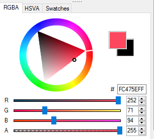
Triadic (Palette)
Triadic palettes are made up of hues evenly spaced around the 12-spoke colour wheel in a triangle formation. It can make for a very diverse colour palette. Tetradic (Also known as double-complementary) is also another version of triadic where you choose four colours instead of three.
Spoiler - click to reveal
1. Pick a random colour on the colour wheel. In my case, I chose violet
2. Pick the colours that correspond in a triangle formation. We want the Bermuda's Triangle here.
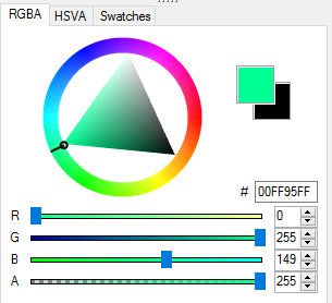
3. You now have three base colours. In my case, I have violet, orange, and minty green.

4. A wide variety of tints, shades, and tones, make this quite the versatile colour palette. Making a colour more vibrant, less vibrant, darker, lighter, or anything is pretty much the way to go. I recommend using the RGBA colour wheel to create the most pleasant colours. You can change some of the base colours to your liking. You also don't need to use all three colours.
Honestly, that green and purple are yucky together. I made the purple and green into a very pale white hue, which went perfectly with the orange.

2. Pick the colours that correspond in a triangle formation. We want the Bermuda's Triangle here.
3. You now have three base colours. In my case, I have violet, orange, and minty green.
4. A wide variety of tints, shades, and tones, make this quite the versatile colour palette. Making a colour more vibrant, less vibrant, darker, lighter, or anything is pretty much the way to go. I recommend using the RGBA colour wheel to create the most pleasant colours. You can change some of the base colours to your liking. You also don't need to use all three colours.
Honestly, that green and purple are yucky together. I made the purple and green into a very pale white hue, which went perfectly with the orange.
Some little tricks:
Using muted tones (greytone/pale colours) against a single vibrant colour gives that colour a pop. It creates better emphasis and often makes cooler looking skins.
You can get inspiration by just looking at paintings.
Colour symbolism can also help you make your theme. This website can enlighten you on this topic:
http://www.three-musketeers.net/mike/colors.html
Conclusion:
I'm really bad at conclusions. Thank you for reading this guide. Remember, this guide can also be extended to use in building and art. You have 1.6777216x10ˆ6 colours to choose from! There are trillions of different colour combinations you can use on your colour scheme/palette.
| Credit | https://designschool.canva.com/color-theory/ https://empireminecraft.com/threads/building-guide-color-palette.33260/ |
| Tags |
5 Update Logs
Update #5 : by b7e 07/18/2016 3:47:15 amJul 18th, 2016
Triadic title isn't in orange. Fixed it.
LOAD MORE LOGS
tools/tracking
3750676
6
colours-do-matter

 HudSolo2009
 20w14infinite
 FBreakDance30
 CrystalRuby
 Arianwyn
 AutumnAura49797
 Apro87
 SpainOnMinecraft
 Ryderlb09
 WYHA-Storm
Create an account or sign in to comment.
Yellow and purple do go together, but when you're making an analogous colour scheme it just won't work out :)