
1
Argh! New Google logo!
Oh noes! Google changed it's logo! EVERYONE PANIC! ;(
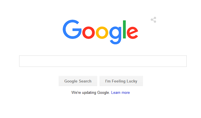
Old title: "So... Google slightly changed it's interface."
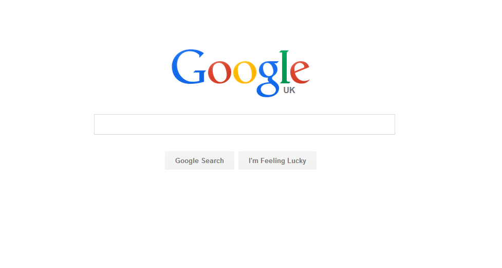
looks a bit better I guess
Old title: "So... Google slightly changed it's interface."
looks a bit better I guess
44

I hate how the top of the G is shorter than the bottom. That should not happen, I know it's a circle, but it needs to not be.

OCD Alert.

I don't like the new one.. Mostly cause I'm used to the old one tho..

I hate the new logo

I mean, like, whatever.

Just relax. Jesus is the answer.
Just relax. Jesus is the answer.
Ik I'm weird but I liked the old look of things before everything became metro-moderny ish. Like iOS 6, Windows 7, the old old google logo that wasn't flat.

0/10 worst company of 2015.

Good lord, they changed the font! This is clearly a sign of the end times. Everyone fill your pockets with whatever you can find and repent, REPENT I SAY!!!

Meh. I really don't have an opinion on it.

The previous one looks like a serious and professional logo.
This one looks something out of a back to school advertisement video for 5th Graders. Too playful.
This one looks something out of a back to school advertisement video for 5th Graders. Too playful.

simplification

I like the new one

FistoFwww.youtube.com/watch?v=olFEpeMwgHk
I hope they will never change their background.
Oh yea xD
Oh noes! xD
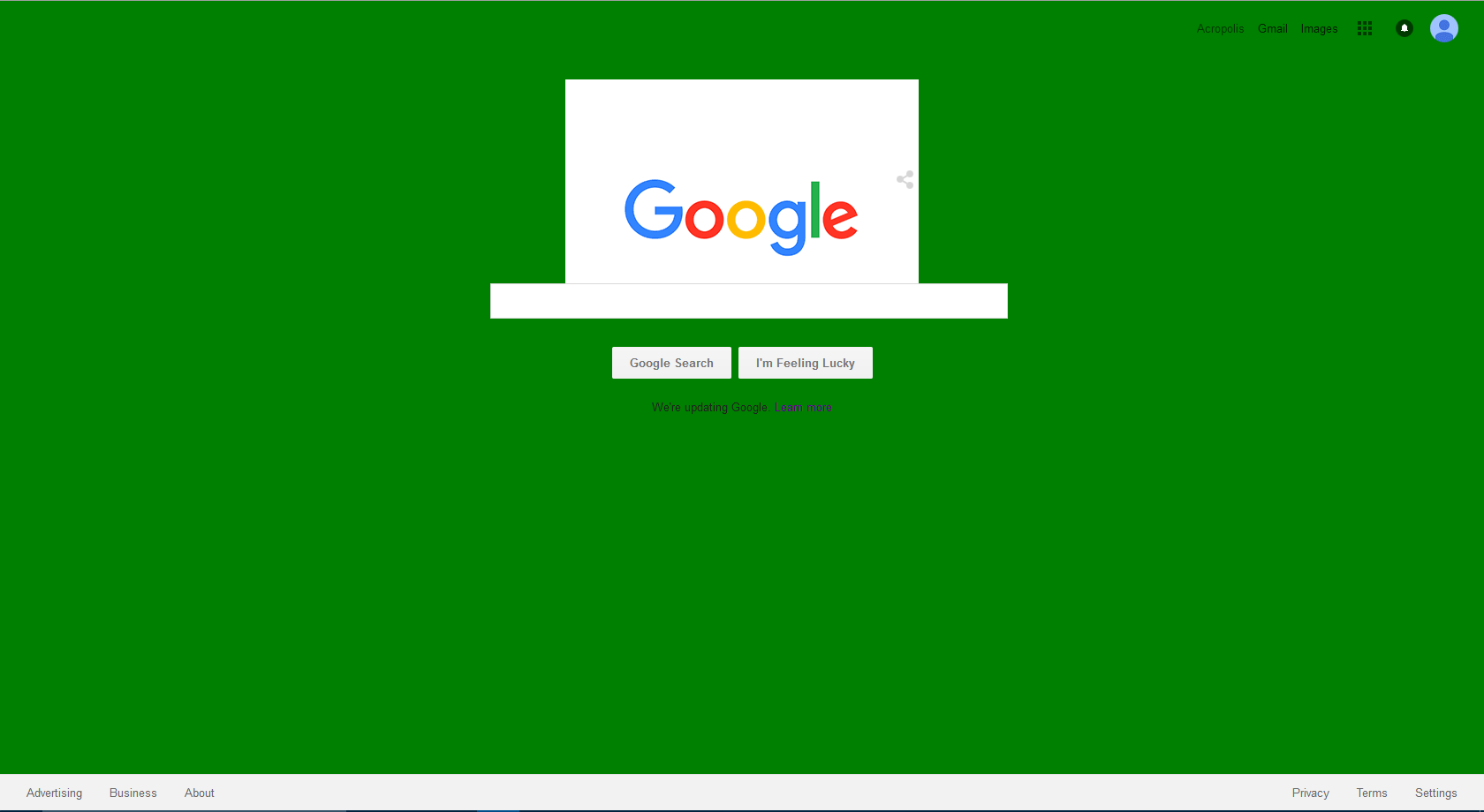

For anyone who doesn't know what the difference is or why they made it:
• They made it more of a modern, flat design
• They along changed many of their logos
• They made it more of a modern, flat design
• They along changed many of their logos

I like the new one! NGL as soon as I saw the new one I forgot how the old one looked.

[deleted]

nooooo I hate it I hate it
this isn't google
where are the serifs :c
the colors are too bright :ccc
arggh
this isn't google
where are the serifs :c
the colors are too bright :ccc
arggh

I know right! I think Google is google, and android font is android font. It looks weird, personally...
[deleted]

I, for one, think it's adorable; It's clean and easy to read, perfect for a universal site used by literally everyone except really old people who don't know what a smartphone is. Oddly enough, this is also coming from someone who despises minimalism.

thiss
except i dont despise minimalism
i despise GOOGLE well not really but kinda
except i dont despise minimalism
i despise GOOGLE well not really but kinda

I think it looks good

It's Okay...

o

Vouch

I guess they changed it to match their icons a bit more.


Its better
EXCITING i like it a lottt

It's okay
Not like they changed it to something rather offensive
Not like they changed it to something rather offensive
It's changed!!! This can't happen!
oh wait, didn't they change logos before? meh.
It changed!!!!!
oh wait, didn't they change logos before? meh.
It changed!!!!!

Nice, I love the new look! Keeping it fresh
also
lol
lol

Can't... handle... new... logo... 10010010 01101101 *passes out*
lawl
Argh!!! Google changed it's logo! EVERYONE PANIC! ;(
(check op)
(check op)

US got it today. It's more spacing.
Yeah Google Canada got this a couple days ago. I guess they want to make everything look a bit more sleek
good to hear

I use Startpage.com, which anonymously submits my search into the google search system, so I rarely see google's frontpage anymore.

Yeah, I think google UK only got it, think US allready had it
Edit: i like it
Edit: i like it
I use google.co.uk so I think so ye

Hasn't it been like that for ever already? .-.
See the buttons, they've changed!.. slightly.
