 Fred
Fred -Kali-
Create an account or sign in to comment.
27
1
I like Musa's but his color contrasts aren't as well done as uPro's
1

hi
1
Oh well I lost. Good luck for the rest of the season Musa.
1

I will avenge you.
Good afternoon, Musa >:)
Good afternoon, Musa >:)
1

[quote="MusaTheLegend":36u8y80t]I get lazy when it comes to skinning at times so tiny mistakes like the ones on the shells I don't really pay attention to, and of course, I'm too lazy to update it.[/quote]
Then don't go into a skinning contest? Lol. Just seems very counter-intuitive to join a contest, and then be "lazy".
2D Picture-Elf. Turtle looks glitchy, and opposing shadows are grr.
3D Model- Elf. Very close, but the flow is better on the elf. Turtle just doesn't flow.
Backstory-Nope. Though "Last updated" is a good sign that elf is being worked on, and author is reading and fixing problems.
Originality-Nah. Elf vs TMNT. Both semi-pop. Ele hands has been done. Weird turtle has been done.
Colors- Elf. Turtle has a weird thing going on that just doesn't work.
Shading- Elf. ^^^^
Use of new layer- Elf. Ele hands>fists. (Musa, using the 1.8 layer? hmm)
Technique- Elf. Explained above and below.
Overall- Elf by uPro
Notes:
Musa: Looks like light source is backwards front vs back. Bad highlighting choices on the front torso(chest) area. Back has the pixel off, and there appears to be an extra pixel on the bottom right armor area of the back.
uPro: Simple shading. Good contrast. Cape is a bit dark. Inside of legs could do with some something. Face is funky, but works somehow... Good job on the ears.
1

uPro. Musa only used a couple of colors, and plus, it kinda looked ugly.
1
I used all of them except for 2, lol.
Also, could you state why it looks ugly?
Also, could you state why it looks ugly?
1
Points taken.
As to the mask, however, highlights would look very awkward, so I won't be adding any.
I get lazy when it comes to skinning at times so tiny mistakes like the ones on the shells I don't really pay attention to, and of course, I'm too lazy to update it. Sure, whatever, call me dumb for not updating it, but to be honest, it looks good in the long run.
Thanks anyways.
1

Here's your feedback
Well, my problem with it is it has one side darker than the other, so if your gonna do it for the shell, do for the whole skin. also it looks like it has a different shading than the rest of the skin.
PS: I liked the eyes before you changed them, not saying you have to change them but the TMNT had eyes like that in the 2003 tv show which is what it looks like your going for.
1
The shell's shading is to portray the fact that shells are 3D, lol.
Let's take a look at this shell:
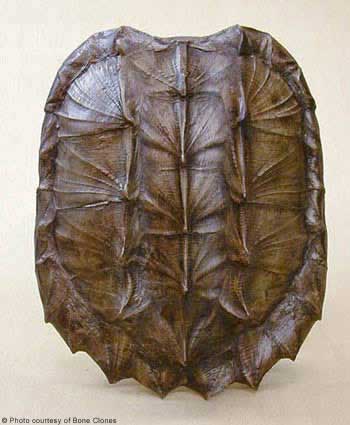
I made one side dark, the middle normal, and the left highlighted so you know its 3D. If I kept it as normal shading you would have a hard time knowing it's a shell IMO.
Let's take a look at this shell:
I made one side dark, the middle normal, and the left highlighted so you know its 3D. If I kept it as normal shading you would have a hard time knowing it's a shell IMO.
1
This is going to come off as an aggressive rant sort of thing because I'm a bit erked right now due to other stuff. Don't take it that I'm angry with you though.

We'll start with the shell. The direction of the highlight doesn't match the overall direction that you're coming from, which appears to be the left and right of the skin as portrayed by the shoulders. Continuity issue. Top right of the shell, the darkest shade is one pixel farther in than it should be if you want it to match the other shades; I can assume this was an attempt to create the highlight setup for the head. What I mean by that is shifting the light from being straight from the side to the front and above, which is done correctly in this case, but as to why the next layer of the shell below it doesn't have that change annoys me. The separation "blackish" lines in between each section of the shell are fine except for the fact that they don't match the highlights; where as the shell goes from dark to medium to light, the separation lines go from dark to medium to dark. I'll admit that it's smart to do that because it shows that the shell is round, but then, use the idea you had going with the top right of the shell(that little center highlight thing I explained earlier) and work that into the lighting in said separation lines.
Front of the shell is poorly done, in my opinion. I can see what you tried to do by shifting it one to the right to get the little indent there, but it just comes off looking incorrect as it is. The bright border around the torso entirely breaks the highlight placement you had going for you; if you wanted to show that that region of the shell was lighter than the others in color, but not in actual brightness, then reduce the chest shades by 1 shade and use a darker shade. If not that, you certainly could have used the brown ramp to create that much more effectively.
The arms look fine to me, and I really have nothing to say about the legs.
The head is fine except for the black line that represents the mask; it's effective on the front and sides, but the back could've used a bit more detail. I mean, take the next shade up the ramp and use it to create some highlighting which you break again by not showing consistently.
Don't have to take any of my opinion, after all, you and I skin in completely different styles, but then, you persisted as to what I meant by I disliked the shell.
1
uProPureNerd217He's saying it looks a little awkward, the same was said about the hair of the elf,
The hair is awkward? Who said that? Also, how so because I will fix it if someone tells me how to improve it.
Oops, sorry. I was talking about my elf, I created an Elf for the first round of PBL and lost mostly cause the hair didn't fit the rest of the skin, your skin is fine
1
PureNerd217He's saying it looks a little awkward, the same was said about the hair of the elf,
The hair is awkward? Who said that? Also, how so because I will fix it if someone tells me how to improve it.
1

Upro for a wider range of the pallet that makes it look really nice.
1
uPro.
Feel like Musa could've made the shell a bit differently, not saying I know how to fix it, but it just doesn't look right to me.
Feel like Musa could've made the shell a bit differently, not saying I know how to fix it, but it just doesn't look right to me.
1
If you're not going to tell me what you don't like about it what am I suppose to do? Let uPro get more votes because I don't get proper feedback?
1
He's saying it looks a little awkward, the same was said about the hair of the elf, just cause they don't know how to fix it doesn't mean they don't know somethings wrong. If a toaster explodes that you invented and you got a complaint but you got mad cause the person who filed the complaint didn't tell you how to fix it doesn't mean he's wrong
1
Not saying he's wrong but it would be nice for someone to actually give me some actual feedback.
1

I love them both, and this is tough, but I have to go with uPro.
Wow. I tied it.
Wow. I tied it.
1

woo uPro
1

Musa for the go.
1

Going for Musa, because uPro's seems a bit too messy.
1

oh my god.
Clash of the Titans, and just the 2nd round!?
Clash of the Titans, and just the 2nd round!?
1
both of the faces look odd, But uPro is a lil bit better
1

Oh, wow. This one's a right toughie .
1

That is rather hard, I must say uPro's looks a tiny bit more pleasing in my eyes, so I will have to vote for him. Good job though guys
07/01/2014 12:01 am
This reply was removed by the poster or a moderator.
1

I like how Musa's shading looks, it fits in well with the character, while uPro's contrast gets the eyes going O.o