
5
Please help me
can somebody give me tips/constructive criticism on improving this skin i made please it looks so bad (i'm a beginner so i'm not very good at making skins)
8

id recommend experimenting with the noise tool a bit if you prefer a flatter, more vintage 2010s skin

Hi there! So, here is a few tweaks that are simple workflow additions that bridges that gap you may feel you are missing. I want to preface with you are good, you have form, understanding of values, etc. You are good, you are probably just feeling like your canvas is not as "detailed", thus creating that "This doesn't feel as good in my head" vibe.
Depth: Adding depth is actually quite simple, even if everything feels overwhelming. My first tip is pick a spot. Just one. Let's take the skin's arms for example. The sleeves are missing shading. Shading adds depth. Now. How do we apply shading? Easy, really! My simple cheat is "we are playing a 2d game, and 3d detail inly adds contrast and depth. Makes the characters feel more natural in their shaded, block environments. That sleeve we don't have to treat as a complicated arm with specific shadows- treat it as it is. Darken around the edges with a bit of highlight pop. For this specifically, I recommend browsing at least 2 reference skins for the quality you like. Do not spend hours of your time hyper fixating on their formula. It is shape, not math. In skins I like, the majority of he depth is added by slightly offsetting the main colour and using a shader tool (or loose hand painting some pixels). This gives the fabrics of the minecraft skin the fabric "feel". Take those images and ask a simple question: "Why does the colours for the clothes contrast from the colours of the skins?".
One word of advice, even if you do not particularly enjoy furries, I encourage you to still look at a few examples of polished furry skins. They will give you a GREAT example and variety of ways to differentiate textures with shading. Because they are not separating skin and fabric, they are separating fur, hair, frabic, and often more.
Face: So, I have already seen some previous comments on the hair, I want to provide you the information as to WHY they recommend moving the eyes down. Looking at the skin, the eyes feel high and the mouth feels low. Why? Well! The hair. The eyes are on top of the hair. This from a 2d to 3d perspective translates as "big". We know eyes are typically smaller and go behind the hair. So, this in combination with the placement exaggerates the eyes. To give the hair back some room, I recommend:
- Shifting the eyes just a pixel down (or bring the hairline up, just be careful because less space and simioal colours between the skin tone can make it seem "bald").
- Allowing the lowest sections of the hair to overlap the eye if need, be. This makes the hair feel like hair rather than painted, static cloth.
- Add slight variation and varieties to the colour as mentioned above.
Seriously, it is super easy to learn and I am really hoping this either helps or allows you to step towards your specific solution!
Depth: Adding depth is actually quite simple, even if everything feels overwhelming. My first tip is pick a spot. Just one. Let's take the skin's arms for example. The sleeves are missing shading. Shading adds depth. Now. How do we apply shading? Easy, really! My simple cheat is "we are playing a 2d game, and 3d detail inly adds contrast and depth. Makes the characters feel more natural in their shaded, block environments. That sleeve we don't have to treat as a complicated arm with specific shadows- treat it as it is. Darken around the edges with a bit of highlight pop. For this specifically, I recommend browsing at least 2 reference skins for the quality you like. Do not spend hours of your time hyper fixating on their formula. It is shape, not math. In skins I like, the majority of he depth is added by slightly offsetting the main colour and using a shader tool (or loose hand painting some pixels). This gives the fabrics of the minecraft skin the fabric "feel". Take those images and ask a simple question: "Why does the colours for the clothes contrast from the colours of the skins?".
One word of advice, even if you do not particularly enjoy furries, I encourage you to still look at a few examples of polished furry skins. They will give you a GREAT example and variety of ways to differentiate textures with shading. Because they are not separating skin and fabric, they are separating fur, hair, frabic, and often more.
Face: So, I have already seen some previous comments on the hair, I want to provide you the information as to WHY they recommend moving the eyes down. Looking at the skin, the eyes feel high and the mouth feels low. Why? Well! The hair. The eyes are on top of the hair. This from a 2d to 3d perspective translates as "big". We know eyes are typically smaller and go behind the hair. So, this in combination with the placement exaggerates the eyes. To give the hair back some room, I recommend:
- Shifting the eyes just a pixel down (or bring the hairline up, just be careful because less space and simioal colours between the skin tone can make it seem "bald").
- Allowing the lowest sections of the hair to overlap the eye if need, be. This makes the hair feel like hair rather than painted, static cloth.
- Add slight variation and varieties to the colour as mentioned above.
Seriously, it is super easy to learn and I am really hoping this either helps or allows you to step towards your specific solution!

I’d recommend not always using pure black for faces
even if it’s a super dark brown
the black makes a super harsh contrast
even if it’s a super dark brown
the black makes a super harsh contrast

Lower the eyes by one pixel, and add some texture to the clothes. otherwise it's good
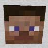
Your skin is amazing, especially with how simple it is. Also, Papa Enny is an amazing person. any advice he has to give is worth it's weight in gold!

Bad is the wrong term. The skin isn't bad, just beginner quality, which is something you must start from.
Taking the skin:
- I would add some shading, not just flat
- Use the second layer more, like for dress details, not only hair
Taking the skin:
- I would add some shading, not just flat
- Use the second layer more, like for dress details, not only hair

thanks :-] i would've added shading but i didn't think of it
YW and it is okay, you can make a next version, where you experiment
