


544
*updated information* The option SHADOW_FRUSTRUM_CULLING is bugged in 1.17+. Just turn it off.
Welcome, welcome to my complete guide to the Chocapic13' Shaders. My name is Krista if you haven't heard of me before. I've been using Chocapic13' Shaders for well over a year now. And throughout that time, I've experienced and played around with many many settings and tweaks that bring this shaderpack to its full potential.
In this blog post, we will go over every single setting in the newest version of this shaderpack as of writing this (v9.1 Extreme beta 5) in as much detail as possible, as well as the settings that I use personally. I will also cover the colour grading in post for even better screenshots. Enjoy!
A Few Things to Note...
Firstly, I want to thank some people for making this possible: Chocapic13 - for obvious reasons; TecThor - I initially followed his instructions on improving Chocapic13' (and other shaders as well,) I learned a lot from that video, and adapt most of it to my current settings too; And many PMC creators - for all the resources and maps used to showcase the shader for this guide.
I'll put all the links and credits and the end of this post.
Secondly, I certainly don't know all of the details about this shaderpack. You know, I didn't spend time digging in the code to see exactly what each option does or anything. This is based on just messing around and trying to find what looks best. I might be wrong on something, but do feel free to correct me.
Let's hop onto it now!
What is this shaderpack? And why do I use it?
Chocapic13' Shaders is a relatively lightweight shaderpack made by Chocapic13. Unlike others, this shaderpack actually have a very very good quality for its performance. So if you're looking for a lightweight shader to use on your potato, this is definitely the one for you. If you are not restricted on the performance, there are some heavier presets to use too.
I started using the shaderpack because it runs a lot better on my laptop, but soon realise how much this shaderpack has to offer. In my opinion, these are some pros and cons of this shaderpack when compared to other similar shaders:
Pros
• The biggest of all, is that it allows you to configure basically everything you can think of. Hundreds of parameters you can change. It's very versatile and you can get pretty much any look you want out of it.
• It runs soooo smoothly. And it's compatible with MacOS as well (because I play on a Macbook xD).
• It has one of the most realistic volumetric clouds I've ever seen. Plus there's like a dozen parameters you can tweak, just for the clouds.
• This thing has a "screenshot preset," more on that later.
Cons
• Mainly issues with how it calculates shadows. The most remarkable one is probably how it treat transparent objects.
• Leaky lights, floating shadows, all that good stuff. But not really noticeable if you don't look for them.
• Rain is just... uhmm... unrealistic, I guess. I mean it looks fine, but... eh
Selecting Versions
Mainly 4 versions are available right now, that is v6, v7, v8, and v9. Each version has 5 different presets you can choose from. Newer versions look better while consuming more performance. Generally, just go for v9 if you can. It adds a lot of important features that will make this shaderpack looks even more incredible. If not then I think v7 performs really well and is the one I use before transitioning to v9.
Now, different presets aren't just different initial settings. There are hidden settings and quality improvements that can't be configured in-game. They are according to this chart by Chocapic13.
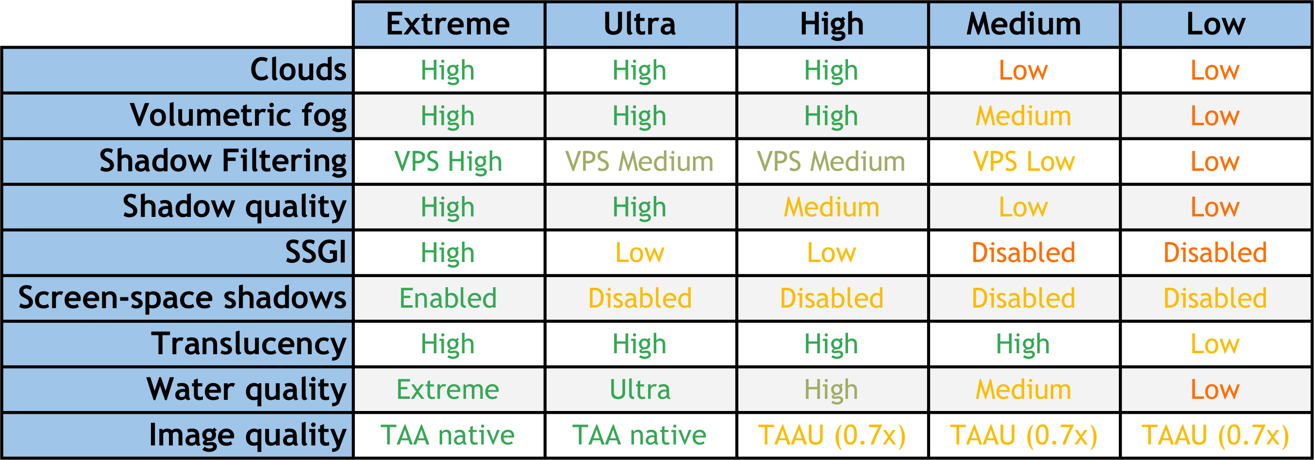
Shader presets chart by Chocapic13
There is one exception, however. For version 9, there's a preset called "screenshots preset". To put it simply, it is not meant for playing the game normally, only for taking screenshots. If you hold the camera still, it will start sampling images to make the final screenshot. Pretty much the same as a Blender or Chunky render process but done in-game. This gives a much better image quality.
Technically there's also the Chocapic13' High-Performance Shaders. But that's its own thing, very different from what we will discuss here.
I won't be going over the installation process as it's basically the same as others shaders. There are many other tutorials online.
Shader Settings
Alright, now to the shader settings. These will vary depending on which version or which preset you use. Things like shadows and lighting will not be the same. However, most settings (colouring, atmosphere, camera settings, etc.) can be applied to any preset. I'll be using v9.1 Extreme beta 5 for this guide.
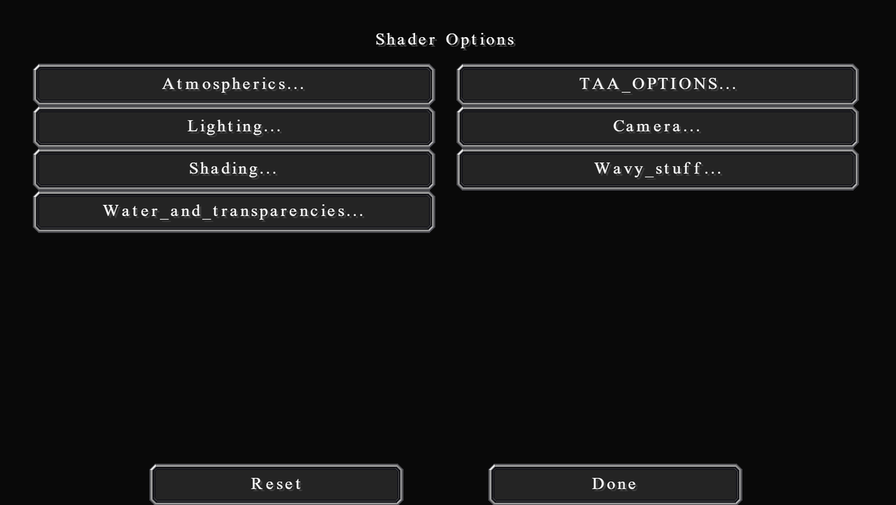
As of version 9, there are 7 categories of settings. You can approach this settings screen by having your shader selected and go to:
And just in case you don't want to go through all of the settings, I've split them into categories (the same as the in-game one). This will be in the order which I think you should configure for the best result since some settings do affect others as well.
I have a rather detailed description of each setting. It will probably take quite a while to go through all of this. But if you don't want to, then I have screenshots of my settings so you can just quickly reference/copy them.
**NOTE** Some settings are marked as "dynamic". This means after the initial settings, these are the options you will regularly change depending on the look you want (conditions of the day, cloudy, sunny, foggy, etc.)
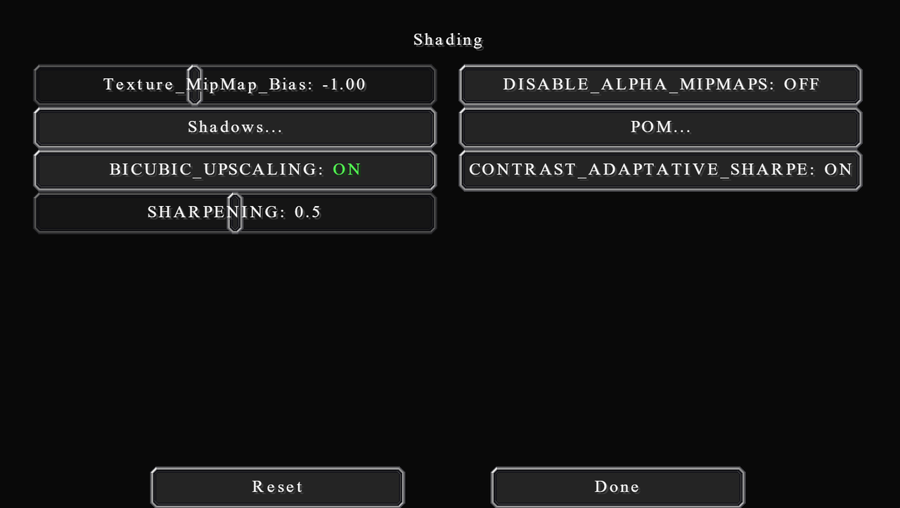
There isn't much to say about shading. These settings hugely depend on what your hardware performance can handle. So, I will go through what each setting does and how much impact it has on performance.
This category is pretty large, I'll try to arrange this so it's easy to read.
First, on the main page, Texture_Mipmap_Bias changes the level of mipmap used. If you don't know what mipmap is, it's basically a configuration of multiple copies of one image, each at a lower resolution than the previous. The more you go down (lower value), the more detailed the final image is, especially at distance. It does have some performance impact.
DISABLE_ALPHA_MIPMAPS disable transparency mipmaps of foliages. It will cost some performance if turned on.
BICUBIC_UPSCALING is a method for sharpening lower resolution images. I highly recommend turning this on if you're playing at a render resolution of less than 1. It will cost some performance in that case, but will greatly increase the image quality. Otherwise, this option doesn't really do anything at normal render resolution or higher.
CONTRAST_ADAPTIVE_SHARPENING toggles sharpening on or off. Not much impact on performance.
SHARPENING sharpens or blur image. 0.5 is a good in-between value.
Shadows...
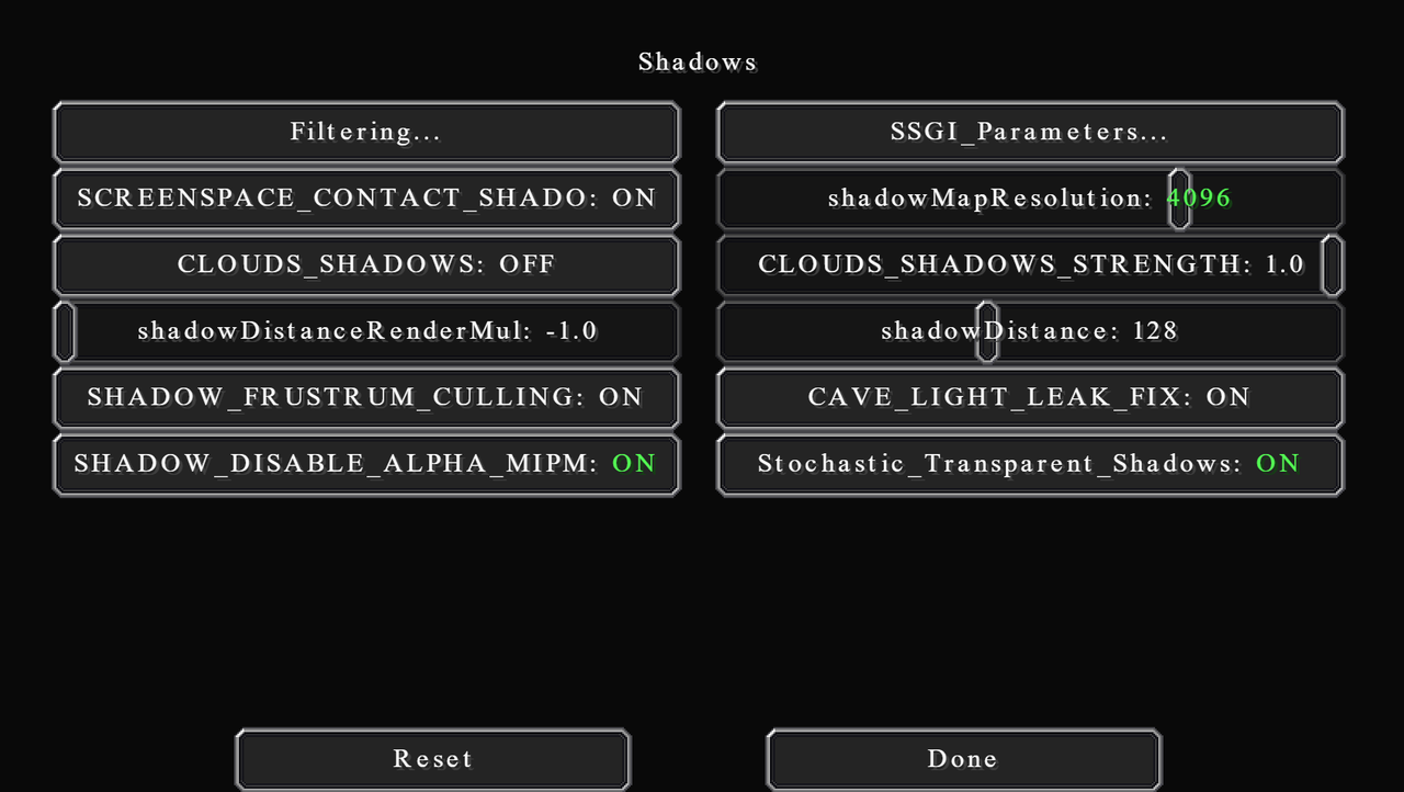
SCREENSPACE_CONTACT_SHADOWS will add shadows to small details that would otherwise not be in the shadow map. This is super expensive at high resolution.
shadowMapResolution is how detailed the shadow map is. This is probably the option that determines how laggy your game will be. Higher value will make shadows more smooth and have less fuzzy edges. Please for the sake of God don't turn it to 16384. That value can crash anything.
CLOUDS_SHADOWS enables or disables clouds shadows. Use this together with VL_Clouds_Shadows in the atmospheric settings. Again, I recommend turning this on when taking aerial images, or if you want a cloudy look.
CLOUDS_SHADOWS_STRENGTH controls how strong the shadows of the clouds are.
If shadowDistanceRenderMul is 1.0, then shadowDistance will be linear, as in 1 unit actually means 1 block. But shadowDistance can only go as far as 256 (16 chunks). If you want anything more than that, you will have to change this option to -1.0, which will make shadowDistance non-linear (I don't know what kind of growth is used instead). With that, 128 is good for about the high-twenties render distance, 175 is good for 40 (as noted in-game).
If SHADOW_FRUSTRUM_CULLING is on, then it will not render any shadows from blocks that will not cast shadows on your POV. Greatly increases performance. It can sometimes bug out though when you turn your screen fast, but nothing crazy. Pretty much leave it on always.
CAVE_LIGHT_LEAK_FIX does what the name suggests. It isn't perfect though, but it's better than nothing. No performance impact.
SHADOW_DISABLE_ALPHA_MIPMAPS is the same as DISABLE_ALPHA_MIPMAPS but for shadows.
Stochastic_Transparent_Shadows extends the transparency rendering by using random noises, which helps achieve better transparency quality. If you want to use this option, then enable SHADOW_DISABLE_ALPHA_MIPMAPS with it, and increase Min_Shadow_Filter_Radius too.
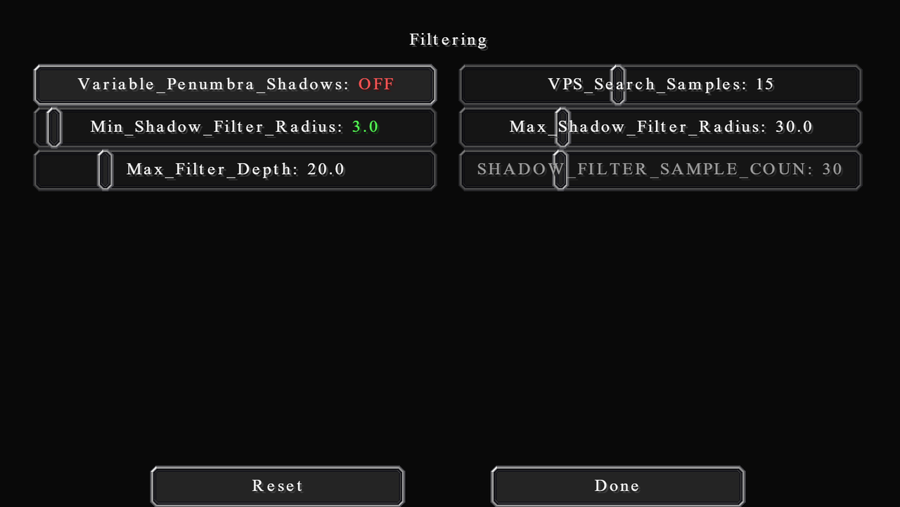
Shadows filtering blurs the shadow map to make the edges look less fuzzy. You can think of Shadow_Filter_Radius as the amount of blur. This blur will start at 0 at the object the casts the shadows, and reach your Shadow_Filter_Radius amount at the edge of the shadow. However, you can configure Max_Filter_Depth to change how soon it will reach your filter radius.
If Variable_Penumbra_Shadows is on, then the radius will be dynamic, meaning that shadows will have different filter radius depending on how far they are from you. That's where the Min_Shadow_Filter_Radius and Max_Shadow_Filter_Radius options come in. If you have it off, the game will use Min_Shadow_Filter_Radius as your normal filter radius size. I find this option quite buggy though. In my case, there are certain areas on the screen that won't have any shadow at all. I leave it off, but turn it on for more realistic shadows if you can.
Finally, VPS_Search_Samples and SHADOW_FILTER_SAMPLE_COUNT are the number of samples used to calculate the filtering. More sample is more smoothly, but also laggier.
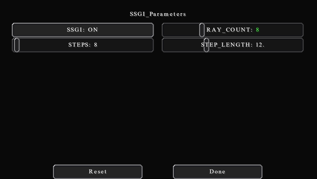
SSGI (Screen Space Global Illumination) adds dynamic indirect lighting to objects, which makes them incredibly realistic. It also gives the dynamic lighting effect to emissive sources. Do turn this on if possible. It makes so much difference.
What you can configure here are RAY_COUNT (number of rays to trace) STEPS (number of steps or iterations) and STEP_LENGTH (I'm not sure exactly what this does, but probably how long each ray is).
POM...
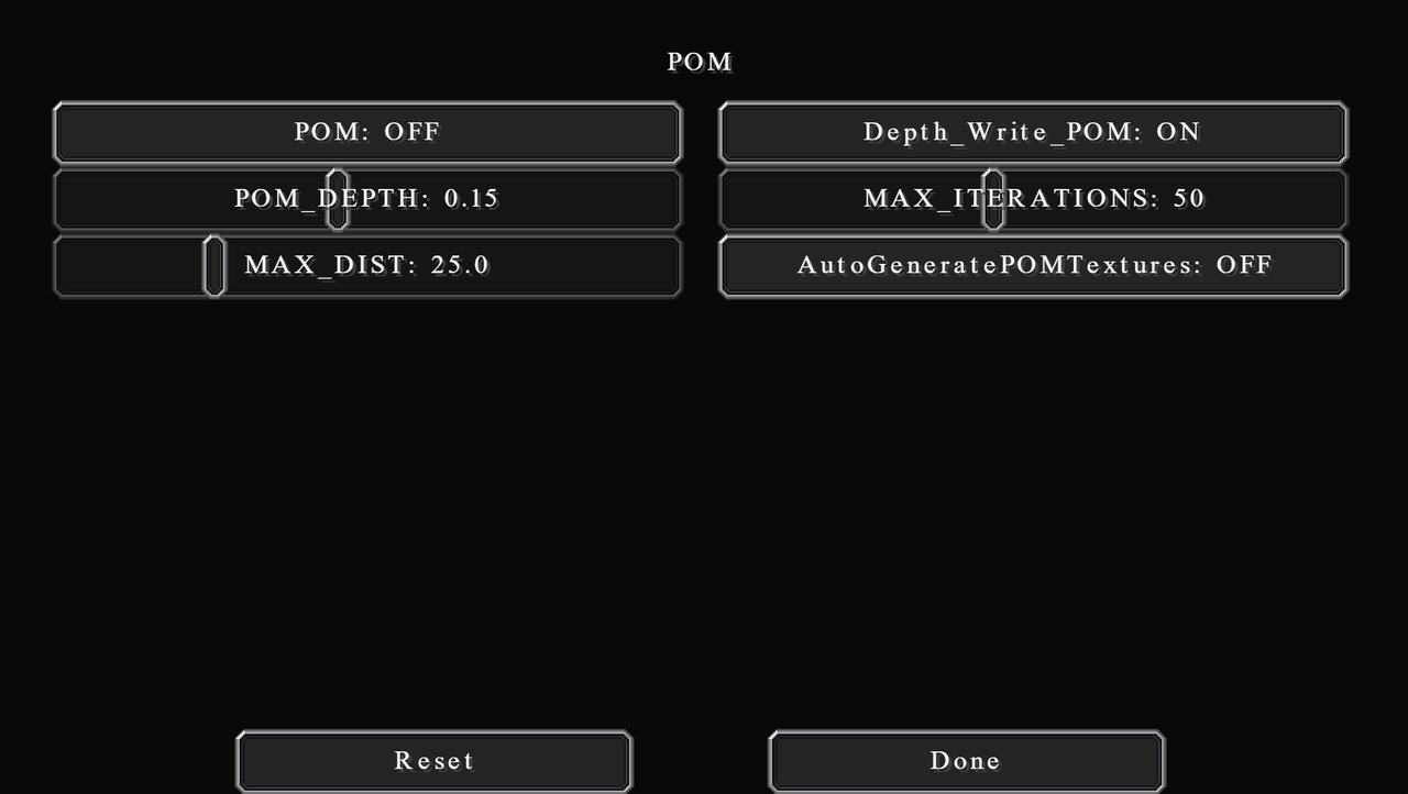
POM (Parallax Occlusion Mapping) creates 3D surfaces or textures by using parallax maps (like heightmap). I honestly have never used this option at all. But I've seen other people use them before, especially with hyper-photorealistic texture packs. In general, I don't recommend turning this on if your texture pack doesn't have a parallax map. It also is really performance-hungry.
Depth_Write_POM adjusts the position of the map so that shadows can be seen on the parallax map itself.
POM_Depth is just the POM strength.
MAX_ITERATIONS is the maximum number of light calculations on that surface.
MAX_DIST is the distance in blocks, I believe. Any further than this then POM will not be calculated.
AutoGeneratePOMTextures is a big no. Doesn't look very good, I warn you. If you don't have a POM pack then just don't use POM rather.
This is where we will be changing the look of the shader the most. The camera settings act as in-game post-processing software.
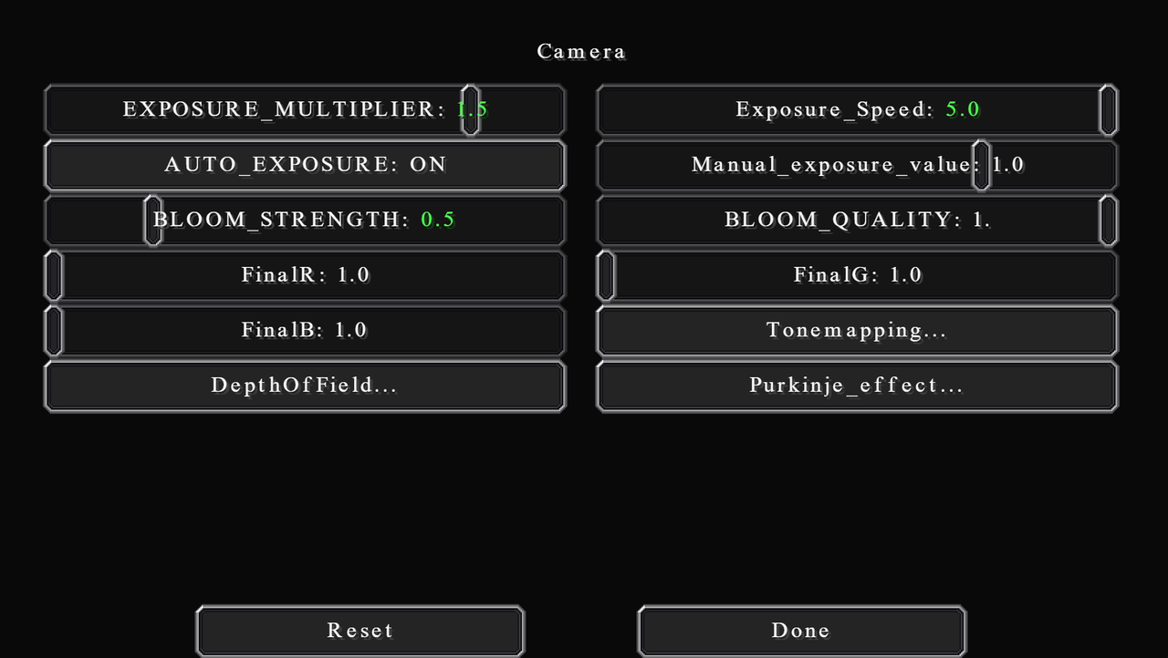
I will start by increasing EXPOSURE_MULTIPLIER to 1.5 to compensate for all lighting tweaks that we've done. You can think of this as a brightness option. The Exposure_Speed can be changed to your desire. It controls how quickly the camera adjusts to the exposure change, e.g., when changing from dark to bright area. I feel 5.0 is still rather slow but set this to whatever you like, it won't have any effect on other settings.
You can choose to use AUTO_EXPOSURE or set your own Manual_exposure_value. I recommend using AUTO_EXPOSURE, especially when you are going back and forth between dark areas and bright areas often. When taking screenshots, you can use Manual_exposure_value to get the consistency. Values between 0.2 and 0.5 work nicely in that case.
In other shaders, you kind of want to turn bloom off entirely. But I feel Chocapic's bloom is really well built and it gives a nice, well, bloomy effect. I find it a little too strong though, so I reduce BLOOM_STRENGTH to 0.5. You can also reduce BLOOM_QUALITY too if you need that little bit of performance.
You can also tweak the final colours. But in most cases you don't really want to change any of it unless you're going for an artsy look, I guess.
Tonemapping...
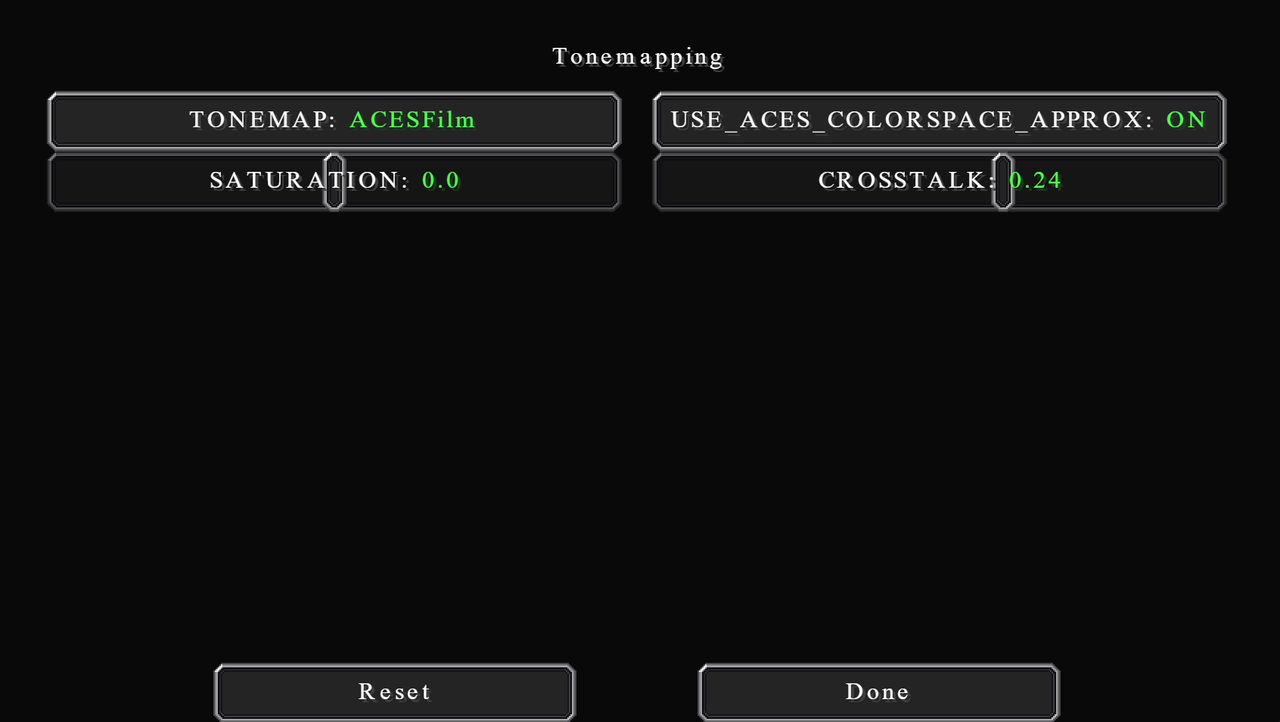
Tonemapping is a way of mapping one set of colours to another to create an HDR image from a lower dynamic range image. Different tonemap uses different colour sets / different algorithm to do so. There are many to choose from, but the ones I recommend is Uchimura (very clear at night), reinhard (more bland and neutral colours, good for colour grading), and ACESFilm (a nice cinematic look).
I personally use ACESFilm, and I also turn USE_ACES_COLORSPACE_APPROXIMATION on. I believe ACES is sort of like a standard for digital colour stuff.
Very important is SATURATION and CROSSTALK. The default look of Chocapic is crazily saturated. You really want to bring that down a lot. I bring SATURATION down to 0.0. Normally I would have gone for -0.16, but in this case, I will be reducing saturation in post afterwards, so I leave it to 0.0.
CROSSTALK controls the saturation contents of the dark and bright areas. You absolutely need to increase this, which will desaturate the bright area but saturates the dark area. I use the value of 0.24. If you want you can go even more than this. That will instead give a faded look which you may like.
DepthOfField...
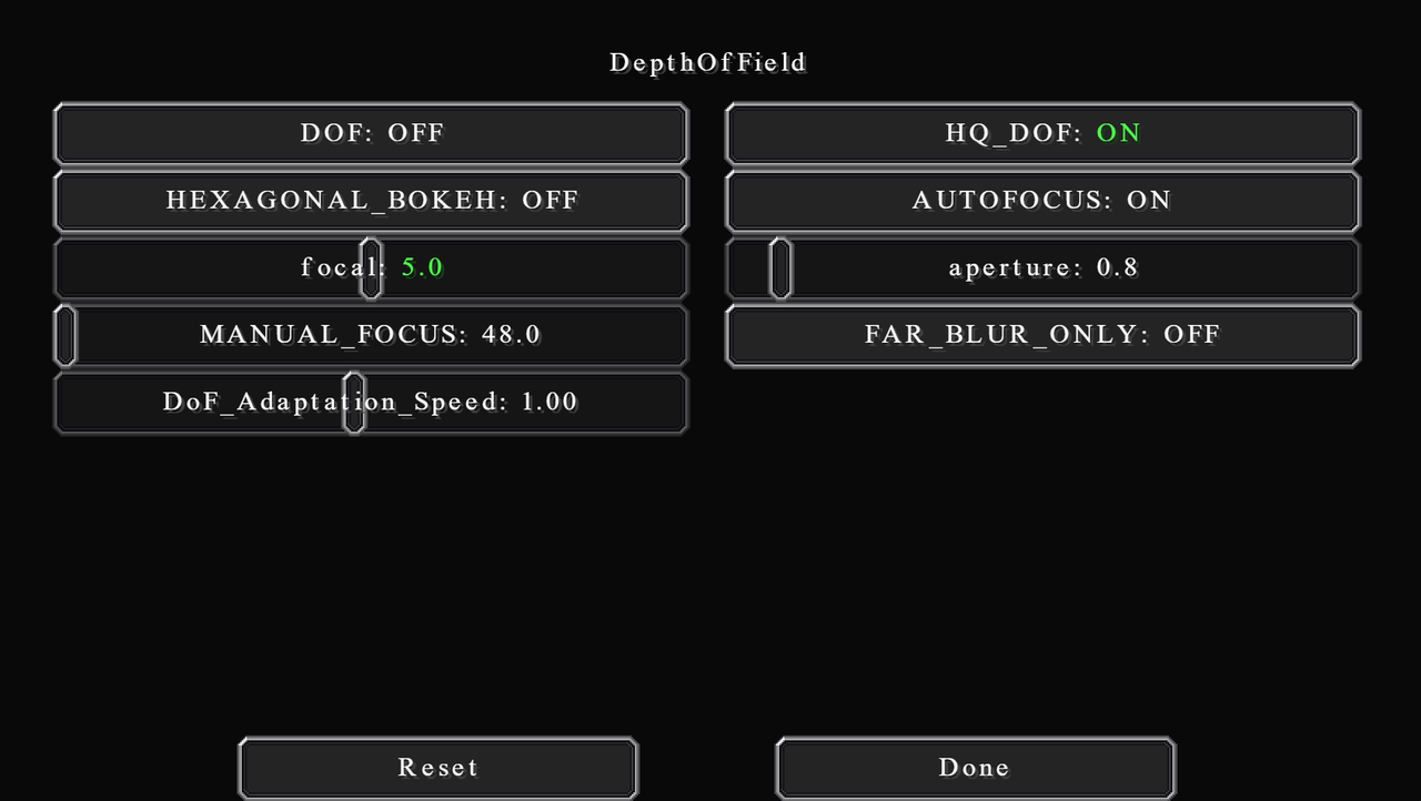
Depth of Field is an effect of objects that are far away from your subject getting more blurry. In most cases, you will want to enable this, but it is really really expensive and can easily cause a lot of FPS. I leave it off most of the time except when taking screenshots. But by no means, it's a good effect and feel free to turn it on if your computer can handle it.
You will want to enable HQ_DOF with it though. Otherwise, it will look kind of weird and funky. Another note is that if you're using ReplayMod, then disable it, or it will blur everything, due to the fact that blurs are according to player position, not camera position.
For artsy people, go for HEXAGONAL_BOKEH if you want. It changes the circular blur to the fancy hexagonal blur instead.
You will want to turn on AUTOFOCUS too. Manual focus is really hard to adjust, but sometimes it can be useful. Then for focal, this is another dynamic option which amplifies the blur effect. Adjust this to your liking. My value of 5.0 gives quite a strong DOF at close range, but a noticeable amount for a further focus.
aperture is the size of the light hole in actual camera. If you have a wider aperture, more light is let in, meaning shallower DOF. This won't change the brightness like in real life camera, however. Then adjust DoF_Adaptation_Speed to your liking. It changes how fast the camera adjusts to DOF change.
Finally, you can also enable FAR_BLUR_ONLY, which will disable DOF for objects that are closer than your focus point. It's great for when you are normally playing, in my opinion. Because then things closer to you (which you will likely interact with) aren't blurred out. This includes the item on your hand, as well.
Purkinje_effect...
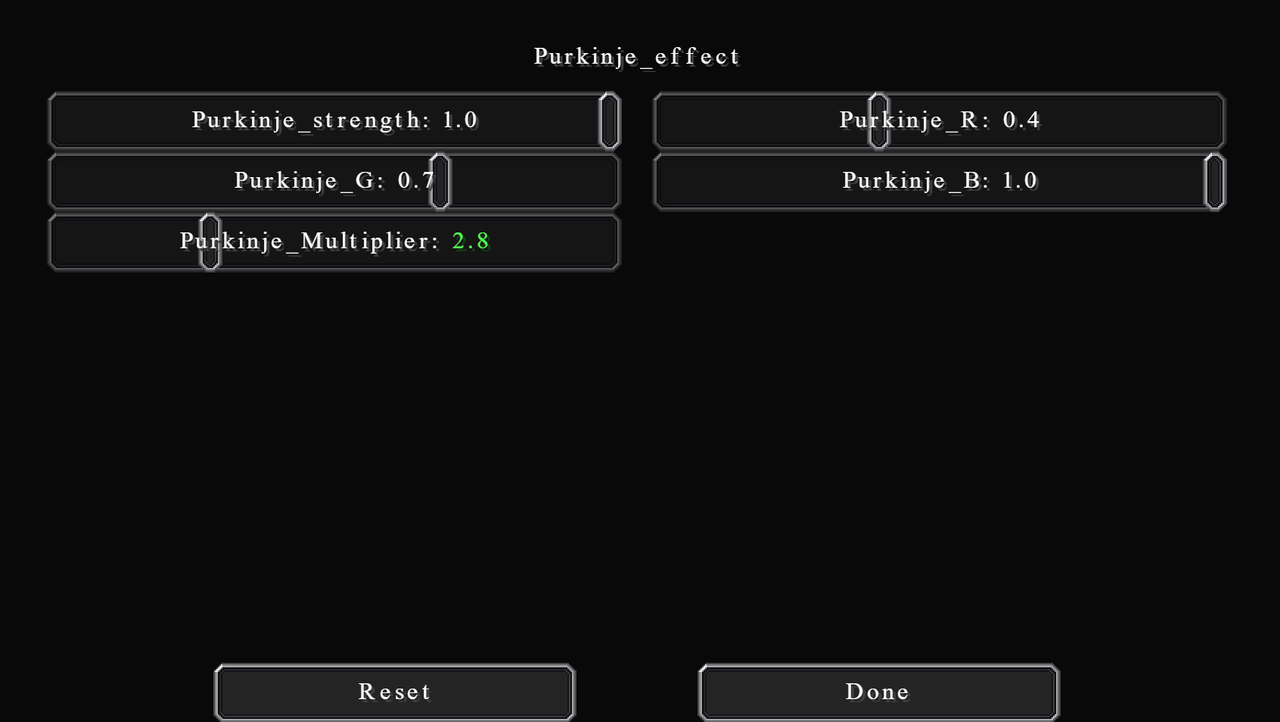
Purkinje is a real-world phenomenon that happens to human eyes. When it's dark (low amount of light), your eyes will not be able to see red as well as green, and not be able to see green as well as blue. That's why nighttime appears bluer, by the way.
Anyways, cameras don't actually see the way we do, and the same is true for simulated computer graphics. So these options are to simulate that effect.
I believe that the three colours are adjusted to approximately how it is in real life already, so I won't change them. I will, however, bring Purkinje_Multiplier down to 2.8 to reduce the effect.
TAA (Temporal Anti-Aliasing) is the only AA option for this shaderpack. If you don't know, AA is a technique that blends the colour of the edges to make them look sharper and less pixelated. It does have a pretty significant performance impact. So, if you can't handle it, turn it off, otherwise, just leave it on for better quality. This won't affect the look of the shader, just the image quality.
Increase BLEND_FACTOR to get sharper images, but also increase the amount of flickering. I set it to 0.12.
CLOSEST_VELOCITY will improve the quality of the edges when on. But it does have some performance impact. I leave it on.
NO_CLIP is a very interesting one. If turned on, this option will create a sharper image overall, but that requires anti-ghosting to be disabled. This means you will have the sort of trail effect when in motion. It's good and I recommend turning it on if you're taking still screenshots. Otherwise, for videos/playing leave it off.
TAA_UPSCALING is like increasing the render resolution in the main shader screen. TAA upscaling is significantly less expensive but will give a poorer image quality. If you want to turn this option on, make sure you set Optifine's render resolution to 1. I leave this option off.
RENDER_SCALE is the resolution multiplier when rendering TAA, both in X and Y-axis. 0.7 is good already, but if you really want that quality then increase them. Do use the same value for X and Y though.
I have some tips and tricks for taking better screenshots too, or just setting up a good image composition in general. I noticed a lot, and I mean a lot, of people don't have a good composition for their screenshots. A good shader simply isn't good enough.
By the way, to take in-game screenshots, just hit F2. Remember to also press F1 to hide GUI before taking your screenshots.
I will go over this in the order you will want to do first. Do take this guide lightly, because there are definitely some exceptions to these general rules. I recommend looking at good photographs in real life and see the composition and the lighting.
That's about it for the general screenshots tips and tricks. Remember to take this lightly, as art is flexible, and there is no strict rule.
I edit my screenshots in Lightroom too after taking screenshots with these settings on. The purpose of the edit is not necessary to change the aesthetic of the image but to make certain colours and materials appear more realistic. In particular, I focus on the colour of bricks, sandstone stuff, the woods (birch, oak, and jungle), and foliages (grass, flowers, and leaves).
I will not give any exact measure. As this is very much a personal preference. I will, instead, be talking in general about what I'm trying to achieve, and how to do so. Also note that you can use any image editing software to do this, if at all, it doesn't have to be Adobe Lightroom.
The most noticeable change is for the birch and sandstone colour. As their most common, and perhaps the only use, is as a yellowish (Bath) stone. To do that I reduce both the saturation and luminance of yellow by a very large amount. It gives a very warm grey colour, which is what I am aiming for. But you will notice this makes them look kind of weird knowing that they are sandstone and birch. A funny unexpected consequence of this is the grass path looking more like an actual dirt street, which is very good.
Secondly, I want to make bricks and similar materials (granite, dirt, jungle planks, terracotta, etc.) more brown. This is clearly a personal preference, as the areas I build in (Shropshire) have the sort of brownish weathered bricks. To do this I adjust the red hue to be noticeably more orange and reduce its saturation and luminance by a fair bit. The same is true for orange, but I only shift the hue to red by a very small amount.
These three colour changes have already taken care of most of the stuff. Another personal preference is that I make the green hue more yellow, and also reduce the luminance. This is to help add warmness to the image. Some other things I also do to give the warmness are increasing the temperature by a small amount, adding a little bit of green tint, adding a small yellowish-orange tone to the shadows, and adding a tiny ocean blue tone to the highlights.
For general lighting balance, I want to reduce the contrast between shadows and highlights. So, I bring highlights down, shadows up, whites up, and blacks down, all by a fair amount. I also reduce the final saturation and vibrance by just a tiny bit.
That's the general idea of my colour grading. I recommend if you want to do this too, play around with the sliders and see what you like. Pulling up some reference, from Instagram or Pinterest or whatever, can really help achieve the feel you want.
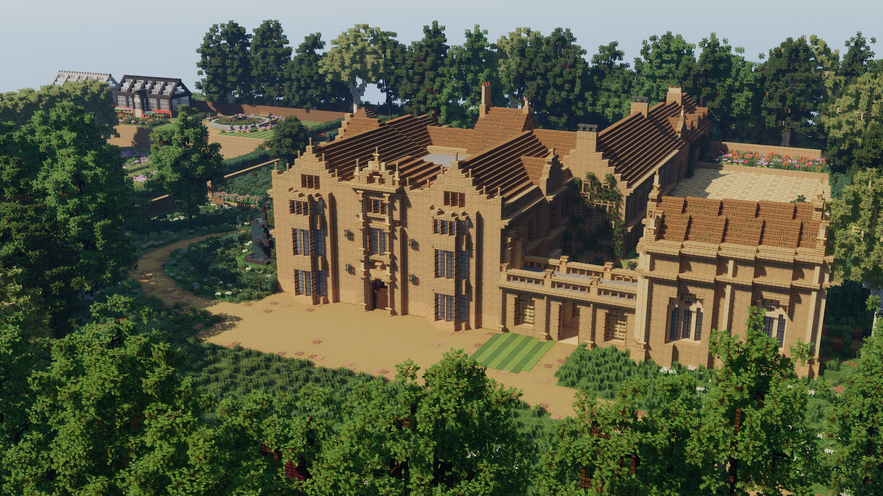
Before grading:
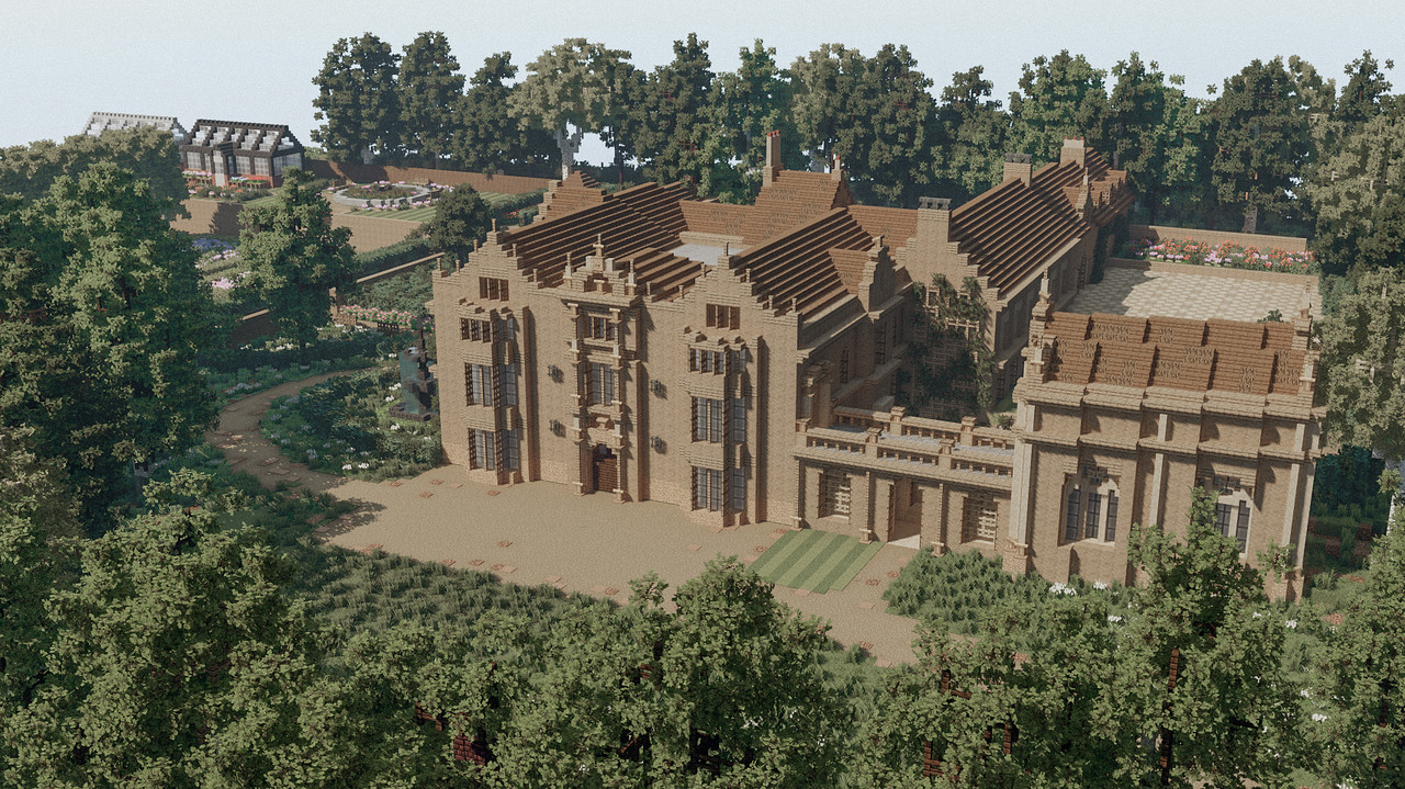
After grading:
Thank you to all these names for making this possible. And thank you to the reader for sticking to the end.
You can download Chocapic13' Shader and check out more of his stuff here. And also check out TecThor's Youtube channel.
Thank you to all creators for the awesome maps and builds I used for taking screenshots. This includes Greenfield, Vales of Amoril, and the WBC Builds server.
I use these great sites to learn about shaders: Shader Bits and The Book of Shaders.
I build on WBC builds server. You can check out more in my profile, or visit the WBC Builds discord for more information on how to join.
Hello Fellow Minecrafters!
In this blog post, we will go over every single setting in the newest version of this shaderpack as of writing this (v9.1 Extreme beta 5) in as much detail as possible, as well as the settings that I use personally. I will also cover the colour grading in post for even better screenshots. Enjoy!
A Few Things to Note...
I'll put all the links and credits and the end of this post.
Secondly, I certainly don't know all of the details about this shaderpack. You know, I didn't spend time digging in the code to see exactly what each option does or anything. This is based on just messing around and trying to find what looks best. I might be wrong on something, but do feel free to correct me.
Let's hop onto it now!
What is this shaderpack? And why do I use it?
Chocapic13' Shaders is a relatively lightweight shaderpack made by Chocapic13. Unlike others, this shaderpack actually have a very very good quality for its performance. So if you're looking for a lightweight shader to use on your potato, this is definitely the one for you. If you are not restricted on the performance, there are some heavier presets to use too.
I started using the shaderpack because it runs a lot better on my laptop, but soon realise how much this shaderpack has to offer. In my opinion, these are some pros and cons of this shaderpack when compared to other similar shaders:
Pros
• The biggest of all, is that it allows you to configure basically everything you can think of. Hundreds of parameters you can change. It's very versatile and you can get pretty much any look you want out of it.
• It runs soooo smoothly. And it's compatible with MacOS as well (because I play on a Macbook xD).
• It has one of the most realistic volumetric clouds I've ever seen. Plus there's like a dozen parameters you can tweak, just for the clouds.
• This thing has a "screenshot preset," more on that later.
Cons
• Mainly issues with how it calculates shadows. The most remarkable one is probably how it treat transparent objects.
• Leaky lights, floating shadows, all that good stuff. But not really noticeable if you don't look for them.
• Rain is just... uhmm... unrealistic, I guess. I mean it looks fine, but... eh
Selecting Versions
Mainly 4 versions are available right now, that is v6, v7, v8, and v9. Each version has 5 different presets you can choose from. Newer versions look better while consuming more performance. Generally, just go for v9 if you can. It adds a lot of important features that will make this shaderpack looks even more incredible. If not then I think v7 performs really well and is the one I use before transitioning to v9.
Now, different presets aren't just different initial settings. There are hidden settings and quality improvements that can't be configured in-game. They are according to this chart by Chocapic13.
Shader presets chart by Chocapic13
There is one exception, however. For version 9, there's a preset called "screenshots preset". To put it simply, it is not meant for playing the game normally, only for taking screenshots. If you hold the camera still, it will start sampling images to make the final screenshot. Pretty much the same as a Blender or Chunky render process but done in-game. This gives a much better image quality.
Technically there's also the Chocapic13' High-Performance Shaders. But that's its own thing, very different from what we will discuss here.
I won't be going over the installation process as it's basically the same as others shaders. There are many other tutorials online.
Shader Settings
As of version 9, there are 7 categories of settings. You can approach this settings screen by having your shader selected and go to:
| Options → Video Settings → Shaders → Shader Options |
And just in case you don't want to go through all of the settings, I've split them into categories (the same as the in-game one). This will be in the order which I think you should configure for the best result since some settings do affect others as well.
I have a rather detailed description of each setting. It will probably take quite a while to go through all of this. But if you don't want to, then I have screenshots of my settings so you can just quickly reference/copy them.
**NOTE** Some settings are marked as "dynamic". This means after the initial settings, these are the options you will regularly change depending on the look you want (conditions of the day, cloudy, sunny, foggy, etc.)
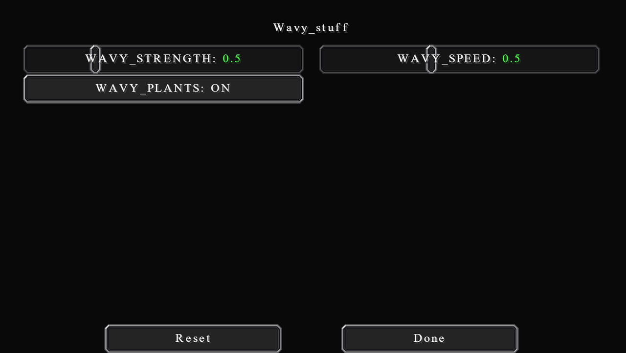
Wavy_stuff
Wavy stuff controls how leaves and foliages wave, simulating the wind effect. Dead simple and straightforward, and almost all shaders have this.
For Chocapic13' the waving is a bit too strong right out of the box. I personally reduce both the WAVY_STRENGTH and WAVY_SPEED to 0.5. You can also turn the effect off by changing WAVY_PLANTS to off.
For Chocapic13' the waving is a bit too strong right out of the box. I personally reduce both the WAVY_STRENGTH and WAVY_SPEED to 0.5. You can also turn the effect off by changing WAVY_PLANTS to off.
Water_and_transparencies
You can make a lot of changes to water with these options. The coolest thing about this is the dirt option. You can configure the amount of dirt and its colour. This option and underwater fog can change both the final colour of the water, but also its transparency very realistically.
The water settings are pretty good already, but there are some minor tweaks to the colour you could make. Realistically, I would aim for some colour between green-ish coast water and dirty, almost brown river water.
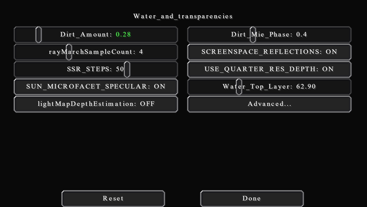
Dirt_Amount
Changes the amount of dirt in the water. The default value is 0.12, but depending on what kind of look you are going for, You can increase the amount of dirt to match the environment (river/lake/ocean).
Shallow or flowing water like rivers will have more dirt because of the turbulence that disturbs the bank. In contrast, deep or still water like oceans and lakes will have less dirt because they all sink to the bottom.
I wouldn't really recommend going below the default if you value the realistic look. However, the higher dirt amount will also change underwater visibility by a pretty drastic amount.
I set mine to 0.28, a kind of in-between value. Not so clear. A bit dirty, but not much.
Dirt_Mie_Phase
Mie is the name of a guy who works with electromagnetic waves. In graphics, it usually refers to what's known as Mie Scattering (light physics stuff). From what I understand, this option, which you can also find elsewhere, basically controls the scattering of light around the fog, or in this case, dirt. If it's set to 0, you will have a uniform distribution. If it's closer to 1, the dirt will be denser around the sun.
I just leave them at the default value of 0.4.
rayMarchSampleCount
Changes the number of samples used in raymarching (a method used to generate volumetric fog and clouds). The more samples, the more realistic, and more expensive. Here's a figure showing the difference between no sample and 3 samples.
Using four samples is already pretty decent looking. Add more if you want, or decrease it if you need more performance.

Raymarching samples comparison from shaderbits.com
SCREENSPACE_REFLECTIONS
Turn water reflection on or off. Chocapic13' uses screen space to calculate reflection, which is basically a more efficient way of doing so. But it's still pretty laggy, especially at high resolution.
This is an image showing the difference:
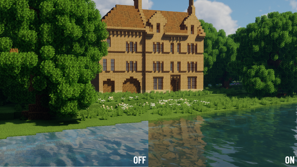
As you can see, reflections change the colour of water too. This is because when the reflection is off, the shader just uses the skymap to create a fake reflection, which gives it a light blue colour.
I leave it on for the best quality.
SSR_STEPS
Or screen space reflection steps is the number of times the reflection vector is calculated. Again, the more the steps, the more realistic and more expensive. 50 is already a good value.
USE_QUARTER_RES_DEPTH
Only uses 25% resolution for depth buffer, which increases performance. I leave it on.
SUN_MICROFACET_SPECULAR
Uses the microfacet model to reflect light. I have no idea what that is, but it looks more realistic. It has no performance impact, so just leave it on.
Water_Top_Layer
Controls the y-level of water when calculating underwater lighting stuff. Set it a bit less than your world's ocean level. For default Minecraft, it's y = 63, so the top layer is set to 62.90.
lightMapDepthEstimation
Basically, just leave it off. It's about how the shader calculates your underwater position for lighting.
Advanced...
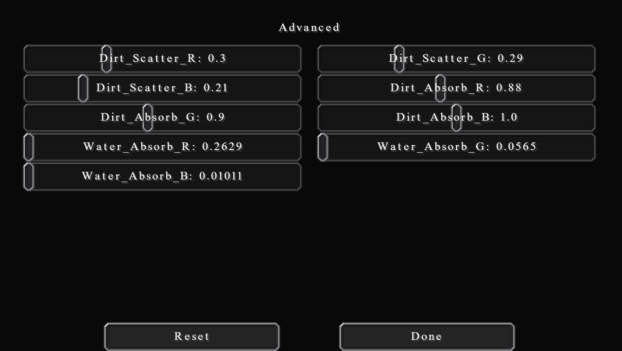
Here you will find further options to control the colour of water in the RGB (red-green-blue) format. There are 3 things you can configure: dirt scattering, dirt absorption, and water absorption.
Higher scattering value means more light of that colour is reflected out. Higher absorption value means more light of that colour is absorbed, that is, not reflected out.
You can play around with these if you like. There's no one specific configuration, but it's up to your personal preference. The default value is pretty good already. And I recommend varying dirt amounts to balance the colour out.
FAQ: Yes, you can have red or pink or purple water for you fantasy people.
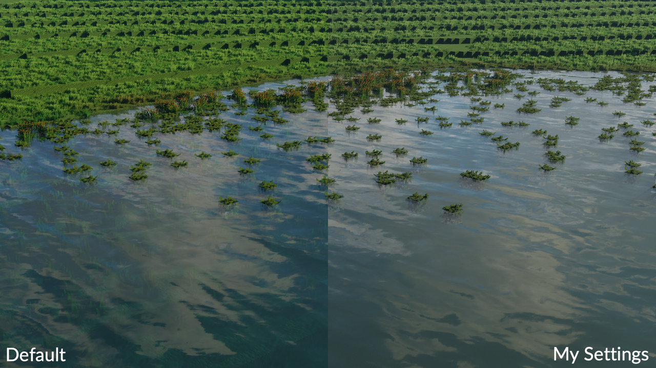
Here is the difference just by adding a bit of dirt:
The water settings are pretty good already, but there are some minor tweaks to the colour you could make. Realistically, I would aim for some colour between green-ish coast water and dirty, almost brown river water.
Dirt_Amount
Changes the amount of dirt in the water. The default value is 0.12, but depending on what kind of look you are going for, You can increase the amount of dirt to match the environment (river/lake/ocean).
Shallow or flowing water like rivers will have more dirt because of the turbulence that disturbs the bank. In contrast, deep or still water like oceans and lakes will have less dirt because they all sink to the bottom.
I wouldn't really recommend going below the default if you value the realistic look. However, the higher dirt amount will also change underwater visibility by a pretty drastic amount.
I set mine to 0.28, a kind of in-between value. Not so clear. A bit dirty, but not much.
Dirt_Mie_Phase
Mie is the name of a guy who works with electromagnetic waves. In graphics, it usually refers to what's known as Mie Scattering (light physics stuff). From what I understand, this option, which you can also find elsewhere, basically controls the scattering of light around the fog, or in this case, dirt. If it's set to 0, you will have a uniform distribution. If it's closer to 1, the dirt will be denser around the sun.
I just leave them at the default value of 0.4.
rayMarchSampleCount
Changes the number of samples used in raymarching (a method used to generate volumetric fog and clouds). The more samples, the more realistic, and more expensive. Here's a figure showing the difference between no sample and 3 samples.
Using four samples is already pretty decent looking. Add more if you want, or decrease it if you need more performance.
Raymarching samples comparison from shaderbits.com
SCREENSPACE_REFLECTIONS
Turn water reflection on or off. Chocapic13' uses screen space to calculate reflection, which is basically a more efficient way of doing so. But it's still pretty laggy, especially at high resolution.
This is an image showing the difference:
As you can see, reflections change the colour of water too. This is because when the reflection is off, the shader just uses the skymap to create a fake reflection, which gives it a light blue colour.
I leave it on for the best quality.
SSR_STEPS
Or screen space reflection steps is the number of times the reflection vector is calculated. Again, the more the steps, the more realistic and more expensive. 50 is already a good value.
USE_QUARTER_RES_DEPTH
Only uses 25% resolution for depth buffer, which increases performance. I leave it on.
SUN_MICROFACET_SPECULAR
Uses the microfacet model to reflect light. I have no idea what that is, but it looks more realistic. It has no performance impact, so just leave it on.
Water_Top_Layer
Controls the y-level of water when calculating underwater lighting stuff. Set it a bit less than your world's ocean level. For default Minecraft, it's y = 63, so the top layer is set to 62.90.
lightMapDepthEstimation
Basically, just leave it off. It's about how the shader calculates your underwater position for lighting.
Advanced...
Here you will find further options to control the colour of water in the RGB (red-green-blue) format. There are 3 things you can configure: dirt scattering, dirt absorption, and water absorption.
Higher scattering value means more light of that colour is reflected out. Higher absorption value means more light of that colour is absorbed, that is, not reflected out.
You can play around with these if you like. There's no one specific configuration, but it's up to your personal preference. The default value is pretty good already. And I recommend varying dirt amounts to balance the colour out.
FAQ: Yes, you can have red or pink or purple water for you fantasy people.
Here is the difference just by adding a bit of dirt:
Atmospherics
This is another part of this shader that is really well done. Atmospherics settings control mainly the clouds and fog. You'd be surprised how good those are in this shaderpack.
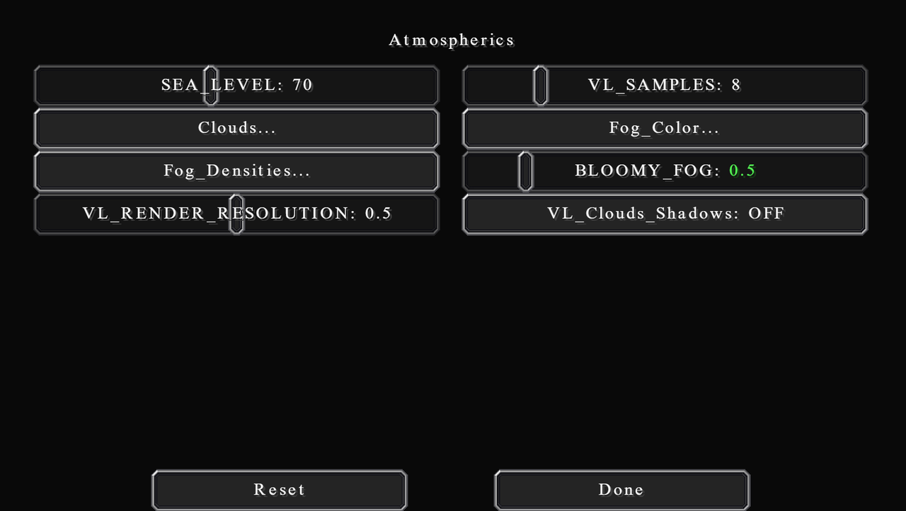
SEA_LEVEL doesn't actually control the level of the sea. But controls the y-level of fog distribution for volumetric lighting. Fog will be the densest at this level. You can change it by an increment of 10 depending on how high your world is. I just leave it at 70 for default world.
VL_SAMPLES changes the number of samples used to calculate volumetric light. Same thing, higher value is laggier but more realistic. I leave it at 8.
BLOOMY_FOG is just literally the amount of bloomy fog. The default of 1.0 is quite obstructive, in my opinion, especially at high render distance. So I reduce it to 0.5.
VL_RENDER_RESOLUTION is the render resolution used by volumetric light and fog. There isn't much of a noticeable difference between values. Increase it to 1.0 if you want, but it will be quite expensive. I just leave it at 0.5.
VL_Clouds_Shadows toggles the shadows of the volumetric clouds on or off. I recommend leaving it off except when you are taking wide aerial screenshots. In that case, it will be more realistic. You will have to enable cloud shadows in the Shadows section with this.
Clouds...

Vales of Amoril by qwryzu
Version 9.1 have some changes in clouds from v9. The default clouds in this version are absolutely tweaked to perfection already. If you're using other versions, just adjust the settings to these values.
There are, however, some settings that are personal preferences. If in case you want to adjust these settings, I will explain them in the spoiler below:
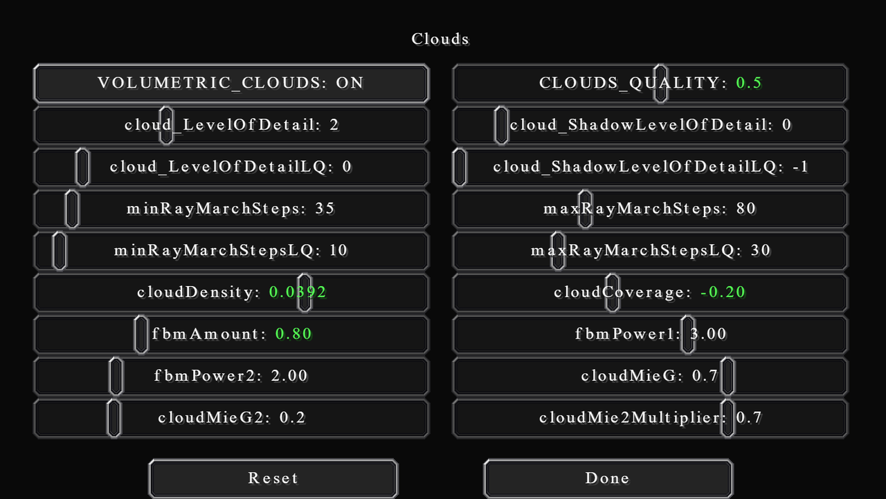
VOLUMETRIC_CLOUDS
Turn volumetric clouds on or off. If you want extra performance then you can change this to off, which will basically use vanilla clouds settings.
CLOUDS_QUALITY
The quality of clouds. Pretty self-explanatory. Not much performance impact I find. I set mine to 0.5.
cloud_LevelOfDetail
Changes the number of noise iterations used in clouds shape.
cloud_ShadowLevelOfDetail
Changes the number of noise iterations used in shadows on the clouds (not shadows of the clouds).
minRayMarchSteps and maxRayMarchSteps
The number of times to find intersections for light rays. The min and max are kind of like a gradient from the zenith to the horizon.
LQ Parameters
The four options mentioned above also have the LQ versions. It's basically the same thing but for reflections.
cloudDensity
Changes the density of the individual. This doesn't change their distribution. Lower density means the clouds are more transparent. The default value is too thick, in my opinion. So, I reduce it to 0.392.
cloudCoverage
Literally cloud coverage. How cloudy the sky is. I usually set mine to -0.20. Although, this is a dynamic option. You will come in and tweak later often depending on the look you want.
fbmAmount, fbmPower1, and fbmPower2
"fbm" stands for Fractional Brownian Motion (or fractal noise). It modulates noises by dynamically changing the frequency and amplitude. Basically, these options control the amount of noise and detail in clouds shape. Higher fbmAmount means more noise is used, which makes the clouds appear smaller.
If you want more detail on what each option actually mathematically does, visit this great site I use to learn about shaders: https://thebookofshaders.com/13/ (this link will also be at the end of this post)
I set my fbmAmount to 0.8.
cloudMeiG
Controls how light is scattered around clouds. Higher value makes the edge scatter more around the sun. Sort of like blending the clouds with the sun.
Fog_Color...
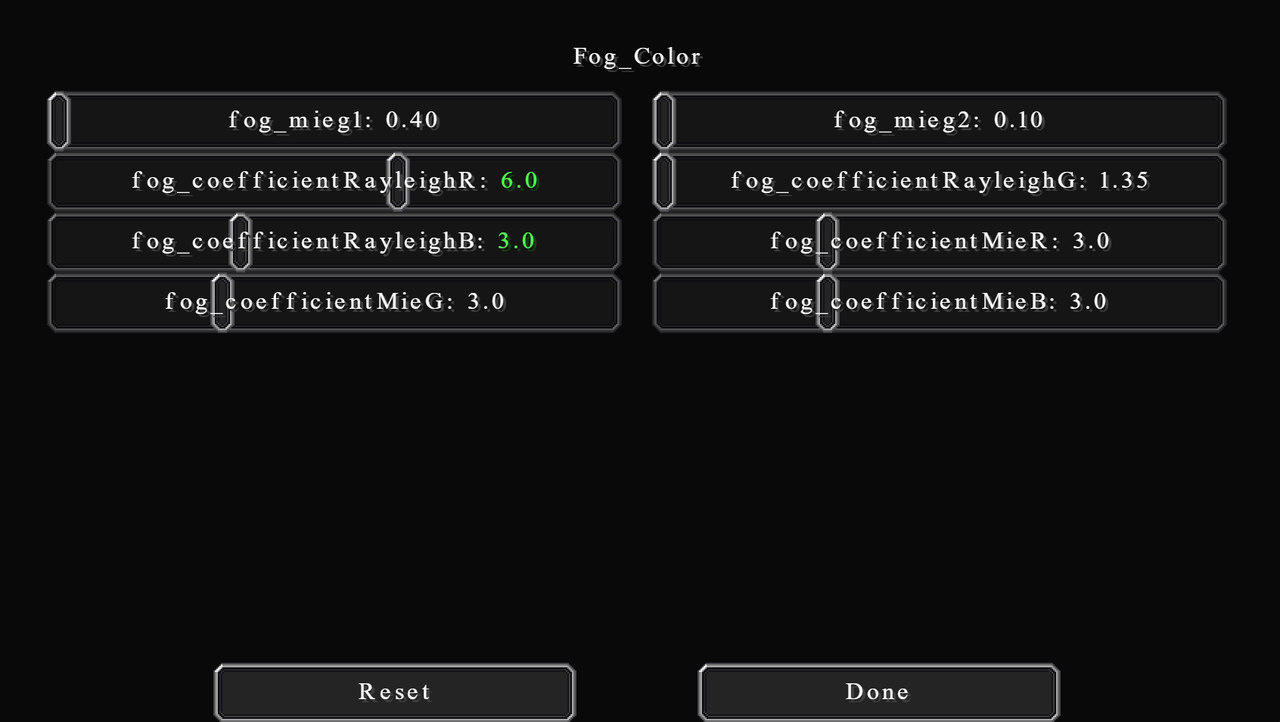
You can change 3 things here: Mie scattering, Rayleigh colour, and Mie colour. Basically, the effect of Mie is much stronger than that of Rayleigh. Turn atmospheric density up to its maximum and play around to see what you like. I recommend searching up real-life images of fog for reference.
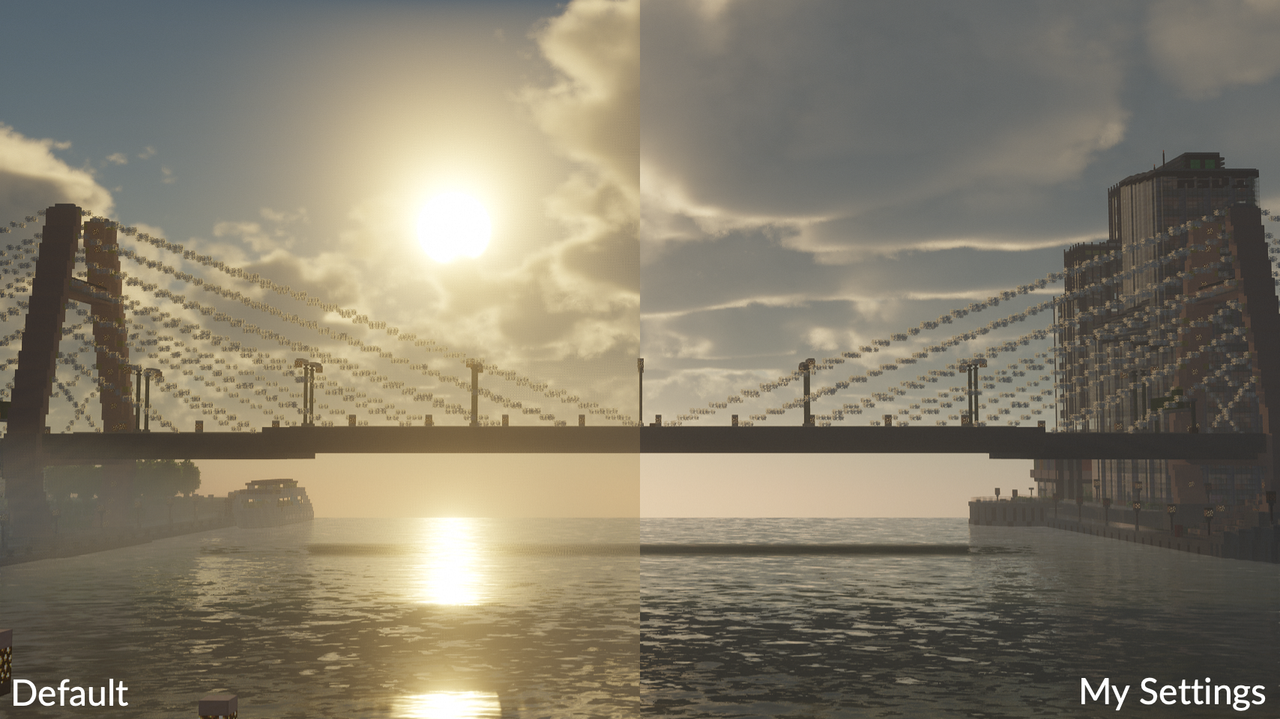
In version 9.1, Chocapic changes the atmosphere colour to be bluer. I personally don't like it that much. To balance it to a more neutral colour, I increase the RayleighR to 6.0 and decrease RayleighB to 3.0.
Fog_Densities...
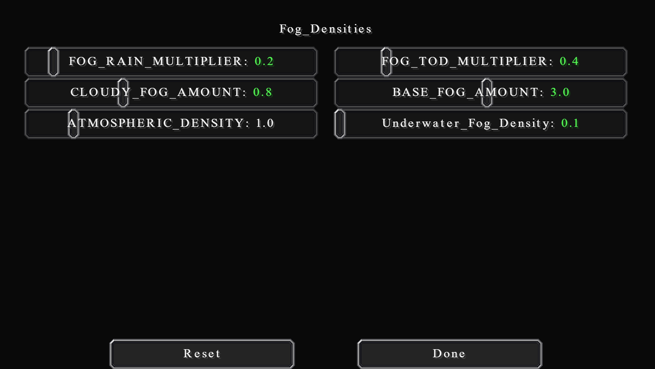
Perhaps the most important settings here are all in this category, fog densities. Here you can change the amount of fog and its density for different situations. The default settings look good but can be obstructive especially at a higher render distance. I will generally reduce all fog densities to create an atmospheric blur effect (the effect of further objects appearing less saturated because of the scattering of the atmosphere).
We will start by increasing BASE_FOG_AMOUNT to 3.0. This gives more fog especially at the distance, so you get a nice atmospheric blur effect.
To reduce the fog obstruction in the morning, at night and when raining, I reduce FOG_RAIN_MULTIPLIER to 0.2, FOG_TOD_MULTIPLIER (time of day multiplier) to 0.4, and CLOUDY_FOG_AMOUNT to 0.8.
ATMOSPHERIC_DENSITY is a dynamic option. You will come back later to increase or reduce this depending on the look you want. Normally, for sunrise and night shots, sometimes you want more fog to give that mysterious feel, sometimes you just want to see your object clearly.
Here's the difference in visibility, pretty drastic.
 Greenfield by Greenfield Build Team
SEA_LEVEL doesn't actually control the level of the sea. But controls the y-level of fog distribution for volumetric lighting. Fog will be the densest at this level. You can change it by an increment of 10 depending on how high your world is. I just leave it at 70 for default world.
VL_SAMPLES changes the number of samples used to calculate volumetric light. Same thing, higher value is laggier but more realistic. I leave it at 8.
BLOOMY_FOG is just literally the amount of bloomy fog. The default of 1.0 is quite obstructive, in my opinion, especially at high render distance. So I reduce it to 0.5.
VL_RENDER_RESOLUTION is the render resolution used by volumetric light and fog. There isn't much of a noticeable difference between values. Increase it to 1.0 if you want, but it will be quite expensive. I just leave it at 0.5.
VL_Clouds_Shadows toggles the shadows of the volumetric clouds on or off. I recommend leaving it off except when you are taking wide aerial screenshots. In that case, it will be more realistic. You will have to enable cloud shadows in the Shadows section with this.
Clouds...
Vales of Amoril by qwryzu
Version 9.1 have some changes in clouds from v9. The default clouds in this version are absolutely tweaked to perfection already. If you're using other versions, just adjust the settings to these values.
There are, however, some settings that are personal preferences. If in case you want to adjust these settings, I will explain them in the spoiler below:
Clouds settings
VOLUMETRIC_CLOUDS
Turn volumetric clouds on or off. If you want extra performance then you can change this to off, which will basically use vanilla clouds settings.
CLOUDS_QUALITY
The quality of clouds. Pretty self-explanatory. Not much performance impact I find. I set mine to 0.5.
cloud_LevelOfDetail
Changes the number of noise iterations used in clouds shape.
cloud_ShadowLevelOfDetail
Changes the number of noise iterations used in shadows on the clouds (not shadows of the clouds).
minRayMarchSteps and maxRayMarchSteps
The number of times to find intersections for light rays. The min and max are kind of like a gradient from the zenith to the horizon.
LQ Parameters
The four options mentioned above also have the LQ versions. It's basically the same thing but for reflections.
cloudDensity
Changes the density of the individual. This doesn't change their distribution. Lower density means the clouds are more transparent. The default value is too thick, in my opinion. So, I reduce it to 0.392.
cloudCoverage
Literally cloud coverage. How cloudy the sky is. I usually set mine to -0.20. Although, this is a dynamic option. You will come in and tweak later often depending on the look you want.
fbmAmount, fbmPower1, and fbmPower2
"fbm" stands for Fractional Brownian Motion (or fractal noise). It modulates noises by dynamically changing the frequency and amplitude. Basically, these options control the amount of noise and detail in clouds shape. Higher fbmAmount means more noise is used, which makes the clouds appear smaller.
If you want more detail on what each option actually mathematically does, visit this great site I use to learn about shaders: https://thebookofshaders.com/13/ (this link will also be at the end of this post)
I set my fbmAmount to 0.8.
cloudMeiG
Controls how light is scattered around clouds. Higher value makes the edge scatter more around the sun. Sort of like blending the clouds with the sun.
Fog_Color...
You can change 3 things here: Mie scattering, Rayleigh colour, and Mie colour. Basically, the effect of Mie is much stronger than that of Rayleigh. Turn atmospheric density up to its maximum and play around to see what you like. I recommend searching up real-life images of fog for reference.
In version 9.1, Chocapic changes the atmosphere colour to be bluer. I personally don't like it that much. To balance it to a more neutral colour, I increase the RayleighR to 6.0 and decrease RayleighB to 3.0.
Fog_Densities...
Perhaps the most important settings here are all in this category, fog densities. Here you can change the amount of fog and its density for different situations. The default settings look good but can be obstructive especially at a higher render distance. I will generally reduce all fog densities to create an atmospheric blur effect (the effect of further objects appearing less saturated because of the scattering of the atmosphere).
We will start by increasing BASE_FOG_AMOUNT to 3.0. This gives more fog especially at the distance, so you get a nice atmospheric blur effect.
To reduce the fog obstruction in the morning, at night and when raining, I reduce FOG_RAIN_MULTIPLIER to 0.2, FOG_TOD_MULTIPLIER (time of day multiplier) to 0.4, and CLOUDY_FOG_AMOUNT to 0.8.
ATMOSPHERIC_DENSITY is a dynamic option. You will come back later to increase or reduce this depending on the look you want. Normally, for sunrise and night shots, sometimes you want more fog to give that mysterious feel, sometimes you just want to see your object clearly.
Here's the difference in visibility, pretty drastic.
Greenfield by Greenfield Build TeamLighting
Torch...
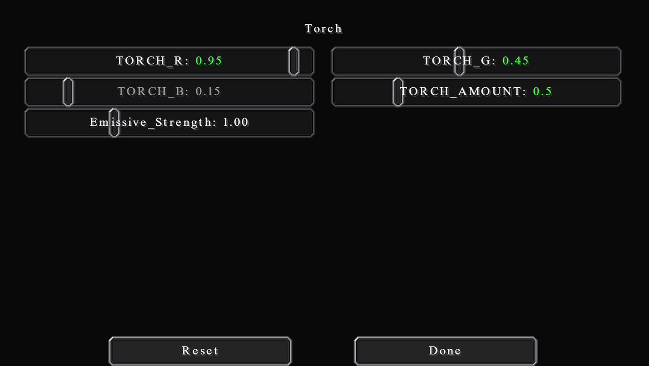
Torch, in this context, means all light sources, not just torch. This setting let you configure both the colour and emissive properties of the torch. I personally like my emissive light to be dull orange in colour. As I build in the time setting from the past, LED/Neon lights didn't exist. I aim for more like fire or gas lamp colour.
The default setting is quite good. But I find it a little too orangey. So, I reduce red to 0.95 and increase green to 0.45. Also for some odd reasons, in this version of the shader, you're not able to adjust the blue amount.
I also reduce TORCH_AMOUNT to 0.5, which unbalances the brightness, but I will account for this later.
Of course, if you want your light sources to be another colour, then feel free to do so. For bright white light, I recommend copying the settings from BSL shader, it did a really good job on the emissive light.
Another option here is Emissive_Strength, which controls the brightness of the source block and its glow. I tend to leave them at 1.00. Keep in mind that if you increase this, the shader will have to calculate additional light rays, which can affect performance.
Sky...
These are the most important settings that will help us achieve a neutral look, by altering the sky colours and sunlight/moonlight.
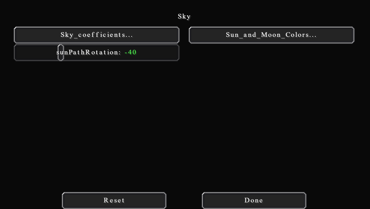
In this category, there is also the setting that you will be tweaking the most after the initial settings. sunPathRotation is a dynamic setting. It controls the angle at which the sun and moon have to the zenith at noon. Positive numbers shift them to the north side, while negative numbers are the opposite. This, with the time of day, allows you to change the sun to basically any position in the sky.
I recommend selecting one value and stick with it. By that I mean select one number, then you can use both the positive and negative version of it. That is because this value affects the colour of the light too, much like the time of day. I use the value of 40 and -40, this gives a good balance between bright white and orange colour.
If you really want that realistic factor, then it is possible to calculate this angle if you know the latitude and the time of year. You can look that up online, it's not difficult at all. Generally, though, the angle is exactly your latitude on equinox day. So if you're building NYC, then use NYC data. If you're building Sydney, then use Sydney data. And so on.
The settings here are the same as Fog_Color, only for sky colours. I won't be going over what each one does again. If you want to know that, please look back in the previous section.
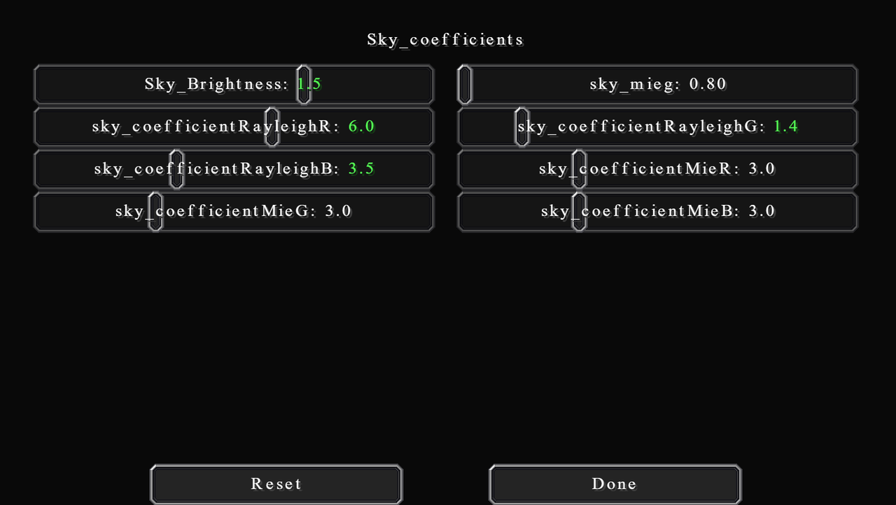
I increase Sky_Brightness to 1.5. This is because I feel the default setting is a little too dark. Keep in mind that this does not affect the light brightness at all, just the luminance of the skybox itself.
I also boosts the intensity of all colours by a tiny bit: red to 6.0, green to 1.4, and blue to 3.5. Again, I recommend keeping Mie coefficients the same and tweak Rayleigh instead. These knobs are really sensitive though, so be careful with that.
These settings will change both the colour of the sun and moon themselves and the colour of the light they emit. Basically, treat them like lighting colour settings.
I want the sun to be a lot warmer than it currently is. So, I decrease green to 0.85 and blue to 0.65. I also find nighttime a lot bluer than it should be. So, I change green to 0.95 and blue to 0.7 for moonlight.
As for their illuminance (brightness), I actually want to reduce both down to compensate for the increased exposure value in Camera Settings. I set sun_illuminance to 80000.0 and moon_illuminance to 100.0.
With these lighting tweaks, you will find that we have a better and more neutral tone of colour, and also better visibility at night. Here are the comparisons:
Sunrise (6 am)
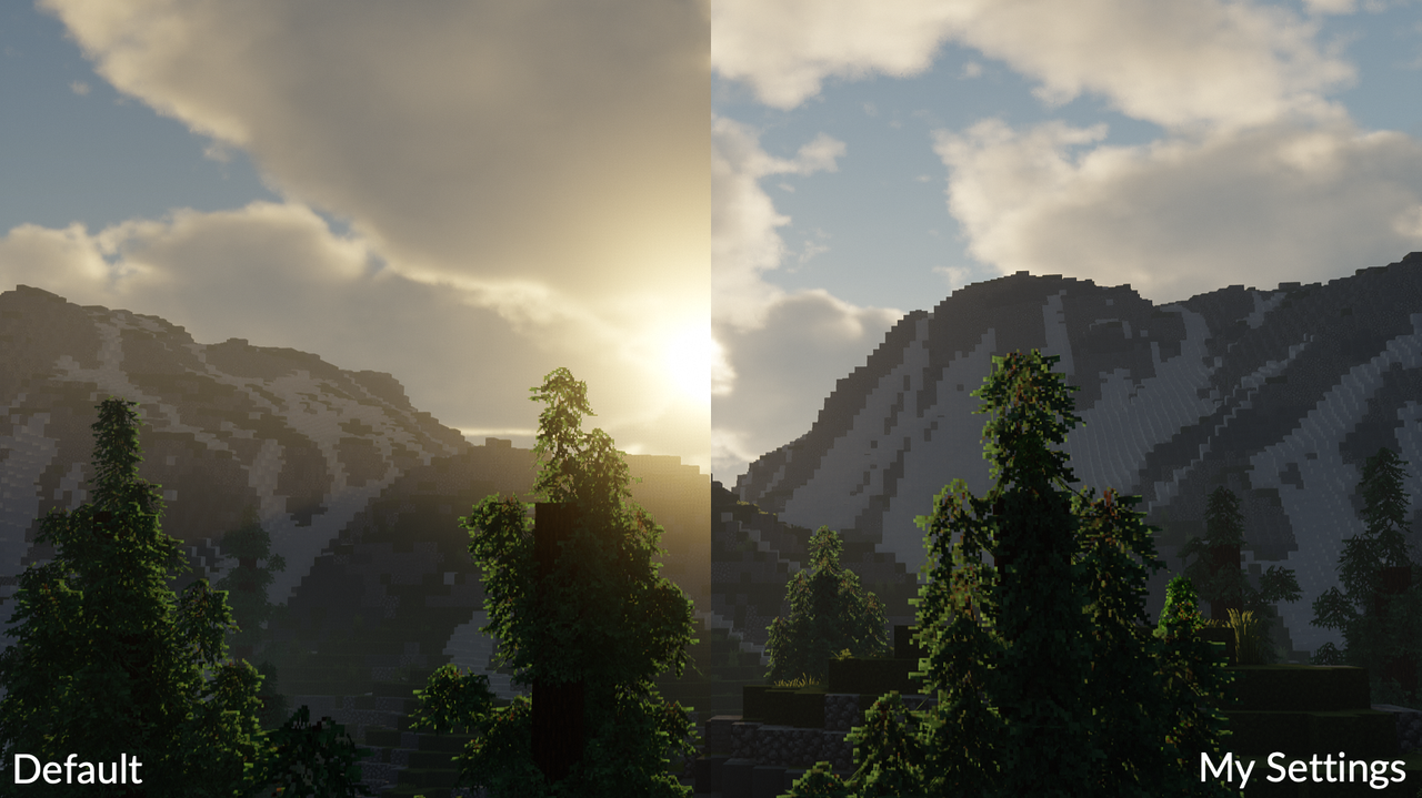
Vales of Amoril by qwryzu
Sunset (6.30 pm)
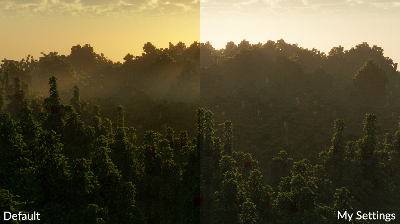
Vales of Amoril by qwryzu
Night and Emissive Light (12 am)
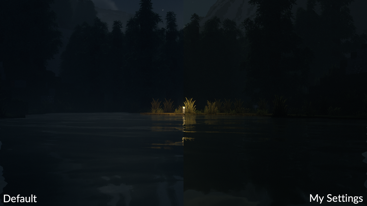
Vales of Amoril by qwryzu
Ambient...
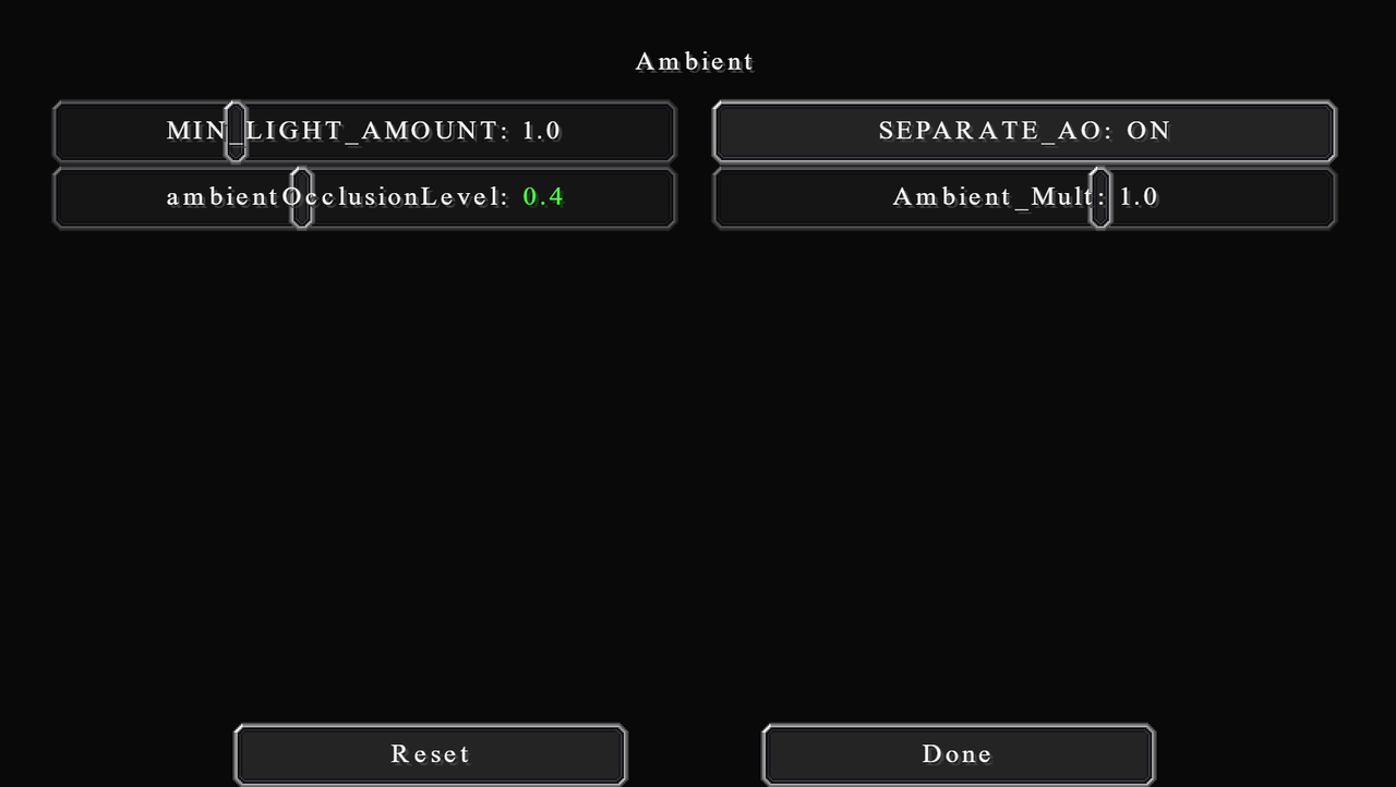
Sounds like a lot, but this category is basically just the ambient occlusion. If you don't know, ambient occlusion is an effect that darkens the corners and edges of blocks. That is because ambient light interacts with the object and your eyes in different ways depending on the surroundings.
MIN_LIGHT_AMOUNT is the minimum amount of light allowed to be rendered. This helps avoid dark spots on the screen.
SEPARATE_AO simply toggles AO on or off.
ambientOcclusionLevel controls how strong AO is. I set this to 0.4 as an in-between value; not too obvious, but noticeable.
Ambient_Mult is the AO strength multiplier.
Torch, in this context, means all light sources, not just torch. This setting let you configure both the colour and emissive properties of the torch. I personally like my emissive light to be dull orange in colour. As I build in the time setting from the past, LED/Neon lights didn't exist. I aim for more like fire or gas lamp colour.
The default setting is quite good. But I find it a little too orangey. So, I reduce red to 0.95 and increase green to 0.45. Also for some odd reasons, in this version of the shader, you're not able to adjust the blue amount.
I also reduce TORCH_AMOUNT to 0.5, which unbalances the brightness, but I will account for this later.
Of course, if you want your light sources to be another colour, then feel free to do so. For bright white light, I recommend copying the settings from BSL shader, it did a really good job on the emissive light.
Another option here is Emissive_Strength, which controls the brightness of the source block and its glow. I tend to leave them at 1.00. Keep in mind that if you increase this, the shader will have to calculate additional light rays, which can affect performance.
Sky...
These are the most important settings that will help us achieve a neutral look, by altering the sky colours and sunlight/moonlight.
In this category, there is also the setting that you will be tweaking the most after the initial settings. sunPathRotation is a dynamic setting. It controls the angle at which the sun and moon have to the zenith at noon. Positive numbers shift them to the north side, while negative numbers are the opposite. This, with the time of day, allows you to change the sun to basically any position in the sky.
I recommend selecting one value and stick with it. By that I mean select one number, then you can use both the positive and negative version of it. That is because this value affects the colour of the light too, much like the time of day. I use the value of 40 and -40, this gives a good balance between bright white and orange colour.
If you really want that realistic factor, then it is possible to calculate this angle if you know the latitude and the time of year. You can look that up online, it's not difficult at all. Generally, though, the angle is exactly your latitude on equinox day. So if you're building NYC, then use NYC data. If you're building Sydney, then use Sydney data. And so on.
Sky_coefficients...
The settings here are the same as Fog_Color, only for sky colours. I won't be going over what each one does again. If you want to know that, please look back in the previous section.
I increase Sky_Brightness to 1.5. This is because I feel the default setting is a little too dark. Keep in mind that this does not affect the light brightness at all, just the luminance of the skybox itself.
I also boosts the intensity of all colours by a tiny bit: red to 6.0, green to 1.4, and blue to 3.5. Again, I recommend keeping Mie coefficients the same and tweak Rayleigh instead. These knobs are really sensitive though, so be careful with that.
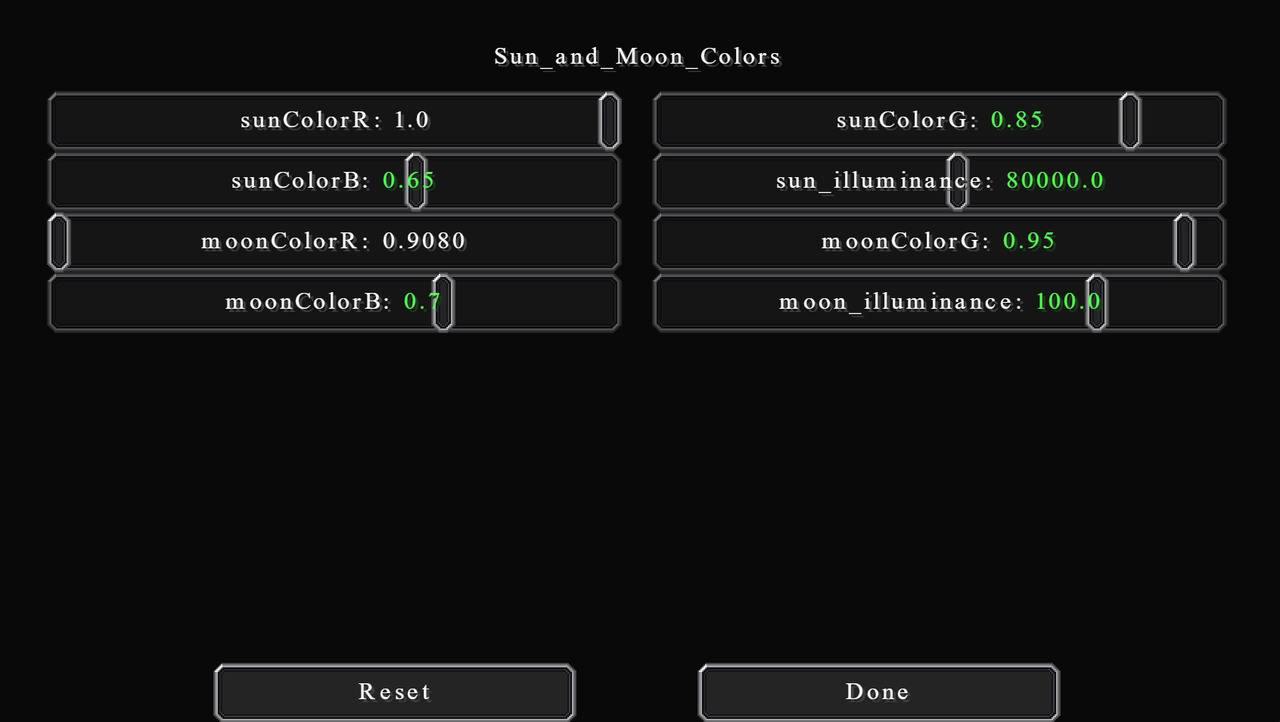
Sun_and_Moon_Colors...
These settings will change both the colour of the sun and moon themselves and the colour of the light they emit. Basically, treat them like lighting colour settings.
I want the sun to be a lot warmer than it currently is. So, I decrease green to 0.85 and blue to 0.65. I also find nighttime a lot bluer than it should be. So, I change green to 0.95 and blue to 0.7 for moonlight.
As for their illuminance (brightness), I actually want to reduce both down to compensate for the increased exposure value in Camera Settings. I set sun_illuminance to 80000.0 and moon_illuminance to 100.0.
With these lighting tweaks, you will find that we have a better and more neutral tone of colour, and also better visibility at night. Here are the comparisons:
Sunrise (6 am)
Vales of Amoril by qwryzu
Sunset (6.30 pm)
Vales of Amoril by qwryzu
Night and Emissive Light (12 am)
Vales of Amoril by qwryzu
Ambient...
Sounds like a lot, but this category is basically just the ambient occlusion. If you don't know, ambient occlusion is an effect that darkens the corners and edges of blocks. That is because ambient light interacts with the object and your eyes in different ways depending on the surroundings.
MIN_LIGHT_AMOUNT is the minimum amount of light allowed to be rendered. This helps avoid dark spots on the screen.
SEPARATE_AO simply toggles AO on or off.
ambientOcclusionLevel controls how strong AO is. I set this to 0.4 as an in-between value; not too obvious, but noticeable.
Ambient_Mult is the AO strength multiplier.
Shading
There isn't much to say about shading. These settings hugely depend on what your hardware performance can handle. So, I will go through what each setting does and how much impact it has on performance.
This category is pretty large, I'll try to arrange this so it's easy to read.
First, on the main page, Texture_Mipmap_Bias changes the level of mipmap used. If you don't know what mipmap is, it's basically a configuration of multiple copies of one image, each at a lower resolution than the previous. The more you go down (lower value), the more detailed the final image is, especially at distance. It does have some performance impact.
DISABLE_ALPHA_MIPMAPS disable transparency mipmaps of foliages. It will cost some performance if turned on.
BICUBIC_UPSCALING is a method for sharpening lower resolution images. I highly recommend turning this on if you're playing at a render resolution of less than 1. It will cost some performance in that case, but will greatly increase the image quality. Otherwise, this option doesn't really do anything at normal render resolution or higher.
CONTRAST_ADAPTIVE_SHARPENING toggles sharpening on or off. Not much impact on performance.
SHARPENING sharpens or blur image. 0.5 is a good in-between value.
Shadows...
SCREENSPACE_CONTACT_SHADOWS will add shadows to small details that would otherwise not be in the shadow map. This is super expensive at high resolution.
shadowMapResolution is how detailed the shadow map is. This is probably the option that determines how laggy your game will be. Higher value will make shadows more smooth and have less fuzzy edges. Please for the sake of God don't turn it to 16384. That value can crash anything.
CLOUDS_SHADOWS enables or disables clouds shadows. Use this together with VL_Clouds_Shadows in the atmospheric settings. Again, I recommend turning this on when taking aerial images, or if you want a cloudy look.
CLOUDS_SHADOWS_STRENGTH controls how strong the shadows of the clouds are.
If shadowDistanceRenderMul is 1.0, then shadowDistance will be linear, as in 1 unit actually means 1 block. But shadowDistance can only go as far as 256 (16 chunks). If you want anything more than that, you will have to change this option to -1.0, which will make shadowDistance non-linear (I don't know what kind of growth is used instead). With that, 128 is good for about the high-twenties render distance, 175 is good for 40 (as noted in-game).
If SHADOW_FRUSTRUM_CULLING is on, then it will not render any shadows from blocks that will not cast shadows on your POV. Greatly increases performance. It can sometimes bug out though when you turn your screen fast, but nothing crazy. Pretty much leave it on always.
CAVE_LIGHT_LEAK_FIX does what the name suggests. It isn't perfect though, but it's better than nothing. No performance impact.
SHADOW_DISABLE_ALPHA_MIPMAPS is the same as DISABLE_ALPHA_MIPMAPS but for shadows.
Stochastic_Transparent_Shadows extends the transparency rendering by using random noises, which helps achieve better transparency quality. If you want to use this option, then enable SHADOW_DISABLE_ALPHA_MIPMAPS with it, and increase Min_Shadow_Filter_Radius too.
Shadows Filtering...
Shadows filtering blurs the shadow map to make the edges look less fuzzy. You can think of Shadow_Filter_Radius as the amount of blur. This blur will start at 0 at the object the casts the shadows, and reach your Shadow_Filter_Radius amount at the edge of the shadow. However, you can configure Max_Filter_Depth to change how soon it will reach your filter radius.
If Variable_Penumbra_Shadows is on, then the radius will be dynamic, meaning that shadows will have different filter radius depending on how far they are from you. That's where the Min_Shadow_Filter_Radius and Max_Shadow_Filter_Radius options come in. If you have it off, the game will use Min_Shadow_Filter_Radius as your normal filter radius size. I find this option quite buggy though. In my case, there are certain areas on the screen that won't have any shadow at all. I leave it off, but turn it on for more realistic shadows if you can.
Finally, VPS_Search_Samples and SHADOW_FILTER_SAMPLE_COUNT are the number of samples used to calculate the filtering. More sample is more smoothly, but also laggier.
SSGI...
SSGI (Screen Space Global Illumination) adds dynamic indirect lighting to objects, which makes them incredibly realistic. It also gives the dynamic lighting effect to emissive sources. Do turn this on if possible. It makes so much difference.
What you can configure here are RAY_COUNT (number of rays to trace) STEPS (number of steps or iterations) and STEP_LENGTH (I'm not sure exactly what this does, but probably how long each ray is).
POM...
POM (Parallax Occlusion Mapping) creates 3D surfaces or textures by using parallax maps (like heightmap). I honestly have never used this option at all. But I've seen other people use them before, especially with hyper-photorealistic texture packs. In general, I don't recommend turning this on if your texture pack doesn't have a parallax map. It also is really performance-hungry.
Depth_Write_POM adjusts the position of the map so that shadows can be seen on the parallax map itself.
POM_Depth is just the POM strength.
MAX_ITERATIONS is the maximum number of light calculations on that surface.
MAX_DIST is the distance in blocks, I believe. Any further than this then POM will not be calculated.
AutoGeneratePOMTextures is a big no. Doesn't look very good, I warn you. If you don't have a POM pack then just don't use POM rather.
Camera
This is where we will be changing the look of the shader the most. The camera settings act as in-game post-processing software.
I will start by increasing EXPOSURE_MULTIPLIER to 1.5 to compensate for all lighting tweaks that we've done. You can think of this as a brightness option. The Exposure_Speed can be changed to your desire. It controls how quickly the camera adjusts to the exposure change, e.g., when changing from dark to bright area. I feel 5.0 is still rather slow but set this to whatever you like, it won't have any effect on other settings.
You can choose to use AUTO_EXPOSURE or set your own Manual_exposure_value. I recommend using AUTO_EXPOSURE, especially when you are going back and forth between dark areas and bright areas often. When taking screenshots, you can use Manual_exposure_value to get the consistency. Values between 0.2 and 0.5 work nicely in that case.
In other shaders, you kind of want to turn bloom off entirely. But I feel Chocapic's bloom is really well built and it gives a nice, well, bloomy effect. I find it a little too strong though, so I reduce BLOOM_STRENGTH to 0.5. You can also reduce BLOOM_QUALITY too if you need that little bit of performance.
You can also tweak the final colours. But in most cases you don't really want to change any of it unless you're going for an artsy look, I guess.
Tonemapping...
Tonemapping is a way of mapping one set of colours to another to create an HDR image from a lower dynamic range image. Different tonemap uses different colour sets / different algorithm to do so. There are many to choose from, but the ones I recommend is Uchimura (very clear at night), reinhard (more bland and neutral colours, good for colour grading), and ACESFilm (a nice cinematic look).
I personally use ACESFilm, and I also turn USE_ACES_COLORSPACE_APPROXIMATION on. I believe ACES is sort of like a standard for digital colour stuff.
Very important is SATURATION and CROSSTALK. The default look of Chocapic is crazily saturated. You really want to bring that down a lot. I bring SATURATION down to 0.0. Normally I would have gone for -0.16, but in this case, I will be reducing saturation in post afterwards, so I leave it to 0.0.
CROSSTALK controls the saturation contents of the dark and bright areas. You absolutely need to increase this, which will desaturate the bright area but saturates the dark area. I use the value of 0.24. If you want you can go even more than this. That will instead give a faded look which you may like.
DepthOfField...
Depth of Field is an effect of objects that are far away from your subject getting more blurry. In most cases, you will want to enable this, but it is really really expensive and can easily cause a lot of FPS. I leave it off most of the time except when taking screenshots. But by no means, it's a good effect and feel free to turn it on if your computer can handle it.
You will want to enable HQ_DOF with it though. Otherwise, it will look kind of weird and funky. Another note is that if you're using ReplayMod, then disable it, or it will blur everything, due to the fact that blurs are according to player position, not camera position.
For artsy people, go for HEXAGONAL_BOKEH if you want. It changes the circular blur to the fancy hexagonal blur instead.
You will want to turn on AUTOFOCUS too. Manual focus is really hard to adjust, but sometimes it can be useful. Then for focal, this is another dynamic option which amplifies the blur effect. Adjust this to your liking. My value of 5.0 gives quite a strong DOF at close range, but a noticeable amount for a further focus.
aperture is the size of the light hole in actual camera. If you have a wider aperture, more light is let in, meaning shallower DOF. This won't change the brightness like in real life camera, however. Then adjust DoF_Adaptation_Speed to your liking. It changes how fast the camera adjusts to DOF change.
Finally, you can also enable FAR_BLUR_ONLY, which will disable DOF for objects that are closer than your focus point. It's great for when you are normally playing, in my opinion. Because then things closer to you (which you will likely interact with) aren't blurred out. This includes the item on your hand, as well.
Purkinje_effect...
Purkinje is a real-world phenomenon that happens to human eyes. When it's dark (low amount of light), your eyes will not be able to see red as well as green, and not be able to see green as well as blue. That's why nighttime appears bluer, by the way.
Anyways, cameras don't actually see the way we do, and the same is true for simulated computer graphics. So these options are to simulate that effect.
I believe that the three colours are adjusted to approximately how it is in real life already, so I won't change them. I will, however, bring Purkinje_Multiplier down to 2.8 to reduce the effect.
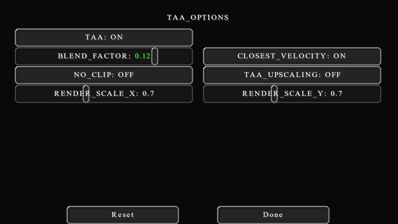
TAA_OPTIONS
TAA (Temporal Anti-Aliasing) is the only AA option for this shaderpack. If you don't know, AA is a technique that blends the colour of the edges to make them look sharper and less pixelated. It does have a pretty significant performance impact. So, if you can't handle it, turn it off, otherwise, just leave it on for better quality. This won't affect the look of the shader, just the image quality.
Increase BLEND_FACTOR to get sharper images, but also increase the amount of flickering. I set it to 0.12.
CLOSEST_VELOCITY will improve the quality of the edges when on. But it does have some performance impact. I leave it on.
NO_CLIP is a very interesting one. If turned on, this option will create a sharper image overall, but that requires anti-ghosting to be disabled. This means you will have the sort of trail effect when in motion. It's good and I recommend turning it on if you're taking still screenshots. Otherwise, for videos/playing leave it off.
TAA_UPSCALING is like increasing the render resolution in the main shader screen. TAA upscaling is significantly less expensive but will give a poorer image quality. If you want to turn this option on, make sure you set Optifine's render resolution to 1. I leave this option off.
RENDER_SCALE is the resolution multiplier when rendering TAA, both in X and Y-axis. 0.7 is good already, but if you really want that quality then increase them. Do use the same value for X and Y though.
Taking Good Screenshots
I have some tips and tricks for taking better screenshots too, or just setting up a good image composition in general. I noticed a lot, and I mean a lot, of people don't have a good composition for their screenshots. A good shader simply isn't good enough.
By the way, to take in-game screenshots, just hit F2. Remember to also press F1 to hide GUI before taking your screenshots.
I will go over this in the order you will want to do first. Do take this guide lightly, because there are definitely some exceptions to these general rules. I recommend looking at good photographs in real life and see the composition and the lighting.
| Lower the FOV This is an easy, but important thing. Stepping further away and limiting your view to a smaller area helps with the distortion. Things that are close to the edge of the image are naturally stretched, due to the light coming at you from an angle. By reducing that angle (limiting your FOV), you are also reducing the distortion at the edges. You can change the FOV in the main Options screen. Go as low as possible. I stick to 30 for the most part. But when you are taking screenshots in a tight space, I recommend the value no more than 50. |
| Lighting Conditions Think about the final screenshots. What kind of day is it? How do you want it to feel? What time in the day is it? You will also need to think about what are you trying to capture. If there is a subject, then what angle do you want to capture it. With those pieces of information, you can try to position the sun by changing the time of day and sun path rotation. A good general tip is to have at least two sides of the subject visible to you, with one side lit with direct sunlight, and another side occluded by shadows. This will give the image more depth than it actually has. After all, that is why you turn on the shader in the first place. Generally, you should have more bright areas than dark areas. Details in the dark area are hard to see, and you should absolutely never go all dark. That is true unless you are willing to give up details for the artistic purpose, like this one, for example: 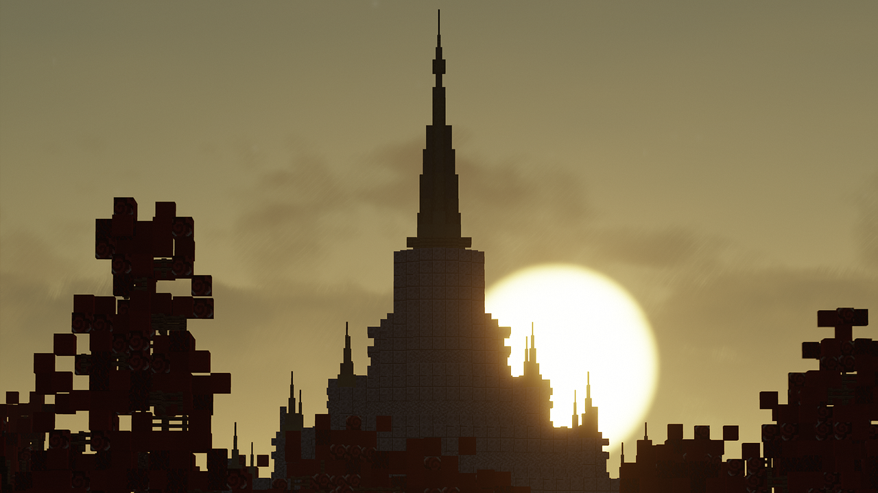 |
| Adjust the Composition Composition is the most important part of an image, in my opinion. There are loads of ways and techniques to compose your images. It's more of a creativity thing, or personal preference even. In general, though, there are some vague rules you can use as a guideline. Have multiple layers to your image. It gives the feeling of depth. You can have three simple layers: foreground, middle ground, and background. Most of the time your subject of focus will be in either foreground or middle ground. Having a foreground is great to draws the attention to other parts of the image. Middle grounds tend to be what you are trying to show, or an important feature of that image. Backgrounds help add context to your image. It is a good way to make the image more immersive with the environment. You can also use a temporary background to give the feel of completeness, for example, try adding some trees and flowers to your stand-alone building instead of a blank sky. If you have a permanent context, though; if you are building a city, for example, you will have to find a view that gives a nice composition to your image and is also not obstructive/distracting. This is typically hard to do, so I recommend, if not too late, to structure your city around viewpoints. Having several centres of attention scattered around your town can really help and is a good general way to plan a town. You can make use of the simple 3 layers concept to create interesting compositions. Here are some of my favourites: 1. Putting foreground at the bottom, middle ground in the middle, and background at the top. This is especially good for when you don't have one particular subject matter, in my opinion.  Holmesbridge by Ozzy 2. Making use of something I called "View Corridor". This technique emphasises the centre of attention, which is usually in the middle of the image, by occluding both sides of the image (or even the top and bottom) with something less important. This is great for taking an image of a street in particular. Have something at the end or in the middle of the street to capture the attention.  3. Contrasting the foreground with the middle ground and background. Usually, you would make the foreground dark or completely black and have either light background and foreground or light background but a dark middle ground. The latter is very hard to replicate in-game though. This lets the dark foreground tell the story, but not necessarily be the main focus of the image. You can learn more about this particular lighting technique in this video by Soulburn Studio. |
That's about it for the general screenshots tips and tricks. Remember to take this lightly, as art is flexible, and there is no strict rule.
Colour Grading Guide
I edit my screenshots in Lightroom too after taking screenshots with these settings on. The purpose of the edit is not necessary to change the aesthetic of the image but to make certain colours and materials appear more realistic. In particular, I focus on the colour of bricks, sandstone stuff, the woods (birch, oak, and jungle), and foliages (grass, flowers, and leaves).
I will not give any exact measure. As this is very much a personal preference. I will, instead, be talking in general about what I'm trying to achieve, and how to do so. Also note that you can use any image editing software to do this, if at all, it doesn't have to be Adobe Lightroom.
The most noticeable change is for the birch and sandstone colour. As their most common, and perhaps the only use, is as a yellowish (Bath) stone. To do that I reduce both the saturation and luminance of yellow by a very large amount. It gives a very warm grey colour, which is what I am aiming for. But you will notice this makes them look kind of weird knowing that they are sandstone and birch. A funny unexpected consequence of this is the grass path looking more like an actual dirt street, which is very good.
Secondly, I want to make bricks and similar materials (granite, dirt, jungle planks, terracotta, etc.) more brown. This is clearly a personal preference, as the areas I build in (Shropshire) have the sort of brownish weathered bricks. To do this I adjust the red hue to be noticeably more orange and reduce its saturation and luminance by a fair bit. The same is true for orange, but I only shift the hue to red by a very small amount.
These three colour changes have already taken care of most of the stuff. Another personal preference is that I make the green hue more yellow, and also reduce the luminance. This is to help add warmness to the image. Some other things I also do to give the warmness are increasing the temperature by a small amount, adding a little bit of green tint, adding a small yellowish-orange tone to the shadows, and adding a tiny ocean blue tone to the highlights.
For general lighting balance, I want to reduce the contrast between shadows and highlights. So, I bring highlights down, shadows up, whites up, and blacks down, all by a fair amount. I also reduce the final saturation and vibrance by just a tiny bit.
That's the general idea of my colour grading. I recommend if you want to do this too, play around with the sliders and see what you like. Pulling up some reference, from Instagram or Pinterest or whatever, can really help achieve the feel you want.
Before grading:
After grading:
Credits and Extra Links
Thank you to all these names for making this possible. And thank you to the reader for sticking to the end.
You can download Chocapic13' Shader and check out more of his stuff here. And also check out TecThor's Youtube channel.
Thank you to all creators for the awesome maps and builds I used for taking screenshots. This includes Greenfield, Vales of Amoril, and the WBC Builds server.
I use these great sites to learn about shaders: Shader Bits and The Book of Shaders.
I build on WBC builds server. You can check out more in my profile, or visit the WBC Builds discord for more information on how to join.
| Tags |
tools/tracking
5062833
6
all-in-one-guide-to-chocapic13-shaders-settings


 ajthepeach
 hotsuop
 Copterman2596
 voktorka
 GalaxyDragon245
 BLACKMAGE_NEW_GHOSTE
 Monarque
 User5125740G

 GalaxyCat24


Create an account or sign in to comment.
on the blog: awesome article