
• 3/21/26 11:26 pm
- 337 views • 0 today
Added Credityojomann_ - plank color palette
- 20
- 13

57
i decided to make a tutorial on color theory because i've heard so many people say color theory is hard, so hopefully this will help!
it was originally going to be a basic tutorial but i talk too much and less than halfway through writing this i realized its probably not basic :D
if you've ever made any kind of art, or even if you haven't, you probably know what color is, so i'm not going to explain that here.
however, i will list the three different color models and explain the difference between additive and subtractive colors.
for painting and drawing:
primary colors:
1. red
2. blue
3. yellow
primary colors are the three basic colors that can be mixed (along with black and white) to create any color.
secondary colors
1. orange
2. green
3. purple
secondary colors are made by mixing two of the primary colors.
tertiary colors
1. red-orange
2. red-violet
3. yellow-orange
4. yellow-green
5. blue-green
6. blue-violet
tertiary colors are made by mixing a primary and a secondary color.
printing and light:
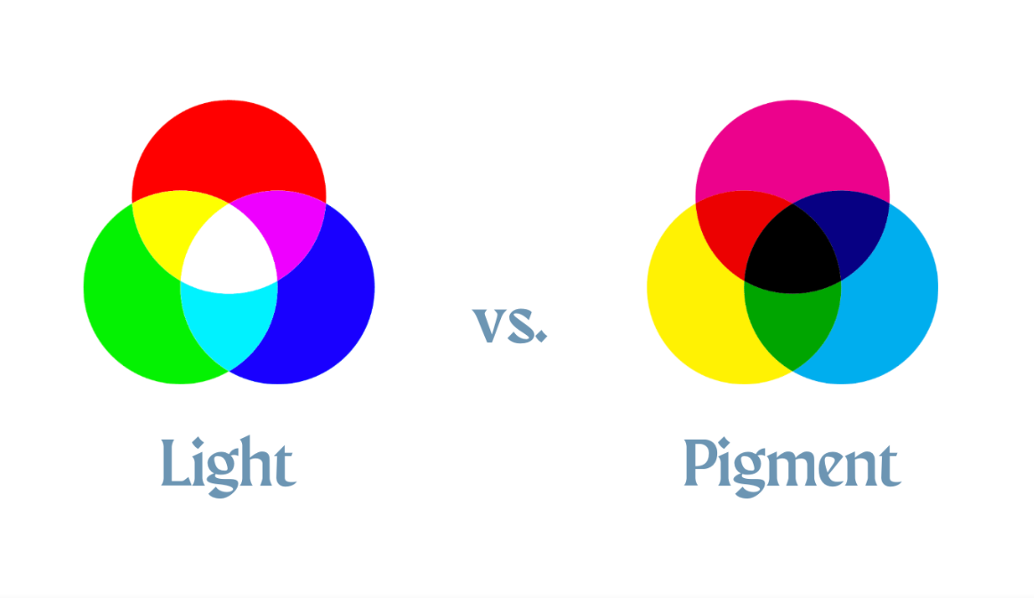
there are three main colors for light (additive): red, green, and blue (rgb). when they are equally combined, they create white.
for pigment colors (subtractive), the main colors are cyan, magenta, and yellow (cmy), which combined equally make a dark brown (which is why sometimes you'll see cmyk, k meaning key/black)
four of the most common color codes you'll see are rgb, hex, hsl, and hsv. i'll explain them all briefly but you can just skip this section if you want.
rgb is an additive color code, and the colors are represented like so: (red, green, blue)
numbers from 0 to 255 are used for the scales. for example, (0, 0, 0) is black, while (255, 255, 255) is white.
(255, 0, 0) is pure red,
(0, 255, 0) is green,
(0, 0, 255) is blue, etc.
there are 16,777,216 possible colors in rgb. (and probably all the other ones, i didn't want to count)
the hex (hexadecimal) color code is almost the same as rgb, except with letters and math.
hex is represented as a 6 digit code: #RRGGBB
the difference is that hex uses numbers 0-9 and then letters A-F
(A = 10, B = 11, .. F = 15)
these are very similar color codes, but you will see them less often than rgb and hex.
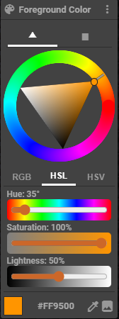
hsl stands for hue, saturation, and lightness.
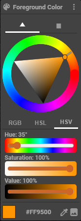
hsv stands for hue, saturation, and value.
the difference is that in hsl (the lightness one), 100% lightness is white, 0% is black, and 50% is the pure color.
in hsv (value), 100% value is the pure color, and 0% is black. to get white you would put saturation to 0% and value to 100%
now we can talk about the actual color theory part ;)
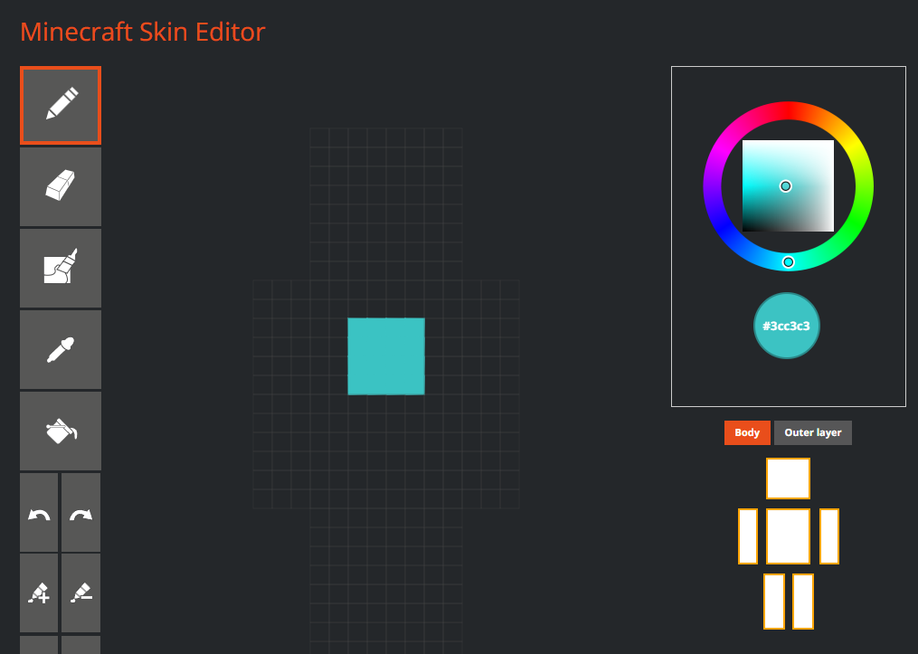
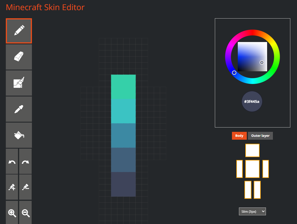
the first thing you think about when you imagine color is hue. its the outer ring on the color wheel (i'm going to use skindex's editor because i like it better)
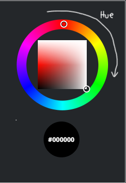
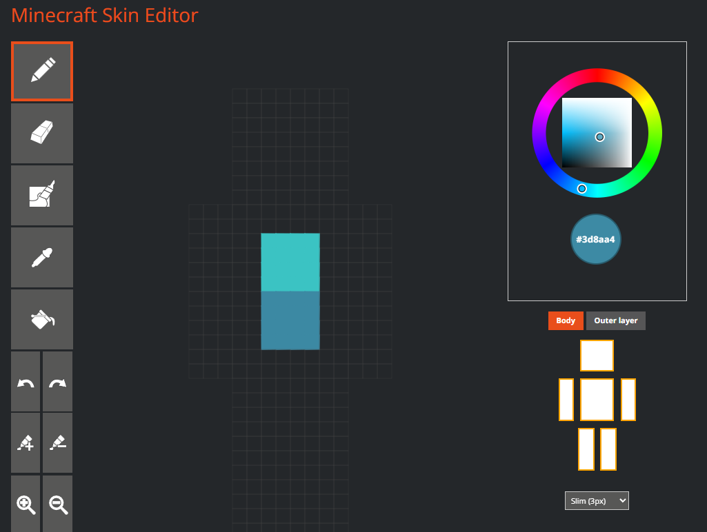
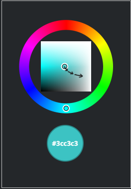
you might have heard of hueshifting in terms of shading. the concept is that the hue gets more purple the darker the color gets, and more yellow the lighter it gets. here is an example:
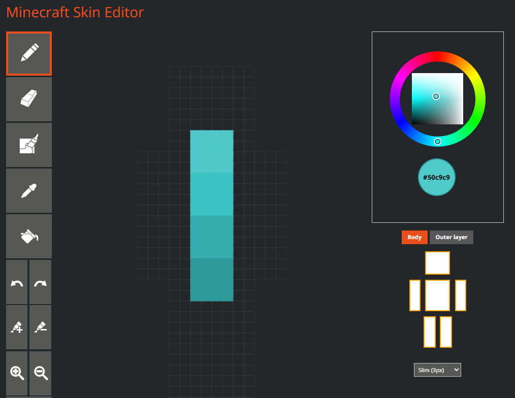
this is using skindex's shade feature (the paint tubes with + and - signs) you can see that its one color. but in real life, shadows usually aren't one color. so using hueshifting, we can replicate the purpleish shadows, and yellowish highlights from reality. obviously the hueshifting is different for each color.
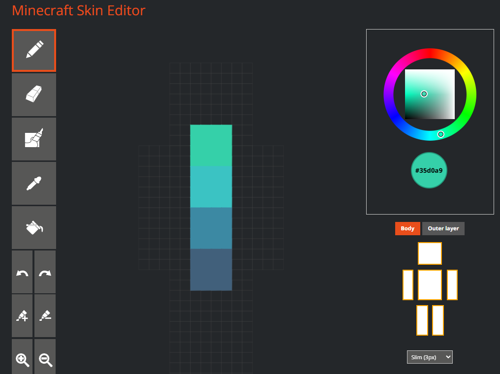
this is using hueshifting, which i will explain in more detail at the end.
value, or shade, is the white and black parts of the color wheel. in skindex's, its vertical.
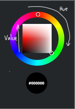
the left side is the value scale, meaning the top is white, the bottom is black, and the middle is pure color.
the right side is the lightness scale, meaning the middle is gray instead of color (think back to the hsv and hsl codes)
a shade is when you add black to a color to make it darker.
a tint is when you add white to make it lighter.
now obviously when you are shading something, the shadows are going to be darker than the base color, and highlights are going to be lighter.
saturation is how much of the pure color you have. its horizontal on skindex's color wheel.
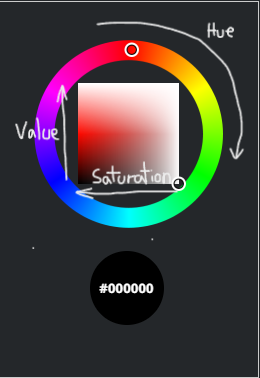
on the left side it will be the purest hue, and going to the right, it will get less saturated.
if you like really blinding colors, you can use that, but i prefer less saturated colors because you will rarely see pure hues in nature. (and i want my eyes to like me)
for shading, when the value gets darker, it also gets less saturated. when the color gets lighter, the saturation goes up.
a tone is when you add gray to desaturate a color.
this is the fun part! when i shade a skin (or any kind of art) i looovvee to use hueshifting.
there's so many ways to hueshift, so i'm just going to show you the one i use.
i start with the base color.
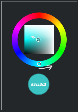
then, looking at the color wheel, i move the hue slightly towards purple, the value towards black, and i also make it less saturated.
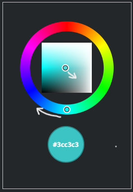
i dont move the one in the square drastically, usually i'll just move it to the edge of the white circle.
but the hue i change a little more, about twice the size of the cursor.
then i keep doing that for the shadows.
for highlights, i don't like to make it a lot brighter, but i make it more saturated.
basically just the opposite of doing a darker shade.
i usually do 3 shades and a highlight.
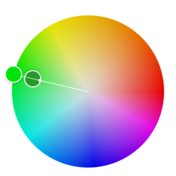
one part i did not show was that the darker i get, the more i desaturate it. like the first shade i'll desaturate the same amount that i darkened it. then the next one ill double the desaturation but keep the darkness the same. if that's confusing, here's an example.
how do you find colors that look good together? how do you make a color palette?
the answer is color schemes!
there are 7 color schemes that we will talk about. these examples are assuming your color wheel has 12 colors. (3 primary, 3 secondary, 6 tertiary)
i am using the adobe color wheel
1. monochromatic = 1 color. you can change the value and saturation, but not the hue. (for those who need to have hueshifting, this is not for you)
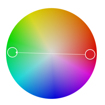
2. complementary = 2 colors. the base color + the color opposite on the color wheel.
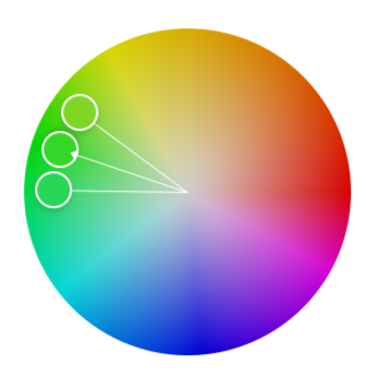
3. analogous = 3 colors. this includes the base color, and two colors on either side of it.
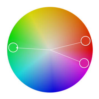
4. split-complementary = 3 colors. the base color, and then the two next to the complementary.
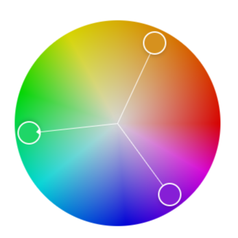
5. triadic = 3 colors that are equal distances from each other on the color wheel, forming a triangle.
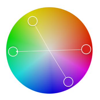
6. tetradic = 4 colors, two main colors and their complementary colors.
7. square = 4 colors that are evenly spaced around the color wheel.
if you choose one of these, you can still add more colors. artists commonly add an accent color or two. (or 14) just make sure the accent color is minimal.
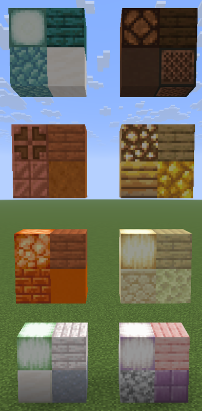
if you are building something in minecraft, there are so many blocks to choose from, so i made some palettes to make things easier.
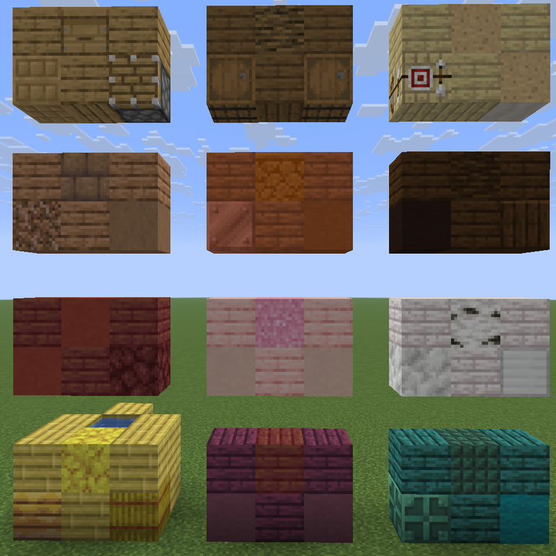
wood plank color palette
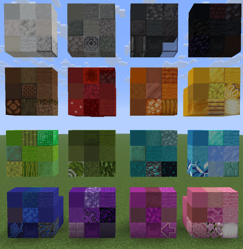
concrete/wool color palette
light blocks color palette
Summary
primary colors:
- red
- yellow
- blue
secondary colors:
- orange
- green
- purple
tertiary colors:
- red-orange
- red-violet
- yellow-orange
- yellow-green
- blue-green
- blue-violet
color codes:
- rgb (red, green, blue)
- hex #RRGGBB
- hsl (hue, saturation, lightness)
- hsv (hue, saturation, value)
hue:
- the basic colors. (red, orange, yellow, etc.)
value:
- shade = darker color
- tint = lighter color
saturation:
- tone = desaturated color, less blinding/bright color
hueshifting:
- when making a color darker, make the hue a little bit more purple and less saturated
- when making it lighter, make the hue more yellow and more saturated.
color schemes:
- monochromatic = 1 color
- complementary = 2 opposite colors
- analogous = 3 colors adjacent on the color wheel
- split-complementary = 1 base color and the two colors adjacent to the base's complementary
- triadic = 3 colors evenly spaced
- tetradic = 2 base colors and their complementary colors
- square = 4 colors evenly spaced
i hope this helps you!
if you think i forgot something or would like to see a tutorial on something else, just let me know!
it was originally going to be a basic tutorial but i talk too much and less than halfway through writing this i realized its probably not basic :D
Color
if you've ever made any kind of art, or even if you haven't, you probably know what color is, so i'm not going to explain that here.if you like science
we see colors because of the wavelengths of light that bounce off of certain surfaces.
on the visible spectrum, the wavelengths range from around 700nm (red) to 400nm (violet)
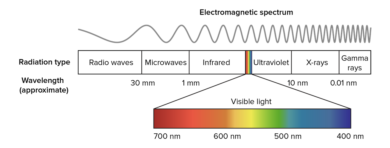
on the visible spectrum, the wavelengths range from around 700nm (red) to 400nm (violet)
however, i will list the three different color models and explain the difference between additive and subtractive colors.
for painting and drawing:
primary colors:
1. red
2. blue
3. yellow
primary colors are the three basic colors that can be mixed (along with black and white) to create any color.
secondary colors
1. orange
2. green
3. purple
secondary colors are made by mixing two of the primary colors.
tertiary colors
1. red-orange
2. red-violet
3. yellow-orange
4. yellow-green
5. blue-green
6. blue-violet
tertiary colors are made by mixing a primary and a secondary color.
printing and light:
there are three main colors for light (additive): red, green, and blue (rgb). when they are equally combined, they create white.
for pigment colors (subtractive), the main colors are cyan, magenta, and yellow (cmy), which combined equally make a dark brown (which is why sometimes you'll see cmyk, k meaning key/black)
if you really want to know why this happens
for light, its basically just all the wavelengths of visible light getting reflected so think of it as just really bright light, which is why it looks white. (this is a simplification because its too complicated to explain here)
for pigment, the different inks (for printing) are what block and absorb the light. something that looks really dark on paper is from all of the wavelengths of light getting absorbed.
for pigment, the different inks (for printing) are what block and absorb the light. something that looks really dark on paper is from all of the wavelengths of light getting absorbed.
Color codes
four of the most common color codes you'll see are rgb, hex, hsl, and hsv. i'll explain them all briefly but you can just skip this section if you want.
rgb
rgb is an additive color code, and the colors are represented like so: (red, green, blue)numbers from 0 to 255 are used for the scales. for example, (0, 0, 0) is black, while (255, 255, 255) is white.
(255, 0, 0) is pure red,
(0, 255, 0) is green,
(0, 0, 255) is blue, etc.
there are 16,777,216 possible colors in rgb. (and probably all the other ones, i didn't want to count)
hex
the hex (hexadecimal) color code is almost the same as rgb, except with letters and math.hex is represented as a 6 digit code: #RRGGBB
the difference is that hex uses numbers 0-9 and then letters A-F
(A = 10, B = 11, .. F = 15)
to convert rgb to hex
1. rgb color: (201, 0, 46) = a pinkish color
2. starting with r (201), we divide it by 16. [ 201 / 16 = 12.5 ]
3. round down if its a decimal. = 12
4. the first digit is C (because C = 12)
5. to find the second digit, we multiply the answer (12) by 16 [ 12 x 16 = 192 ] and then subtract that from the original number (201) [ 201 - 192 = 9 ]
6. the second digit is 9
7. repeat for the other colors (green is 0 so you skip that)
8. blue is 2E
9 final hex = #C9002E
to convert hex to rgb
1. hex color: #00731D = a dark green color
2. starting with green (because red is 0) multiply the first digit by 16 [ 7 x 16 = 112 ]
3. add the second digit [ 112 + 3 = 115 ]
4. repeat for each color
5. blue is 29
6. final rgb = (0, 115, 29)
2. starting with green (because red is 0) multiply the first digit by 16 [ 7 x 16 = 112 ]
3. add the second digit [ 112 + 3 = 115 ]
4. repeat for each color
5. blue is 29
6. final rgb = (0, 115, 29)
hsl and hsv
these are very similar color codes, but you will see them less often than rgb and hex.hsl stands for hue, saturation, and lightness.
hsv stands for hue, saturation, and value.
the difference is that in hsl (the lightness one), 100% lightness is white, 0% is black, and 50% is the pure color.
in hsv (value), 100% value is the pure color, and 0% is black. to get white you would put saturation to 0% and value to 100%
now we can talk about the actual color theory part ;)
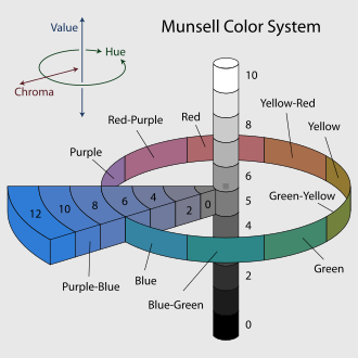
Hue
the first thing you think about when you imagine color is hue. its the outer ring on the color wheel (i'm going to use skindex's editor because i like it better)
you might have heard of hueshifting in terms of shading. the concept is that the hue gets more purple the darker the color gets, and more yellow the lighter it gets. here is an example:
this is using skindex's shade feature (the paint tubes with + and - signs) you can see that its one color. but in real life, shadows usually aren't one color. so using hueshifting, we can replicate the purpleish shadows, and yellowish highlights from reality. obviously the hueshifting is different for each color.
this is using hueshifting, which i will explain in more detail at the end.
Value
value, or shade, is the white and black parts of the color wheel. in skindex's, its vertical.
the left side is the value scale, meaning the top is white, the bottom is black, and the middle is pure color.
the right side is the lightness scale, meaning the middle is gray instead of color (think back to the hsv and hsl codes)
a shade is when you add black to a color to make it darker.
a tint is when you add white to make it lighter.
now obviously when you are shading something, the shadows are going to be darker than the base color, and highlights are going to be lighter.
Saturation
saturation is how much of the pure color you have. its horizontal on skindex's color wheel.
on the left side it will be the purest hue, and going to the right, it will get less saturated.
if you like really blinding colors, you can use that, but i prefer less saturated colors because you will rarely see pure hues in nature. (and i want my eyes to like me)
for shading, when the value gets darker, it also gets less saturated. when the color gets lighter, the saturation goes up.
a tone is when you add gray to desaturate a color.
Hueshifting
this is the fun part! when i shade a skin (or any kind of art) i looovvee to use hueshifting.
there's so many ways to hueshift, so i'm just going to show you the one i use.
i start with the base color.
then, looking at the color wheel, i move the hue slightly towards purple, the value towards black, and i also make it less saturated.
i dont move the one in the square drastically, usually i'll just move it to the edge of the white circle.
but the hue i change a little more, about twice the size of the cursor.
then i keep doing that for the shadows.
for highlights, i don't like to make it a lot brighter, but i make it more saturated.
basically just the opposite of doing a darker shade.
i usually do 3 shades and a highlight.
one part i did not show was that the darker i get, the more i desaturate it. like the first shade i'll desaturate the same amount that i darkened it. then the next one ill double the desaturation but keep the darkness the same. if that's confusing, here's an example.
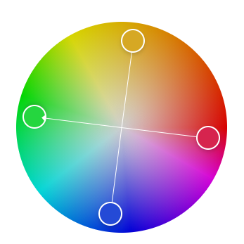
Color Schemes
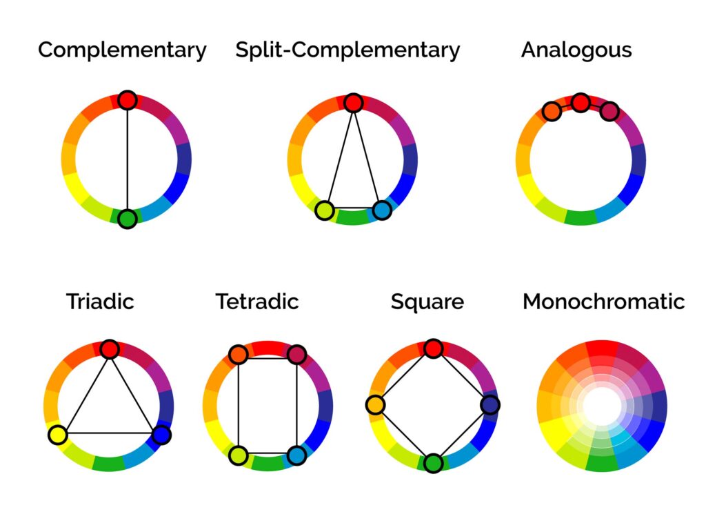
how do you find colors that look good together? how do you make a color palette?
the answer is color schemes!
there are 7 color schemes that we will talk about. these examples are assuming your color wheel has 12 colors. (3 primary, 3 secondary, 6 tertiary)
i am using the adobe color wheel
1. monochromatic = 1 color. you can change the value and saturation, but not the hue. (for those who need to have hueshifting, this is not for you)
2. complementary = 2 colors. the base color + the color opposite on the color wheel.
3. analogous = 3 colors. this includes the base color, and two colors on either side of it.
4. split-complementary = 3 colors. the base color, and then the two next to the complementary.
5. triadic = 3 colors that are equal distances from each other on the color wheel, forming a triangle.
6. tetradic = 4 colors, two main colors and their complementary colors.
7. square = 4 colors that are evenly spaced around the color wheel.
if you choose one of these, you can still add more colors. artists commonly add an accent color or two. (or 14) just make sure the accent color is minimal.
if you are building something in minecraft, there are so many blocks to choose from, so i made some palettes to make things easier.
wood plank color palette
concrete/wool color palette
light blocks color palette
Summary
primary colors:
- red
- yellow
- blue
secondary colors:
- orange
- green
- purple
tertiary colors:
- red-orange
- red-violet
- yellow-orange
- yellow-green
- blue-green
- blue-violet
color codes:
- rgb (red, green, blue)
- hex #RRGGBB
- hsl (hue, saturation, lightness)
- hsv (hue, saturation, value)
hue:
- the basic colors. (red, orange, yellow, etc.)
value:
- shade = darker color
- tint = lighter color
saturation:
- tone = desaturated color, less blinding/bright color
hueshifting:
- when making a color darker, make the hue a little bit more purple and less saturated
- when making it lighter, make the hue more yellow and more saturated.
color schemes:
- monochromatic = 1 color
- complementary = 2 opposite colors
- analogous = 3 colors adjacent on the color wheel
- split-complementary = 1 base color and the two colors adjacent to the base's complementary
- triadic = 3 colors evenly spaced
- tetradic = 2 base colors and their complementary colors
- square = 4 colors evenly spaced
i hope this helps you!
if you think i forgot something or would like to see a tutorial on something else, just let me know!
More like this

 Lay
Lay
 popchkn
 doctordiamondz
 Sam_The_Odd
 KeyBoy18
6884415
6


 kristina_girl
Have something to say?