- 3,072 views, 6 today
- 322 downloads, 1 today
519
Version: 1.12.2
Resource Pack: ModernHD (Adds a beautiful modern touch to contemporary builds!)
Mod: Little Tiles
Shader: Complementary Shaders
Schematic? Indeed!
Architectural Style: Scandinavian, Contemporary, Modern, Minimalism, partial Brutalism
More Little Tiles Builds: #1 - #2 - #3 - #4 - #5
Astrological Sign: Aquarius (The water bearer)
Description:
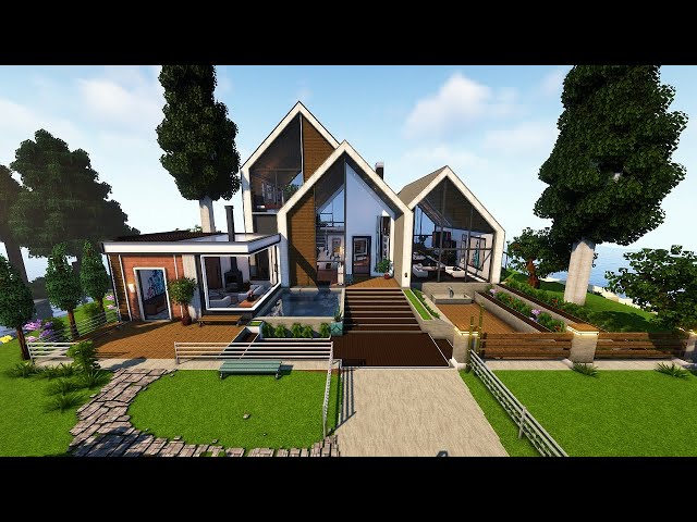
Being unfamiliar with the building style of the modern Scandinavians, I had to educate myself on their structural basis, layout, and general color selection; affording competence and vision to be applied to my very first Nordic residence in a survival setting.
The reason I chose Little Tiles is a no brainer really. Aside from the excruciating effort it requires to raise a detailed build from the ground using Little Tiles, it offers a building potential that vanilla simply can't produce without breaking the scale, a consequence that affects presentation and appreciation from a panoramic with an 8 chuck draw distance on older machines. This simply implies that visual cohesion were considered and performance measured, of which both checked out as desirable results for older systems.
Per usual, I had to construct my own furniture, misc objects, and structural features with a critical eye, often working for hours on something as simple as a bed and chair that respectively functions as such.
The external layout of course display gables with deep seated walls in certain areas, triangles that accentuate the play between spruce and oak paneling, and excess glass implements that amplifies the interior with a sleek touch. Instead of using the slicer tool exclusively (miniature triangles), I mixed it with small modular diagonals in specific areas that creates a visual contrast between the two; effectively drawing more attention to the intricate play between deliberate features that would otherwise feel too…expected?
Internally, I decided to balance clutter and minimalism between point of interest. While the main entrance captivates the player with surrounding objects akin to semi-clutter, the connected kitchen and living room shifts towards a minimalistic feel with two skylights, paned window frames, and diamond shaped hanging lights that adds a neat aesthetic.
I'm prompted to believe that the surrounding elements complements the overall atmosphere, adding vibrancy in areas that would have felt lifeless and too flat. I tried applying more bumps and grooves to flooring, but it honestly did not work for me. Adding too much striations and tessellation affected the finish I intended, so I tossed the idea and went for a cleaner presentation; thus the reason I avoided filling too much space with microwaves and objects that would have bruised a clean approach.
Breaking the build down to the nuts and bolts will take too much time to explain, so I'll use a YT walkthrough to drive the presentation home by observing as much angles as possible while roaming the structure. This will give you a broader scope on what is being presented instead of renders and fancy pictures that honestly adds too much drama to a build that doesn't look nearly as interesting as the render.
Quote, because why not:
"Surround yourself with those who see greatness within you, even when you don't see it yourself"
| Credit | WorldEdit, Optifine, ModernHD, Little Tiles, Better leaves addon, and the PMC community for the support and inspiration! Much love! |
| Progress | 100% complete |
| Tags |
1 Update Logs
Update #1 : by Peculiar-Gemini 11/19/2023 6:03:45 amNov 19th, 2023
Moved the Tier from Libra to Aquarius, which makes the build extremely affordable for the amount of effort put into it. I think it's fair to give my Aquarius supporters also some benefits.
I'll be brainstorming a new build after take a break for a day or two to focus on exercise and meditation. Hope you're all still doing well, and thank you for supporting my efforts, incredibly grateful! :]
I'll be brainstorming a new build after take a break for a day or two to focus on exercise and meditation. Hope you're all still doing well, and thank you for supporting my efforts, incredibly grateful! :]
tools/tracking
6118705
2
incredibly-detailed-scandinavian-house-survival-interior-download


Create an account or sign in to comment.