

• 5/1/15 4:15 pm
- 647 views • 0 today
- 5
- 2
- 5

14

I've been doing graphics design for a couple of years, and I've learned many different things along the way. In this tutorial, I would like to show you one of my favorite font styles, so you may use it for any graphics you create.
Step 1: The base text
To start, open up Photoshop, and choose a text you'd like to work with. I personally recommend text that looks rounded and cartoony, but most fonts work.

Step 2: Bevel & Emboss/Contour (RECOMMENDED)
I use bevel and emboss to give the text a slightly 3D look to it, and contour to further improve that look. This is an optional step, though I highly recommend doing it. Here is the settings I use (contour is default):
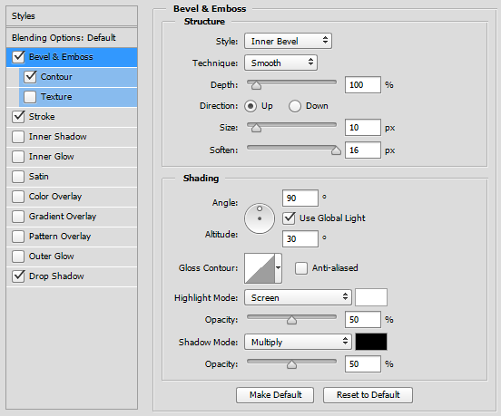
Step 3: Stroke
I usually give my text a slightly thicker stroke to it, so I'm able to mess with the drop shadow more to give it a better 3D look. Here is the settings I use:
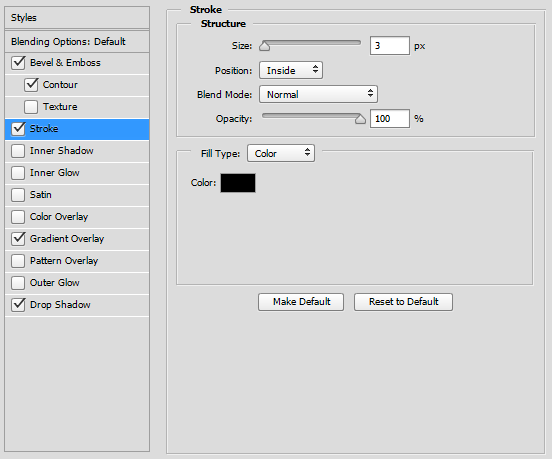
Step 4: Drop shadow
This is probably the most important step. It really ties the whole 3D look together, and gives it a pretty nice look. Here is the settings I use:
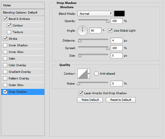
Finished product:

That's it, the final product! I hope that this tutorial has helped to give you guys a font style that you can use for any graphics related activities you have. This is also my very first blog, so any feedback would be very much apppreciated.
More like this
 Contest Entry : Minecraft Style Font! With photoshopTutorial Blog
 DiamondDesignsHD
•7/19/12 12:27
26.4k 13x 1135
DiamondDesignsHD
•7/19/12 12:27
26.4k 13x 1135 How To Shade Your Skins With Photoshop - TutorialTutorial Blog
 Sabretooth[CZ]
•7/9/12 9:43
7k 22x 13227
Sabretooth[CZ]
•7/9/12 9:43
7k 22x 13227![[Tutorial] Texture pack ( PICS! ) FREE PHOTOSHOP Minecraft Blog](https://static.planetminecraft.com/files/resource_media/screenshot/1309/Untitled-4_4937940_thumb.jpg)


 repasa
 Vexcenot
 Diamondhackers
3307461
6
![Enlarging Minecraft Textures [Photoshop Tutorial] Minecraft Blog](https://static.planetminecraft.com/files/resource_media/screenshot/1521/enlarging-minecraft-textures-thumbnail8939847_thumb.jpg)
![My Horrifying Username [Story Blog] Minecraft Blog](https://static.planetminecraft.com/files/resource_media/screenshot/1519/usernameblog8901380_thumb.jpg)
![Simple Font Style [Photoshop Tutorial] Minecraft Blog](https://static.planetminecraft.com/files/resource_media/screenshot/1518/039dd8a07069bcc4e9282b2f8b82cab28881495_thumb.jpg)




 Lucas96449PMC
 Threnos
 uzvarua


Have something to say?
A font that's slightly similar to it is Folklore, which is free.