So with colour it's very important, as it sets the whole vibe and tone of ur skin. So here u can see the large difference it makes:


The one on the left was what I started with and it took me a while to realise why my entry was missing something and wasn't on par with the other entries in my eyes. The lack of saturated and interesting colours was present. Having darker tones that r more saturated helps a lot to achieve this as well.
Below r the 3 paths I take.

I mainly use the red line but the others r still viable. It just depends what u r going for. For yellows and oranges, higher saturation is required as minimal causes it to appear brownish.
If u want interesting colours, do random, wild shifts backwards towards desaturation and slightly sat so like this:

The scale of the zigzagging is dependent on how soft or harsh u want the jumps in brightness to be between the tones
With the hue, u want to go randomly but strategically; back and forth and not in a uniform pattern. Make it look 'realistic' or random but plan it out in ur head and make what u want as highlights/strong highlights to be of a higher tonal brightness.
Below u can see the difference between a 'realistic', interesting red palette on the top and a 'clean' red palette on the bottom.

I apologise if u do the colours as u go but this should still apply :).
If u r planning on linking multiple colours, such as having the highlights of a completely different hue and/or a contrasting colour to the shadows, then go close towards grey with the mid-tone or roughly around it. This is because u can use the high desaturation, low contrast of a close to grey to link any colour together and blend/link them through this. Make sure not to go too desaturated when getting close to the desaturated mid-tone as the colours may look bland and plain. So to avoid this jump largely to the grey mid-tone as it will look nicer and also make the other colours appear more saturated.
I could go on forever about this stuff haha, but this is just the basics. I might add more and go full nerd but I'll see how I go lol.
Thank u for listening to my TED talk!


 Dino statue from a musuem
  "Wasteland" Pixel Art pieces from art class at school (2020)
 A vibing frog I made from
  Ron Weasley I made from my friend's pfp for him cause he is a lad (2021)
  Fwog for
 The crow that keeps waking me up in the morning, that
  A tamanduas I made for


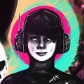
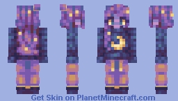
 Fascinated by the Flame (DB32 Palette Skin Jam)Minecraft Skin
 VinylReplica
•10/18/22 2:04
2.2k 138 2314781
VinylReplica
•10/18/22 2:04
2.2k 138 2314781 The Approaching Springtime (CaelChan's Springy Reshade comp!)Minecraft Skin
 Days Gone By (SSPBL S2 All Palettes to Ramp)Minecraft Skin
 Man gets all da dragon biddies (Commission???)Minecraft Skin
 King of Tainted Spirits (Stream Server PBL - S1W2)Minecraft Skin
 Galactic Misfortune (Stream Server PBL - S1W1)Minecraft Skin
 CORRELATION Palette Contest *Announcement*Minecraft Skin


 Wildcard_Gamer

 Campestral
 caidencestudio
 Momu
Momu
 -Lunatique
 DragonsDungeon


 Anna Graem
![Buff Pikachu [Collab w. Moon ♡] Minecraft Skin](https://static.planetminecraft.com/files/resource_media/preview/buffpika3-16531145-minecraft-skin.jpg)

 BlueMeanial
 Swanko
 GingerPie
![[8x8] Perch! - A Tiny RPG Experience Minecraft Texture Pack](https://static.planetminecraft.com/files/image/minecraft/texture-pack/2020/249/13024616-title_m.jpg)
 FishyMint
 Felidae
![Dark Knight [SSPBL] Minecraft Skin](https://static.planetminecraft.com/files/resource_media/preview/alex-slim-arms-planetminecraft-com-15679505-e1330-minecraft-skin.jpg)